“Why you can trust Digital Trends – We have a 20-year history of testing, reviewing, and rating products, services and apps to help you make a sound buying decision. Find out more about how we test and score products.“
Update 3/2/2016: The review has been updated to reflect a few minor changes since the release of Windows 10. Most importantly, the Action Center bugs that were frequent at launch have been resolved.
Windows 8.1 was an innovative, visionary operating system designed to finally put Microsoft ahead of the curve. It dreamed of a future where the computer was no longer just a desktop, or laptop, but rather a multi-use device that can transition between modes with ease. There was just one problem with that dream – it never came true.
Microsoft’s mistake, though massive, is understandable. We know now that laptop manufacturers weren’t up to the task of constructing a machine that’s truly as good of a tablet as it is as a notebook, but in 2011 that wasn’t as clear. Everyone was convinced touch would take over the world of computing, just as it had smartphones a few years prior.
Instead they’ve failed to gain popularity. Overall PC sales have slumped, but there are hundreds of millions sold every year, and the majority lack touch. Even tablets now struggle to maintain growth. The anticipated revolution never occurred, and the hordes of users who prefer the classic keyboard and mouse – that is to say, most of them – want an operating system built for them.
Windows 10 isn’t that operating system. Like Windows 8 before, it still attempts to reach a compromise. Unlike 8, though, Microsoft’s new operating system turns the dial more towards the desktop. But is it enough to right the wrongs of its predecessor?
A fresh coat of paint
Windows 8 marked the first comprehensive, unified overhaul of the operating system’s look and feel since Vista. A visual style usually lasts for at least two revisions of Microsoft’s operating system, so the numerous changes found in Windows 10 are surprising, though they also make sense. The aesthetics of 10 are an evolution of the Metro design philosophy introduced in Windows 8, rather than an entirely new branch.
The aesthetics of 10 are an evolution of the Metro design philosophy introduced in Windows 8.
That may make users cringe, but in fact it’s no cause of concern. Metro looked beautiful, and it’s arguable that the current trend of “flat” designed embraced by Apple and Google started with Windows 8.
Flat design means a simple, elegant, high-contrast look. Microsoft has backpedaled slightly from the ultra-basic icons introduced in the first builds of Windows 10, which were a real snooze, but the pseudo-3D icons introduced in Vista, and used ever since, have mostly been put out to pasture. The result is a clean, modern design that visually unifies the operating system.
This unification extends to windows themselves. Store applications now work in a Window like any other, but because they weren’t originally intended for that, their UI lacks borders. Microsoft’s answer? Strip borders from other windows, too. Everything is flat, minimal, simple, defined by a tiny frame and minimal drop shadow. It’s a simple solution that works well, not only because it gives Windows 10 a cleaner look, but also because it takes out bulky boundaries that never served a purpose.

While the new operating system does re-invigorate Windows’ design, it’s still not perfect for the desktop user. The main problem is the continued use of Metro-style setting panels and apps. While they share the same clean, flat look, they’re built on an entirely different scale, and thus look out of place. There are still menus that look like they belong to another operating system, or early alpha software, and somehow snuck into the release. I have a particular axe to grind with toggle buttons. These fat, burly switches appear in numerous menus, and they make little sense if you’re using a mouse.
A new start for Start – and a revised task bar
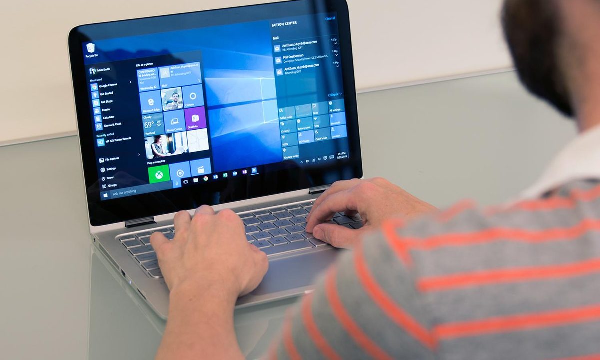
Killing the Start Menu was one of Windows 8’s biggest mistakes. Thankfully, it’s been mended in Windows 10 – and Microsoft has done more than replicate what was lost. The new Start combines a panel of small icons with text descriptors, similar to the older menu in Windows 7, with customizable Live Tiles. It’s the best of the worlds – mostly.
The new Start makes a calculated compromise by shifting focus from viewing all installed applications and option menus to just a select few. In fact, by default, it doesn’t immediately show a list of programs at all; only those “most used” appear. Users who want to see everything must click “all apps,” but even that often fails to pick up everything, and doesn’t organize software as well as the Windows 7 menu (because there’s no folders).
Traditionalists are likely to gripe about how the Start Menu now works, as it doesn’t quite fit the role it did in older versions of Windows.
Traditionalists are likely to gripe about how the Start Menu now works, as while it’s back, it doesn’t quite fit the role it did in older versions of Windows. But there’s something to be said for progress. I think it’s right to say most users spend most of their time accessing a small handful of applications, and the new menu makes finding them easier without over-populating the taskbar. That simplification also makes it easier to find Explorer and Settings. Both used to be readily accessible, too, but they were listed alongside numerous other choices that might distract the user.
Then there are Live Tiles, a feature that first appeared in Windows 8 but was restricted to the Start Screen. They’re a modular, customizable, web-connected user interface unlike anything found in other desktop operating systems.
Like desktop icons, Tiles are shortcuts, but unlike icons they can be individually resized to fit the interface as you’d like. You can lay out a series of tiny Tiles to make maximum use of space, use large Tiles for improved navigation and readability, or mix-and-match, using big Tiles for important software and smaller ones for whatever you need, but rarely access. They’re also “Live,” which means they can access content from the web or your local PC. Photos, for example, displays a slide-show of recent image file, and the Weather tile tells you how warm it is outside.
The Tiles still aren’t as intuitive as Microsoft likely wants them to be. Discerning what is or isn’t “Live” can be difficult. Many apps, particularly those that aren’t from the Store or bundled with Windows, lack a Live function – but you won’t know that until you add them. There’s also the problem of older applications that lack properly styled Tile icons; in that situation the desktop icon is used instead, and it looks out of place.
I find I don’t use the Tiles much as a result. They don’t do enough for me to care about customizing them, and I launch most applications through the search bar. In a way, this is an argument in favor of Microsoft’s original decision to kill the Start Menu. There’s truly not much reason to use it aside from force of habit. Now that it’s back, it would’ve been good to see a more original approach — but re-purposing live tiles works well enough.


Customization beyond tiles is also lacking. Users can decide if they’d like to see the “most used” and “recently added” apps, or not. Start’s full screen mode, which effectively is the new Start Screen, can be turned on or off. And users can choose which folders they’d like to see (the list is extensive, but a “Programs” folder is not among them). To be fair, Start has never been extensively customizable by default, but the menu replacements that third parties introduced after the release of Windows 8 have shown more is possible.
Of course, the Start menu works hand-in-hand with the taskbar. The most notable change here is search, which used to be hidden in the Start Menu or Start Screen, but now has its own much-needed space. That’s handy because, as mentioned, Search can now be used as an effective substitute for the Start Menu itself. Embedding Search into Start would add an extra, unneeded step.
Otherwise, not much has changed other than the aesthetic, which has been refined a bit to fit the cleaner look of Windows 10. Programs sort themselves just as before, are pinned just as before, and jump lists haven’t gone away. The taskbar remains a shining beacon of user interface design that’s perfect no matter how you use your PC.
Settings takes Control
While the Start Screen was Windows 8’s most well-known flub, it wasn’t the most annoying. I’d say that honor goes to Settings. The Metro-style implementation was a legendary failure because it forced desktop users to fumble through menus clearly designed with touch in mind. It also lacked many critical functions, which meant users fell back on the ancient Control Panel. Most eventually learned to go straight to Control Panel first instead of wasting time in Settings.
The new menu is also more inclusive than before, so there’s not much need to fall back on Control Panel.
Windows 10 almost completely revises Settings, keeping only a few sub-menus and the occasional icon. Desktop users now see it as a Windows App that can be resized or moved like any other. It breaks everything into nine sub-sections which are actually better organized than Control Panel. For example, screen resolution is now accomplished through the System menu – which makes sense – rather than Appearance and Personalization, as has long been true in Control Panel since Vista (if you use the default, large icon view).
Settings does look a bit odd compared to its predecessor, as it’s designed for use on devices of every size. Icons are fat and there are very few small, finicky text links that only make sense when a mouse is readily available. The menus take up more space than they really need to, at least in most cases. Users can re-size the window, and if it’s made very small, the icons re-arrange themselves and downsize. That’s not immediately obvious because the large icons appear by default even on large, high-resolution displays.
The new menu is also more inclusive than before, so there’s not much need to fall back on Control Panel. Virtually every common task, from creating an account, to changing display resolution, to setting up an Internet proxy, can be accomplished.
But that doesn’t mean Control Panel has gone away. It’s still there for power users, and will be necessary to access certain functions that remain important. Windows 10 falls back on Control Panel menus for network adapter options, for example, which seems odd given the frequency with which that settings panel is accessed.
Other notable exclusions from Settings include Device Manager, the Network and Sharing Center, and OneDrive settings.


That brings us to a problem that Settings, and Windows 10 as a whole, still fails to solve – feature sprawl. There’s a lot going in Windows, so much that users have difficulty keeping track of it all. The fact there’s no true one-stop-shop for settings and features exacerbates the issue. This is not just due to the use of Control Panel for legacy support, but also new UI decisions, such as reliance on the “hamburger” menu. Many features, including Cortana and the Edge browser, have their own hamburger menus that can only be accessed from Search, or from the application itself. That can make finding the right switch or setting a chore.
The challenge of managing Windows’ ever-expanding constellation of settings is not a trivial matter. I suspect it’s a prime reason why Microsoft’s operating system is often considered difficult, despite the fact many of its interface features, like the taskbar, are superior to their OS X equivalents.
Ready for Action
Ding, dong, the Charms Bar is dead – and boy, it didn’t last long. Built to provide easy access to Search and Settings no matter the device, it ultimately proved too limited to be useful. Action Center, its replacement, takes a different approach. Instead of serving as a menu, it’s a tool in itself, as it provides access to notifications and numerous system settings immediately.
Action Center provides access to notifications and numerous system settings immediately.
This implementation works better than the Charms Bar, though mostly because features once incorporated in Charms have been moved to other, more sensible locations – Search and Settings being the most important. While the Action Center contains many important features for tablet owners, they can be mostly ignored on the desktop.
That means Action Center essentially turns into the Notification Center. With Windows 10, Microsoft has brought notifications up to date with a full-blown notification pane, providing integration with both first-party and third-party apps. The catch here is that unlike OS X, which simply integrates social networks into the operating system, you’ll need to download the Metro app – something not every user is going to think of.
Take that small step, though, and they appear as on any other device. The app doesn’t even have to be open for its notifications to appear. Not everyone will embrace this feature, I’m sure, given the lackluster implementation of many Windows Apps for social networks (Twitter is especially bad). But it’s an important step forward.


At launch, Windows 10 had a lot of problems displaying notifications on time. Sometimes they’d pile up, then all slide in at once – quite annoying when ten or twenty are in line. This has been fixed, for the most part. Outlook is still strangely lazy about notifications at times, but other applications like Facebook and Slack show notifications as quicker, or quicker, than a mobile device connected to the same service.
Action Center also looks nice. Microsoft has settled on a transparency effect with blur reminiscent of the Aero Glass theme from Vista. This keeps it in line with the Start Menu and taskbar. This throwback seems unlikely to work on paper – bringing back memories of Vista doesn’t sound like a great idea – but it works well in practice, thanks to Windows 10’s clean-cut borders and simple, high-contrast icons. This look is carried over to volume, calendar and the task tray.
Windows to Mission Control
OS X 10.3 “Panther,” released in 2003, introduced Expose, a feature which organized windows into a simple thumbnail view. It was incorporated into Mission Control with OS X 10.7 “Lion,” and has become a defining feature of the Mac. Microsoft sorta-kinda tackled the issue of window previews with Windows 7, when the updated taskbar received Aero Peek, a thumbnail that appears when a cursor hovers over an open program’s icon. But until now, that’s been the extent of its efforts.
Windows 10 mounts a two-prong attack on the problem of window previews.
Windows 10 mounts a two-prong attack on the problem of window previews. The first is a new Alt+Tab short view that shows full window thumbnails rather than just icons. While this is the less dramatic of the changes, it’s likely that’ll be most used, and it benefits from familiarity. Anyone who’s used Windows already knows the wonders of Alt+Tab. Improving the shortcut improves Windows without forcing users to learn a new feature.
There is, however, a new feature to compliment Alt+Tab, and that’s Task View. Accessible through a taskbar icon, or the new Windows+Tab keyboard shortcut, Task View provides a full-screen thumbnail overview of every open window. It also offers another first for Windows – virtual desktops. These let users lump open windows into separate work areas, making organization easier. If you want to work on a document without distraction, for example, you can create second desktop in which only Word is open.
Learning Task View takes some time because it’s easy to forget it’s available. Windows helps you remember, however, by automatically opening Task View whenever you use Snap to place two or more windows side-by-side on the desktop. When you do this, Task View is used as a selection screen to decide which other window you want to occupy the other half of your screen. It’s a minor addition, but it eliminates the need to drag two separate windows into place – instead you only move one, then select the other with Task View.


Speaking of Snap, it’s been improved to allow the use of all four corners of a display, rather than just each half. Placing a window in a corner opens up Task View, just as when dividing the display in halves. It’s another change that seems small, but provides a lot of use. That goes double on monitors with 1440p resolution or greater, which have enough space to display four usable windows simultaneously.
The usefulness of Task View can’t be overstated. It makes picking out a specific window from a selection of open windows much easier than it was before. And when combined with Snap, it organizing a mess of open windows into a sensible arrangement, well — a snap! Windows 10 is the new standard for how multi-tasking should be handled by a modern desktop OS.
Easy on your hardware
Window’s Vista, which made sweeping changes to the bones of Windows, was widely regarded as a performance hog. Microsoft has been conservative about system requirements ever since, and that continues with Windows 10.
The numbers say there’s very little difference, and my subjective impressions agree. Windows 8.1 and 10 feel similarly responsive on the same systems.
You don’t even need multiple cores; a single 1GHz processor will do. You’ll also need a single gigabyte of RAM for 32-bit Windows, or two gigs for 64-bit. The required hard drive space is quoted at 16GB for 32-bit and 20GB of 64-bit. Finally, you need a DirectX 9 compatible video card.
Sound familiar? It should. These requirements are entirely identical to those for Windows 7. That makes sense, as the bones of Windows haven’t changed much since then.
I ran a few basic tests to see how things have changed since 8.1. First, I looked at RAM usage on the same system after a fresh boot without any third-party programs. In Windows 8.1 this resulted in memory usage of 2.4 gigabytes, while Windows 10 used 2.6 gigabytes.
That may seem like a lot given the minimum requirements state as little as a single gigabyte is usable, but Windows’ has aggressively cached data ever since Vista. The fact it’s using 2.6GB doesn’t mean is absolutely needs so much.
Next up I examined the size of the Windows folder itself. Here there was some growth, with Windows 8.1 demanding 13.7GB, and Windows 10 eating 15.5GB. That’s less than two gigabytes more, so it’s not likely to matter, but it could be a problem on a handful of Windows tablets with very little storage.
Finally, I ran Geekbench. The processor-centric test returned a single-core score of 3,439, and a multi-core score of 12,684, in Windows 8.1. In Windows 10 it reported a single-core score of 3,372 and a multi-core score of 12,874. The difference here is no greater than two percent – well within the margin of error.
The numbers say there’s very little difference, and my subjective impressions agree. Windows 8.1 and 10 feel similarly responsive on the same systems. All but the least expensive notebooks, and nearly all desktops, can run it without a hitch. In this regard Windows remains ahead of OS X, which has long struggled to tame subtle stuttering in its numerous interface animations, which are on by default.
Conclusion
In late 2014, when the first preview builds of Windows 10 went live, there was a sense of disappointment lurking beneath the initial excitement. Those early versions showed promise, but also weren’t hugely different from Windows 8.1. It felt like Microsoft had slapped a Start Menu on it and called it a day.
Fortunately, those concerns have proven unfounded. While the new and improved Start Menu is a big deal, it’s also just part of the evolving story. Microsoft has unloaded a barrage of desktop goodness for enthusiasts; an improved Settings menu, more convenient Search, new Snap options, and Task View, the best default windows management solution to yet debut in any desktop operating system.
Microsoft has pulled through for its most dedicated fans. Anyone who owns Windows 7 or Vista can upgrade to Windows 10 without reservation; those who’ve used Windows 8.1 and become accustomed to its quirks will be pleasantly surprised by 10’s focus and refinement. Mac OS X is more intuitive, but Windows 10 is more flexible, and it’ll restore faith in those who worried Microsoft was giving the cold shoulder to its most important platform; the traditional PC.
Highs
- Slick, modern aesthetic
- Useful new features
- New start menu is great
- Task View is awesome for power users
Lows
- Settings menu still isn’t ideal
- Notifications don’t always work