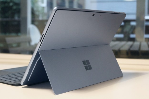
Microsoft knows this better than any other company. Time and time again it’s put all its chips on a big bet and gone home empty-handed. The Xbox One is the most recent evidence of that. Remember mandatory Kinect for the Xbox One? The company nearly lost a decade of progress in that fiasco.
Self-inflicted wounds do have an upside, though; eventually, you’ll become an ace at patching yourself up. The desktop patch job was a success. The scar’s barely noticeable. But what about Tablet Mode, as it’s now officially known? Does Microsoft truly have the surgeon’s touch? Or is Windows 10 little more than gauze stuck in a nasty wound?
Tablet mode – engage!
Windows 8 was a one-size-fits-all operating system. Though designed for a wide variety of devices, it offered a single interface for all of them. Like most anything that takes such an approach, the result was a hodge-podge that didn’t fit any device perfectly. Users with very large – or small – displays took particular offense.
Microsoft has switched tactics with Tablet Mode in Windows 10. The feature’s purpose is self-explanatory. Want to use your convertible Windows device as a tablet? Then open the Action Center and hit the big, fat Tablet Mode button. Want to revert back to the standard desktop? Hit it again.
Sounds easy, right? It is. Moving between the two modes is absolutely seamless. There’s no need to close or re-arrange open windows, as they transition themselves without user input from windows (on the desktop) to full-screen apps (in Tablet Mode) and back again. Most 2-in-1 notebooks take ease-of-use a step further, automatically prompting the transition to Tablet Mode with a notification when the keyboard is detached or rotated out of the way.
New interface
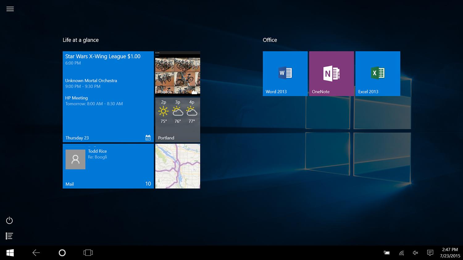
Microsoft hasn’t slacked on the touch interface for Windows 10. Many key elements have been changed significantly, starting with the Start Screen, which is now an extension of the Start Menu rather than the centerpiece of the Windows experience.
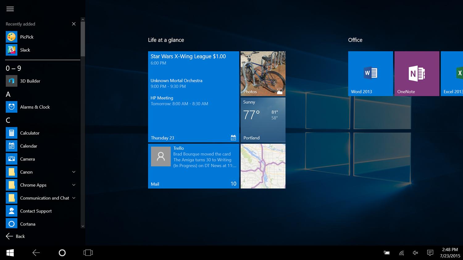
Though it looks a lot like the Windows 8.1 Start Screen, the new version works differently. It now scrolls vertically, rather than horizontally, and Live Tiles are less densely packed by default. A hamburger menu in the upper right provides further information in a Start Menu fashion, including access to frequently used apps, Settings, and File Explorer. Confusingly, a separate menu in the lower right provides access to the full list of applications.
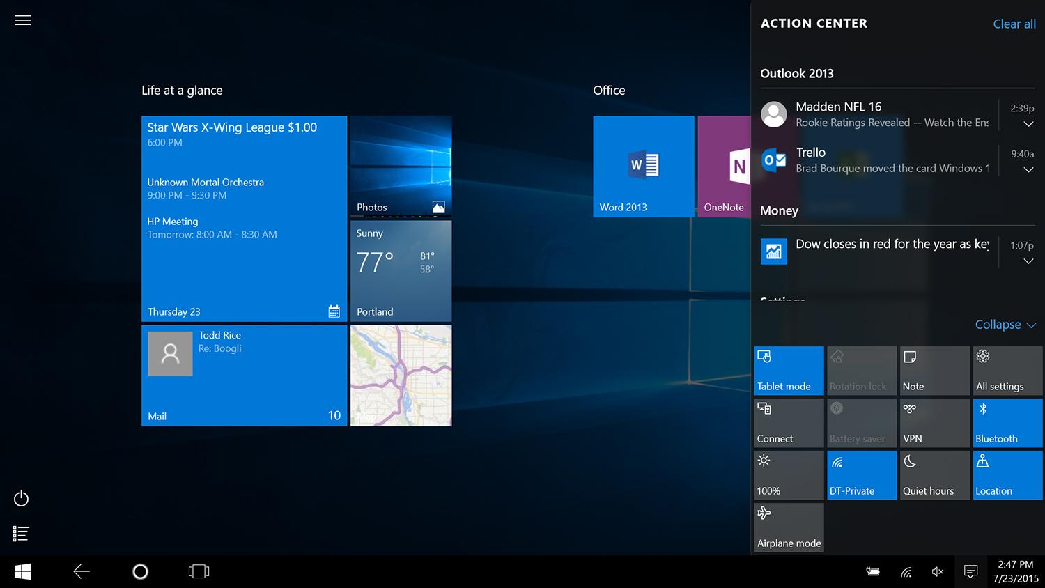
The Action Center has a lot going on – perhaps too much.
Multi-tasking has completely changed, too. Tablet Mode is still designed for full screen use, just like Metro applications of old – it’s impossible to use any application in a window with Tablet Mode enabled. That includes legacy desktop apps, and even File Explorer. Switching between apps has entirely changed, however. In Windows 8.1 users swiped horizontally across the screen with one finger to switch between open applications. In Windows 10, the same gesture instead activates Task View, where users can select from all open applications. Task View also lurks on the task bar, which is ever-present even in Tablet Mode.
Action Center, another new addition, handles notifications and commonly accessed Settings. It’s accessed by swiping horizontally to the left, and more or less does what any notification center does. Recent information is provided, and can be dismissed with a swipe. The bottom half of the Action Center is consumed by a variety of options like Wi-Fi, Location Settings, Brightness, and much more. There’s probably too much going on here, as by default the settings options consume a full third of the Action Center’s usable space.
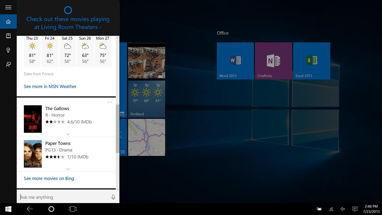
There’s a million other little updates, too. Users can now easily view the calendar without opening the actual app, a variety of new hamburger menus and swipe-friendly toggle buttons make features easier to turn on or off, and the revised Settings menu includes far more features than before, which means users have to dip into the Control Panel less frequently.
Old Problems
But – notice how I said less? Despite all of the changes, Windows still feels hastily implemented on touchscreen devices. Many of the changes listed above – the Start Menu in particular – seem to have occurred for no good reason.
Switching apps is still awkward. Many interface elements, including the window previews in Task View, are tricky to operate with touch. At times Windows seems almost willfully ignorant of what I wanted to do, miss-reading taps I thought deliberate, miss-interpreting gestures I thought accurate. Using gestures on an OS X touchpad is easier and more convenient than using gestures on a Windows touchscreen device.
At times Windows seems almost willfully ignorant of what I wanted to do, miss-reading taps I thought deliberate.
Let’s say, for example, that you’d like to switch Wi-Fi networks. You’ve probably noticed Wi-Fi in the Action Center, so you’d reasonably head there first. But clicking that option actually just toggles Wi-Fi on or off. Instead you have to head to the taskbar, where clicking the itsy-bitsy Wi-Fi symbol results in a list of networks. Now, finally, you can select a different network. But what if you need to change a setting for said network? Well, now you’re diving into Settings, probably through a Cortana search for Wi-Fi Settings. There you can manage a few more options, but not Adapter Settings or Network and Sharing options. For that you’re taken to another, Control Panel window, and at that point you’re just using the desktop interface with Touch.
That’s an astounding and confusing series of steps. While advanced users can handle it without much issue, the average individual will be rightfully befuddled. A short-cut to the Network and Sharing Center is available with a long-tap of taskbar Wi-Fi icon, but the interface provides no obvious suggestion that tactic might work, and you end up dealing with the desktop-style interface elements either way.
Metro, now a second-class citizen
The biggest change to Windows apps, the new name for what were once Metro apps, is the fact they can all be used in a window. It’s not an option – it’s a default feature. And it’s entirely irrelevant to Tablet Mode, which forces every application, be it a Windows app or desktop software, into full-screen mode.
Arguably, this change is a disadvantage for touchscreen users, because it makes the already murky guidelines for good touchscreen use even less appetizing to use. Every app on the Windows Store is now a windowed, desktop application, where it wants to be for start. Given that touchscreens are drastically outnumbered by conventional PCs, it’s hard to see why a Windows 10 developer would ever focus on the former. Microsoft has flipped the script of Windows 8. That operating system made desktop owners feel second-class. Windows 10 does the same for anyone with a touchscreen all-in-one or 2-in-1.
That’s not to say Windows Apps have been entirely ignored. Microsoft has revised the vast majority of the old Metro-style apps from Windows 8. Calendar, Maps, Mail, Photos, People, Weather, and Xbox enjoy these changes, which includes more visible menu elements, better use of space, and more high-resolution assets. Only a few apps, such as Camera and Reading List, return to Windows 10 untouched. The OneDrive is gone, as Microsoft’s cloud service is now well-integrated.
Redesigned apps, of varying success
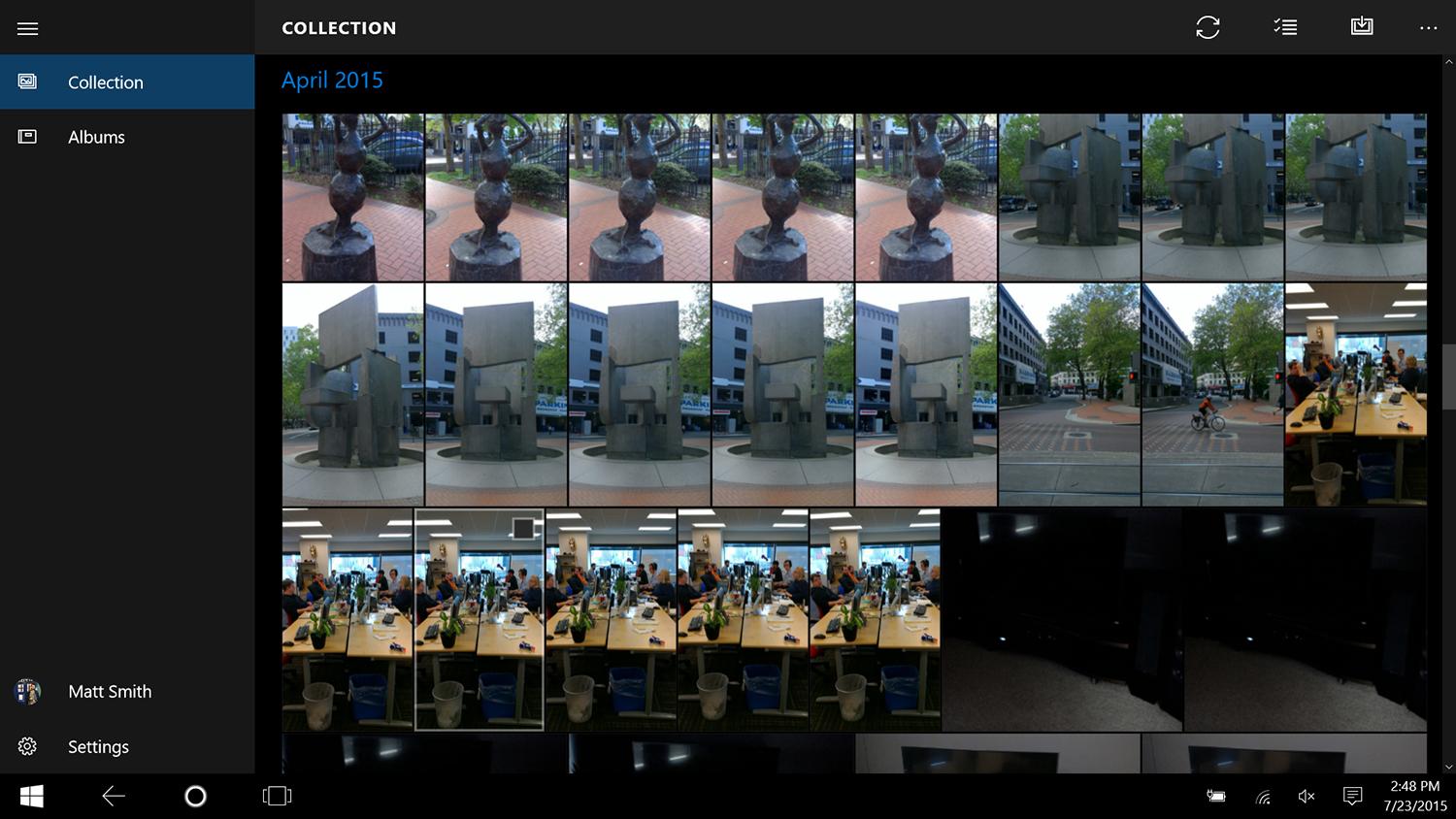
A closer look at the Photos app provides a good overview of these changes. The Windows 8 version was so simple it bordered on useless. It effectively worked only as a less intuitive and convenient version of the Pictures Library in File Explorer. That, of course, meant that skipping Photos entirely and using Explorer was often the easier route, sometimes even on a tablet.
While the revised first-party touch apps look slick, their usefulness varies.
In Windows 10, Photos is more sensible. It now works more like a photo roll, collecting all of the images you’ve captured with various Windows devices automatically, through OneDrive, and putting them in one constant stream. The new app also automatically creates albums based on date or other metadata, as available. Changes like these better align the app with the way users want to browse and view photos on a touchscreen device, yet also provide sufficient organization and functionality.
Yet, even here, the app is based on the bones of the desktop experience. You can view photos, make some basic enhancements, and save the results, but if you really want to organize – create new albums, rename old ones, or delete large quantities of shots – File Explorer remains the best and, in some cases, only way to do that.
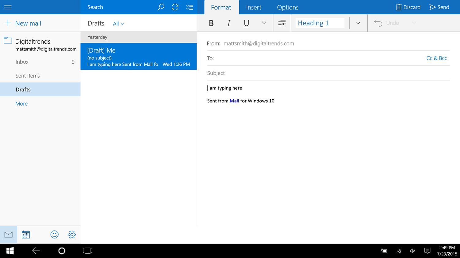
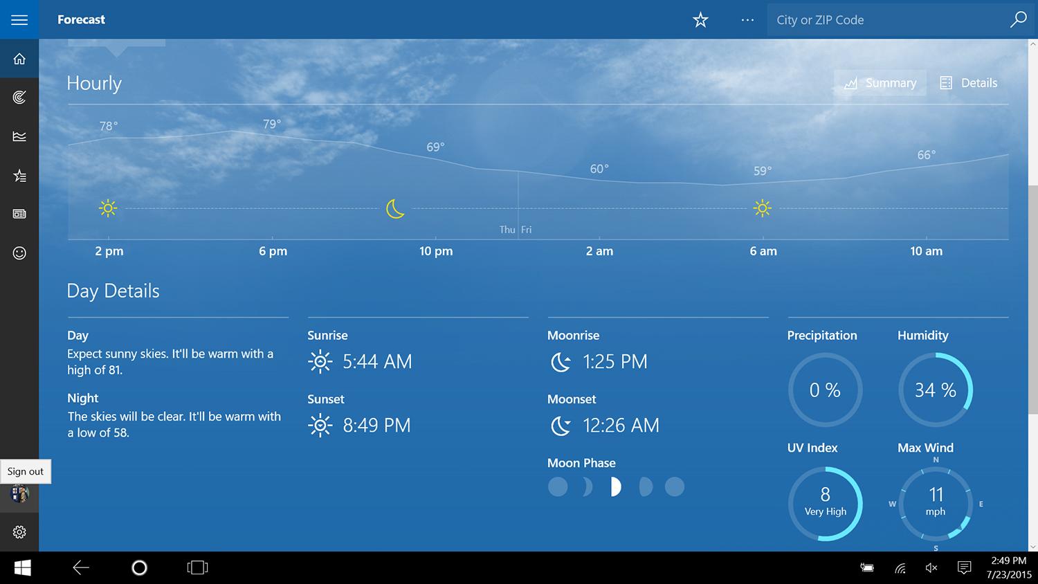
There are a few baked-in apps that deserve commendation. Weather looks great and works perfectly on both the desktop and tablet. Calendar is a big improvement over its hopelessly obtuse Windows 8 predecessor. Mail deserves props for the same reason. Yet the suite of apps, taken as a whole, still feels too loosely strung together. That’s partially because users have the option to dive into the desktop interface. Alone, on a phone, the Photos app might seem sufficient. On a Windows 10 PC, though, it’s held back by the knowledge it can do more – because the “more” is only a few clicks away.

Microsoft is also, for the first time, providing touch-friendly Office applications for Word, Excel and PowerPoint. These are available through the Windows Store, are entirely free, and provide a basic feature even if you’re not an Office 365 subscriber (and function fully if you are). Extensive work will of course be a chore if a keyboard isn’t handy, but the apps work very well for quick edits. It’s quite easy to drag a photo from one page of a document to another, or quickly delete an errant paragraph.
Windows Store is improving, but still has growing pains
When Microsoft launched its official Store, alongside Windows 8, I called it “spectacularly terrible,” and for good reason. Aside from major interface issues and a general lack of content, the Store was plagued by apps that were blatant scams, or ripped off the intellectual property of others, including Microsoft itself.
Fortunately, the Store has managed to clean up its act since then. A tour of the top free and paid apps reveals a selection that’s largely legitimate. The featured sections of both the Store’s front page and sub-sections have been taught to put top-notch software in the spotlight. Most of the scam apps that were successful in the early days of Windows 8 have been banned.
The Windows Store still lacks selection, but it’s given most scam apps the boot.
That does not, however, mean the Store is now a success. Most of woes can be traced back to a common problem – lack of content. App selection still falls well short of Android or iOS. With so few quality apps to promote, more questionable content inevitably creeps in.
The promoted “Get Fit” section, for example, includes several apps – like Daily Workouts and Gym Guide – which are essentially web pages bound into a different format. The Music Lovers section, meanwhile, relies on less popular standbys like Shazam and Rdio. Spotify, iTunes and Pandora don’t offer an app on the Store. And the entire games section is essentially a re-hash of titles popular on iOS two years ago, with the exception of a few Microsoft-created games, like Halo: Spartan Assault. Even when the right app exists, there’s no guarantee it will work well. The Facebook app isn’t bad, but the Twitter app is atrocious.
Like other Windows apps, the Store has abandoned its horizontal orientation in favor of old-fashioned vertical scrolling. This is a wonderful change on the desktop, as the Store’s old design never made since with keyboard and mouse. For tablets, though, it’s more of a sidestep. Microsoft has improved the amount of content on screen by reducing unneeded white space, but has also made categories more difficult to find. I also noticed that the new Store interface is poorly optimized for use with a tablet held in portrait orientation. Sidebar items format themselves strangely, consuming half the display when they in fact need no more than a fifth.
The Windows Store has come a long way since it first launched. App quality has improved noticeably, the interface has substantially improved, and the curated lists are mostly worthwhile. Yet somehow, Microsoft still struggles with thin selection and a lack of high-profile, high-quality software. Developers still seem reluctant to jump into the Store ecosystem, and it’s unclear when that skepticism might lift.
One step forward, one step back
Using Windows 10 on a 2-in-1 device is a strange experience. A number of key interface features have changed from Window 8.1. Yet many of the alterations seem to cause as many problems as they solve. A few features, like Task View and the new first-party apps, unquestionably outperform their predecessors.
But the core problem remains the same. Windows was not originally designed for tablets, and no new app, interface or feature is going to change that fact. There’s too much going on under the hood, and the hood needs to be opened too often.
Microsoft tries to combat that with a dynamic, customizable interface that changes based on what the user’s doing, but you’ll still frequently end up staring at desktop-style applications, menus and settings. Even the applications designed for touch are of varying quality, and third-party developers still haven’t leaped in to pick up the slack.
Windows 10 fails to make the experience of using a tablet enjoyable. Anyone who owns a Windows touchscreen device already should check it out, and it might be good enough to satisfy owners who rarely need a tablet, anyway. For most, though, Tablet Mode will prove frustrating, and send users screaming back into the arms of their phablets.
Highs
- Switching to and from Tablet Mode is seamless
- Revised first-party touch apps are solid
Lows
- Many interface tweaks have questionable value
- Desktop interface still spoils touchscreen use
- Windows Store lacks high-quality apps
Editors' Recommendations
- The next big Windows 11 update has a new hardware requirement
- Surface Pro 10: all the major changes rumored for the new model
- Windows 11 tips and tricks: 8 hidden settings you need to try
- How to adjust screen resolution in Windows 11 and older
- Windows 11 vs. Windows 10: finally time to upgrade?