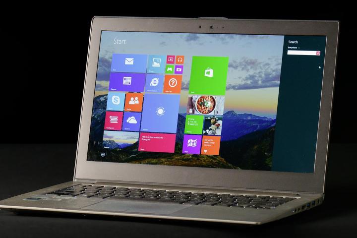
When Windows 8 launched last October it seemed it might bring Microsoft into the touchscreen age. Today, with PC sales slipping and tablets rising, it’s starting to look like a necessary step taken a few years too late. While manufacturers are clearly ready to sell touch-enabled computers, their efforts aren’t being matched by Microsoft, which has failed to provide an operating system consumers can love. Or, for many, even like.
There’s irony to be found in this turn of events, as Windows 8 was meant to avoid this exact situation. Redmond’s top management, after what appeared to be a period of denial, eventually realized that giving touch the middle finger would force some consumers to purchase Android and iOS tablets by default. But Microsoft’s delay, and its previous baggage, drove the company to craft a compromise solution. Consumers are buying iOS and Android tablets even more frequently, and often because Windows 8 isn’t up to par.
The only solution to this mess is a quick recovery, and CEO Steve Ballmer acknowledged this both at Build 2013 and with Microsoft’s recent re-organization. Windows 8.1, available as a free download now, could be proof that Microsoft truly understands its problems and seeks to reinvigorate itself. Or, it could be a Band-Aid applied to a wound the company doesn’t fully comprehend.
We’ve spent some time with Windows 8.1, and here’s what we think so far…
The Start Button is back, the Start Menu isn’t
 Windows’ greatest challenge is dealing with previous success. Every significant change forces millions of users across the globe to adjust, and they’re often vocal about their disapproval. Microsoft’s decision to kill the Start menu, though bold, has been met with protest from both consumer and enterprise users, so the company has partially relented. The Start button is back; the Start menu isn’t.
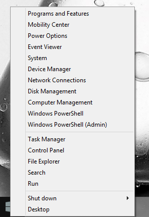
Okay, yes, there is a menu that can be opened from Start, but let’s be real; it’s not the Start Menu you’re looking for. All it amounts to is a context menu with a few important functions.
Instead of returning to the old ways, Windows 8.1 attempts to merge function of the Start Menu into the new UI design through a feature called the “apps view.” Accessible either by swiping down from the Start screen or by activating the Start button (if the user customizes their settings), the apps view is a simple grid of small, Metro-style icons.
Users can even boot directly to the desktop, bypassing the Start screen entirely. But don’t be fooled; this doesn’t mean you’ll be able to enjoy Windows 8.1 as if it were just Windows 7 with a few extra features. All of the other Metro UI elements, from the revised settings menu to the charms bar to the new (and improved!) search, remain. While the Start button’s return does make life a little easier for the desktop user, it’s a difference in tone instead of a difference in hue.
Apps view is half-baked
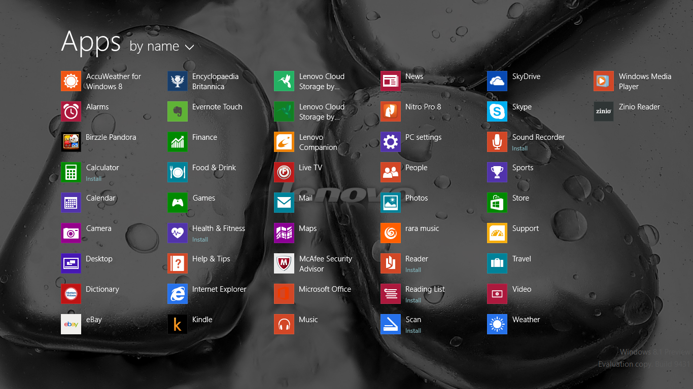 Unfortunately, apps view does little to unify the jarring difference between Windows desktop apps and Metro apps, a problem driven home by Internet Explorer. Windows 8.1 devices, like those before them, essentially come with two versions of the browser: one for desktop, and one for touch. You’d expect that desktop version to appear in the apps view, but instead only touch is available. To launch Internet Explorer for desktop you must open the program from the taskbar, find it in Explorer, or use Search.
To make matters worse, apps view attempts to automatically populate the menu drags in a lot of unwanted junk. While Windows 8 apps appear properly, desktop apps are often recognized along with many unessential but related files. For example, the operating system automatically displayed not only SiSoft Sandra (the software we use to test processor performance) but also twenty other non-executable files found in its folder. What a mess!
We also can’t find a way to remove these files from the apps view without deleting them. Only Windows 8 apps can be properly removed by long-tapping them and then clicking uninstall, the same process that’s used to remove those apps from the Start screen. We hope Microsoft will resolve this before release; if it doesn’t, apps view will be all but useless.
All of these problems make the new apps view a terrible Start menu replacement. Third-party companies in the business of resurrecting Start can breathe a sigh of relief.
Two steps forward for personalization
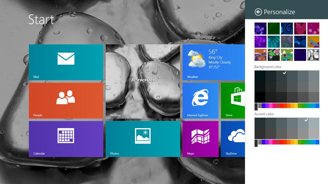 With the apps view sunk, many users may return to the Start screen instead. Here, Microsoft has improved both the aesthetics and function of personalization. Though the changes aren’t revolutionary, they’re appreciated.
Visual customization now comes through a variety of patterns and colors that can be customized to your personal preferences. This addition is nice to have now that the desktop is no longer prominent, and the process of personalization couldn’t be easier. Users can now use their desktop background as a Start screen background, too.
Windows 8.1 also adds Large and Small tiles, the former taking up as much space as four regular tiles, and the latter taking up a quarter of the same. This simple change significantly enhances user customization; indeed, a user on a desktop machine might make the new “apps view” largely irrelevant through obsessive use of small tiles.
Unfortunately, these minor improvements are soured by a small step back. To move tiles, users must now long-tap to “select” the tile, then tap again and drag to move it. Previously, tiles could simply be moved with a tap-and-drag motion. While the new method enables extra editing features, it’s also less intuitive and feels strange after nine months using a different process.
Searching for a unified experience
 Microsoft made search a prominent feature of Windows 8 but strangely split it up into three separate categories, a decision that may have looked good on paper but felt odd in actual use. Microsoft unified search in Windows 8.1. There’s now just one field, and it’s used to search apps, settings and the Web by default (users can narrow the search if desired.) Search also automatically suggests related Web searches automatically.
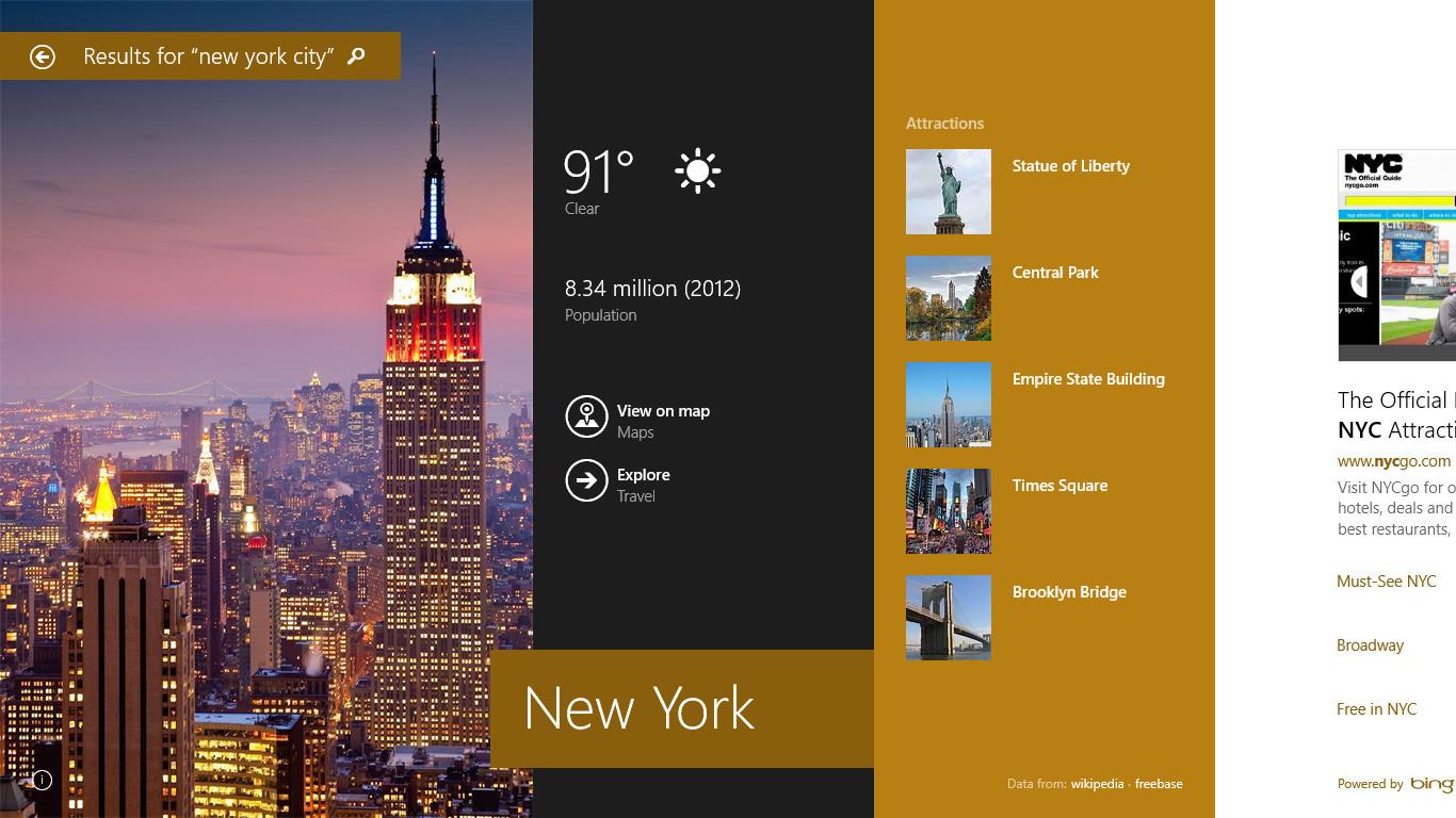
Besides unification, Microsoft also added a “Smart Search,” which automatically builds an attractive, Metro-UI result out of data pulled from Bing. Smart Search includes result thumbnails and, when possible, will pull in location data, videos, apps, and more. For example, searching for restaurants often brings the Maps app up as a result, and when opened from search, the Maps app automatically shows relevant local results. In some cases, Search will even create a beautiful spread with portraits, maps, weather, and other data, though this only occurs with the most popular and common keywords.
All of this makes for an experience that’s simple, attractive and “just works” in a way other Windows 8.1 features should envy. However, the experience is absolutely refined for touch rather than the desktop, which may frustrate users who prefer a keyboard and mouse.
Shortly after its Windows 8.1 reveal, Microsoft announced that Web search results served via Bing will include advertisements. While this could be a distraction, we didn’t notice any ads during our use, though it may be that the “on” switch hasn’t been flipped yet.
Improved ‘split view’ still so-so for multi-tasking
 Multi-tasking is a feature that Microsoft has always made hay over, comparing itself (favorably, of course) to devices like the iPad which can only run one app at a time. Windows 8.1 attempts to broaden this gap by taking split view a step further, allowing the use of numerous apps on devices with large displays and customization of each app’s size. Even the desktop can be opened in split view.
This feature exists in Windows 8.1, and it’s not available on Android or the iPad. What’s arguable, however, is split view’s utility. Not all apps opened in this way are actually useful, and opening split view can be a pain, particularly for those users lacking touch. Neither concern is at all addressed by the new operating system.
And, if you’re using a laptop with a display resolution of 1366 x 768 or lower, you won’t even be able to access more than two apps at a time, which means the split view tweaks are of minimal use to consumers who own an average 15.6-inch (or smaller) laptop.
App store gets revamp but is still filled with junk
 The Windows 8 Store is one of the operating system’s greatest failures. Setting up a storefront with some apps and a few basic features is just not enough. To be great, an app store must curate, tailor, and present. The original Windows Store did none of that well.
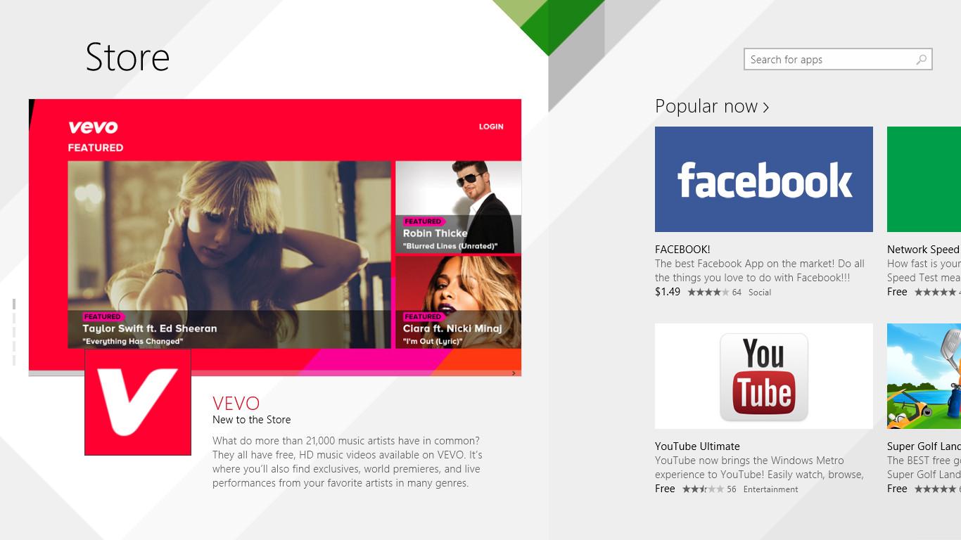
In response, Microsoft has thrown out the old Store interface and started anew. Unlike the previous incarnation, which was organized via generic categories, the new Store takes a more personal approach. Featured apps are brought to the foreground along with personalized recommendations based off past purchases. Everything looks coherent, and the junky apps that plagued the previous Store are less obvious.
But they’re still there. In the prominently featured “Popular Now” section, for example, we found an app called “FACEBOOK!” Yep – in all caps, with an exclamation point at the end. This was flanked by “MSN Touch” in the New Releases section, an app that’s actually not made by Microsoft, though it has no trouble using its logo and iconography.
In the categories, which are now hidden in a swipe-down menu at the top of the screen, little has changed. Social is still dominated by paid third-party Facebook apps, Photo is still dominated by “Sexy Anime Cosplay Girls Daily,” and Security is still populated by anti-malware apps of dubious origin.
The new Store is undoubtedly a step in the right direction, but this is merely a move towards the proper path rather than the last step in the journey. Major improvements are still needed to make the Windows Store a success.
Internet Explorer 11
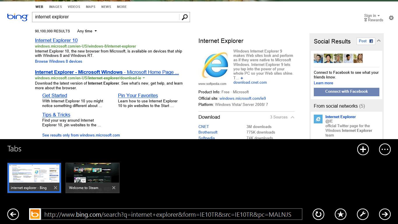 Internet Explorer 11 adds the support for permanent tabs, support for infinite tabs, some general performance enhancements and … that’s about it.
Sure, there’s a bit more, but most of the improvements (such as WebGL support) are not the kind of thing a user will immediately notice, nor are they revolutionary. That’s the downside of a faster development cycle. We are getting new versions of Internet Explorer, but the difference between each has become vanishingly small.
And that’s too bad, because Internet Explorer could, as always, use some help. The browser still feels incredibly slow next to its major contemporaries (Chrome and Firefox). Worse, it remains split in half like the rest of Windows. There’s the desktop version, which works better with sites like Google Docs, and the touch version, which is better for on-the-couch browsing. Each version launches from its own executable, and there’s no way to transfer tabs between them.
Other tweaks and changes
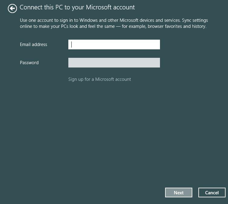 One change that’s sure to anger some users is the need for an online account if Windows 8.1 is installed on a system with an active Internet connection. Official word is that support for local accounts will be part of the Windows 8.1 full release, but it’s unclear how obvious this will be during installation – based on the wording of Microsoft PR, it could even be an after-installation option.
The justification, as always, is that online connectivity enhances the experience. SkyDrive is the best example, and it’s featured more prominently than ever before. Many apps can link up to SkyDrive to store data, which in turn makes it possible to share that data with another Windows device, be it a PC or Windows Phone. Users will also notice that the Libraries once again appear as folders (though they appear to act as libraries), and SkyDrive is among them. SkyDrive can also be accessed via a Metro App.
Other changes include a new “top settings” view in the Settings menu, minor tweaks to File Explorer, the ability to use Skype from the local screen, improved portrait support, and refinements to apps like Xbox Music and Mail. All of this is appreciated, but it’s difficult to notice at first and not exceptional. If you’ve used Windows 8 before, you’ll probably like what Microsoft has done with Xbox Music. But users coming from Windows 7 or another operating system won’t be impressed.
Windows 8.1 is still Windows 8
This first revision of Windows 8 takes several steps in the right direction. We’re happy to see the Start button is back, but not merely copied from Windows 7. We also like the improved personalization options, love the new search function, and appreciate the small tweaks that make Windows 8.1 a smoother, more approachable operating system. Microsoft does seem to understand many of its problems and is working to resolve them.
However, we’re worried by what appears to be continual half-hearted execution. Apps view is a great idea and looks beautiful, but it doesn’t work well. Internet Explorer remains woefully behind the alternatives. And the Store still contains far too much junk. Microsoft is still a long way from producing a version of Windows 8 that users will want to own.
Pros
- Start button returns and can be customized
- New tile sizes and Start screen personalization options
- Unified, online search is quick and useful
Cons
- Desktop and Metro user interface still at odds
- Apps view is flawed
- Split-view multi-tasking is limited on low-resolution PCs
- Windows Store remains full of junk
- Internet Explorer still slow, unwieldy
This review is primarily based on our impressions using Windows 8.1 on Lenovo’s Yoga 11S.
Editors' Recommendations
- Microsoft may fix the most frustrating thing about Windows updates
- How to remove a Microsoft account from Windows 11
- Ranking all 12 versions of Windows, from worst to best
- Microsoft Surface Pro 9 vs. Surface Pro 8: here’s how they stack up
- After 10 years of headaches, I’m finally a believer in Windows on ARM