“Entune is just what we would expect from Toyota, a competent but unimaginative system that delivers just enough features to be competitive.”
- Key features are easily accessible
- High quality optional 8.0-inch touchscreen
- Simple menu based user interface
- Unresponsive and balky standard 6.1-inch touchscreen
- Low-end graphics and resolution
“Why you can trust Digital Trends – We have a 20-year history of testing, reviewing, and rating products, services and apps to help you make a sound buying decision. Find out more about how we test and score products.“
Updated on 7-8-2015: This rating was lowered to reflect increased competition in the space from Apple and Google. For more on how we rate products, see our scoring breakdown.
Entune is not just one of the most common systems on America’s streets, it’s also one of the most average. And that isn’t a bad thing, either.
While there are standout systems in the industry that make Entune look out of date and downright unappealing, there are also far more that aimed for glory and wound up as disasters. Entune doesn’t stand out, and it is far from perfect, but it does work. So, for buyers who don’t care too much about having the most advanced system out there, Entune might be the perfect choice.
Ease of use
The biggest thing any customer is going to notice when it comes to infotainment is the user interface. Fortunately for Toyota, this is one of Entune’s stronger points.
Entune is not just one of the most common systems on America’s streets; it is also one of the most average.
Entune is designed around two main menus. The first is the home screen, which shows audio, current weather, navigation map, and an apps page that provides access to everything else. Users can also navigate by using hard buttons surrounding the touchscreen.
The good side of this setup is that users can always get from A to B quickly. The downside, however, is that not quite everything is accessible via each system. In practice, some specific settings and features are tough to find. For example, Internet radio apps aren’t directly accessed through the audio button, as one might expect, but rather through the apps page. Go figure.
Entune’s menus have their share of backwaters and dead ends, too, but using the main features, like the audio system or navigation, is straightforward. Honestly, that is what matters.
Features
Toyota buyers aren’t starved of choice, when it comes to Entune. Toyota produces four feature packages for Entune with the two simplest: Entune Audio and Audio Plus packages delivering just audio and phone connectivity. On the fancier Premium Audio package Toyota delivers a full suite of apps.
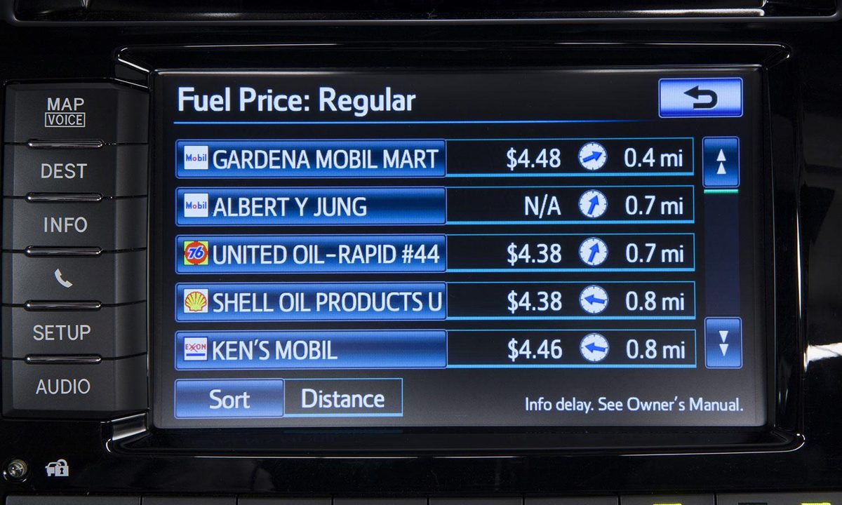
Toyota has developed an Entune app for Apple, Android, and one for the eight poor souls who still use Blackberry. However, while the Entune app does have some functionality, its chief job is to funnel the phone’s data to Pandora, Facebook, Yelp, iHeartRadio, Bing (God help the one person who uses Bing and Blackberry), and a Toyota-designed data app that allows drivers to track gas prices, weather, and traffic.


It is a nice group of features … that no one will ever use, with the possible exception of Pandora. The reality is that, as useful as the features may be in the abstract, customers already know how to use their smartphones, and will almost certainly use them instead of a clunky infotainment screen.
Honestly, I understand why automakers include these features; it’s to sell cars and expensive optional extras. Okay, I take that back. I understand all of the features except Bing. No one likes Bing.
Fortunately, Entune has perfectly good versions of the features anyone ever uses, like navigation, Bluetooth streaming, and phone connectivity.
Hardware
Regardless of which package users opt for, they are given a choice of two touchscreens. And the difference between these two are as different as day and night.
The good side of this setup is that users can always get from A to B quickly.
The standard 6.1-inch screen is among my least favorite in the entire industry. The screen lacks sensitivity, and, even when it does work, it is slow to respond. The result is growing frustration and confusion, as the user mashes his or her finger into the screen repeatedly, wondering if the screen has even detected their finger or just has forgotten it is supposed to do a thing.
This is particularly aggravating when trying to use the navigation. The lack of sensitivity makes scrolling across the map so imprecise that I found the cursor constantly stuck in the middle of bodies of water rather than the road I wanted.
Fortunately, the optional 8.0-inch touch screen is excellent. For starters, it is is responsive and precise, where the standard 6.1 is balky and slow. The increased size also makes the entire system easier to use, as the buttons and text become larger and easier to read.
For users who can afford it, the upgrade is absolutely worth the money.
Graphics
Unfortunately, even the nicest screen can only display the graphics god – or the Japanese – gave it. Entune may not have fallen out of the ugly tree, but it was at least born in close proximity.


Toyota has opted for a brutally simplistic approach to its graphics. The result is relatively easy to read but looks cheap. The sense of cheapness is added to by the comparatively low resolution of the display, which compares badly to that of market leaders like Uconnect. This is fine on a $20,000 Corolla, but on a top-of-the-line Highlander, it stands out … and not in a good way.
Conclusion
Entune is a middle-of-the-road offering in nearly every way. Its high points are not that high and its flaws are not disastrous. Notably, the 6.1-screen should be avoided at all costs.
This makes Entune laudable in an odd way. The infotainment market is littered with spectacular failures from companies that shot for the stars and then proceeded to blow up on the launch pad. While I applaud the creativity and ambition of these systems, I wouldn’t actually want to live with them.
Entune set its sights lower, and accordingly it does the important things right. And thankfully, it also lacks cute features that quickly grow annoying. That is enough to make it a solid option and an asset to Toyota’s lineup.
Highs
- Key features are easily accessible
- High quality optional 8.0-inch touchscreen
- Simple menu based user interface
Lows
- Unresponsive and balky standard 6.1-inch touchscreen
- Low-end graphics and resolution