- Home
- Mobile
Mobile
About
Mobile and smartphone news, reviews, and discussion for everything from Android to iPhone and every accessory and app you could ever use.

3 foldable phone deals you should seriously consider today
If you want to buy a foldable phone, you're going to want to take advantage of these offers for the Motorola Razr, Motorola Razr Plus, and Google Pixel Fold.


Original Series

Best refurbished iPhone deals: Get an iPhone 14 for $513
A new iPhone costs a pretty penny -- actually, a lot of pretty pennies. We gathered the best cheap refurbished iPhones below.

The best Samsung Galaxy Z Fold 4 deals
Interested in the Samsung Galaxy Z Fold 4? Here are the best deals for the foldable smartphone, but you need to hurry if you want to enjoy the huge savings.
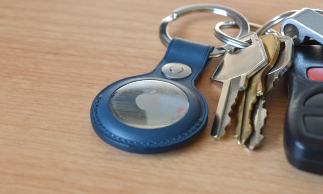
AirTags range: here’s how far the tracker can reach
How far can your iPhone track an Apple AirTag? Perhaps a lot further than you ever imagined thanks to the Find My Network. Here are the details.
Best Verizon new customer deals: Galaxy S24, iPhone and more
Shopping around for cell phone plan deals, or a new carrier altogether? Check out this roundup of the best Verizon new customer deals available right now.
From Our Partners


Presented By AnkerWork

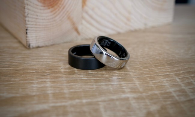
One of the biggest Oura Ring competitors just did something huge
Ultrahuman, one of the biggest competitors to Oura, just made a huge leap forward. It's opening a production facility on U.S. soil. Here's why it matters.
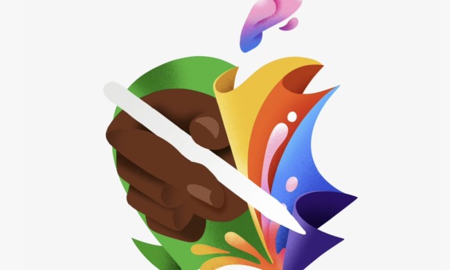
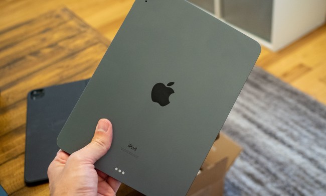
We finally know when Apple will announce its 2024 iPads
Next month, Apple will lift the covers from its next-gen slates. The iPad Pro could get an OLED display upgrade, while the mid-tier Air line will expand.
Nomad’s new iPhone case and Apple Watch band may be its coolest yet
Your Apple Watch and iPhone are fine on their own. But what if they also glowed in the dark? Thanks to Nomad's new Glow 2.0 accessories, now they can.

OnePlus surprises us with dazzling Android tablet and smartwatch
OnePlus has surprised us by announcing a wider release for its OnePlus Pad Go Android tablet and a special edition of the OnePlus Watch 2 smartwatch.
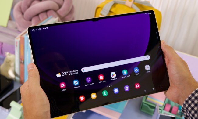
Every Android tablet we’re expecting in 2024
It's been an exciting couple of years for Android tablets, with more new and unique options than ever. So, what does 2024 have in store for us?

Is the Oura Ring waterproof?
The Oura Ring is a powerful wearable device, allowing you to track your sleep patterns, wellness, and more. But is it waterproof? It's time to find out.

Best Samsung tablet deals: Discounted tablets as low as $184
We've picked out all the best Samsung tablet deals currently available, and they range from budget friendly to high-end options.
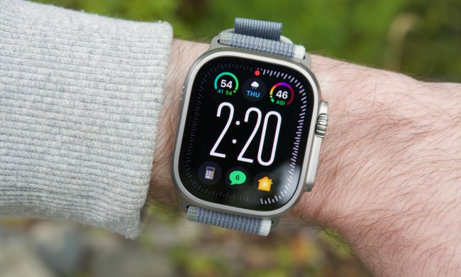
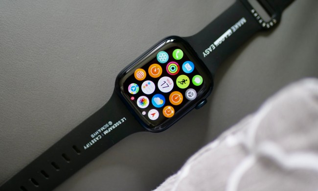
Best Apple Watch deals: Series 9 and Ultra 2 discounted
The Apple Watch has surged to prominence in recent years. If you're in the market for an iOS wearable, we've sniffed out the best Apple Watch deals available.

Best Samsung Galaxy S22 deals: Save big on unlocked models
If you're thinking about the Samsung Galaxy S22 as your next smartphone, check out these offers for amazing discounts on carrier-locked and unlocked models.
An Apple insider just revealed how iOS 18’s AI features will work
Apple is reportedly trying to emulate the same formula that Google deployed for putting Gemini AI on Pixel phones. But Apple's approach might be more practical.

Best iPhone deals: Save on iPhone 15, iPhone 15 Pro Max and more
Apple gear gets expensive, but if you can't live without iOS, we've got all the best iPhone deals right here, with discounts on new and last-gen devices.
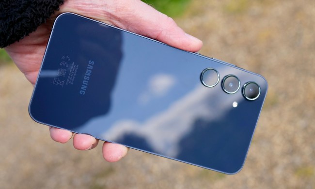
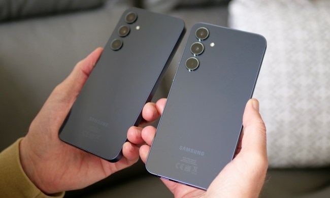
I reviewed the Samsung Galaxy A55. It didn’t go as expected
My time with the Samsung Galaxy A55 didn't get off to the best start and I worried about it. Did things change for the better? Here's the whole story.
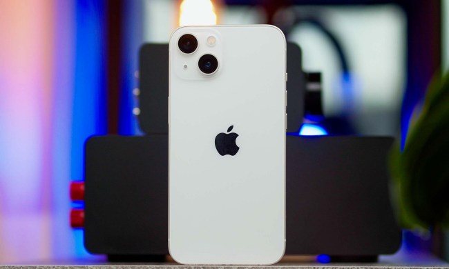
5 phones you should buy instead of the iPhone 15
Thinking about buying the iPhone 15? Wait! Here are five other alternatives you should consider instead.
Samsung has a new (and cheaper) way to buy the Galaxy S23
If you need a new phone, the Galaxy S23 is still a great choice, And now, you can save even more money with Samsung's Certified Re-Newed program.
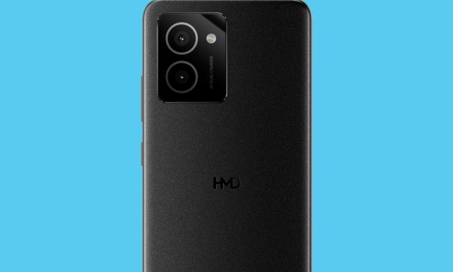
This is one of the cheapest 5G phones worth buying today
Looking for a cheap phone? Motorola has reduced the Moto G 5G to $150 for a limited time only. Here's why it's good for all your basic needs.

This Android phone is a surprisingly great buy at $100
One of the rare phone deals that lets you take home a new phone for just $100, don't miss this deal on the Motorola Moto G smartphone.

The 5 best ring lights for phones in 2024
We've gathered the best ring lights for phones so you won't have to do the research yourself, whether you're a content creator or you just want better selfies.
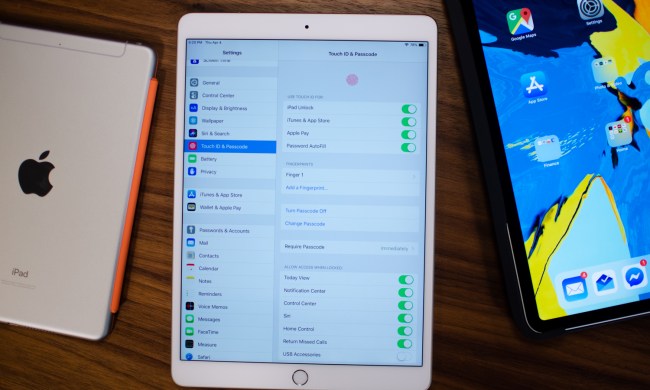
The most common iPad problems and how to fix them
The Apple iPad is powerful, but it can still run into glitches or issues. Here's our troubleshooting guide on the most common problems and how to fix them.
Mobile News


Android


Wearables


Apps


Section Editor, Mobile
Joe Maring is the Section Editor for Digital Trends’ Mobile team, leading the site’s coverage for all things smartphones, tablets, and wearables. Since joining the industry in 2012, Joe has reported on the latest mobile tech news, reviewed countless devices, and worked with other writers to help them find the angles that matter.
Need to get in touch? You can reach Joe at jmaring@digitaltrends.com, or find him on Twitter as @JoeMaring1.