
Researchers discover the ugliest color in the world: Pantone 448 C

pantone 448 c ugliest color worts
Pantone
Photographers, filmmakers, artists, and graphic designers all tend to know a thing or two about color. There is an emotional connection to different colors: Blue is soothing and red is powerful, for example. But when tasked with finding the ugliest color, where does the needle land when you spin the color wheel?

According to Australian market research firm, GfK, it lands on Pantone 448 C.

As reported by Visual News, the color — which has been described as “death,” “dirty,” and “tar” — will be used on cigarette packaging in an attempt to dissuade people from smoking. GfK spent three months on the project.

The color of the dress and shawl worn in Leonardo da Vinci's "Mona Lisa" is related to Pantone 448C, which suggests it was a popular color at one time in history.
The color of the dress and shawl worn in Leonardo da Vinci’s “Mona Lisa” is related to Pantone 448 C, which suggests it was a popular color at one time in history. Leonardo da Vinci / Wikimedia Commons (public domain)

Wait a second: Isn’t it the job of a market research firm to find ways to better sell a product? Well, yes, normally — but GfK was contracted by the Australian government for this project, not the tobacco companies. “It had as its aim the antithesis of what is our usual objective,” said researcher Victoria Parr, in an interview with Australia’s Brisbane Times.

When it comes to trends in the use of color, none is more prevalent than the orange and blue treatments found in Hollywood cinema. The effect tends to be particularly noticeable in Michael Bay action films, although he is hardly the only offender. A similar trend has come about recently in electronic music, with album covers decorated in various shades of pink and blue.

Related: Turn Your Patio Into Any Color You Want with Ilumi’s Outdoor LED

Will Pantone 448 C start a new trend in color? Will we see its use spread to other products we should avoid? Or will it become the new vogue, embraced first by hipster smokers, but later celebrated by all those who would see the dreary color flown high as a banner of their resistance to healthy choices?

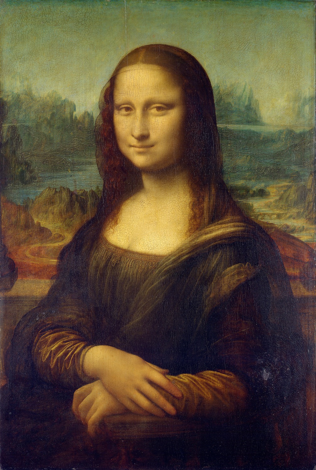
If art history is any indicator, it may have already been a much more popular color — and far less ugly — than we consider it now. The Hyperallergic blog has an interesting read on how some of the greatest works of art, including Leonardo da Vinci’s “Mona Lisa,” were created with close relatives of Pantone 448 C.

Clearly, beauty is still in the eye of the beholder.

Daven Mathies
Former Digital Trends Contributor
Daven is a contributing writer to the photography section. He has been with Digital Trends since 2016 and has been writing…
Fujifilm’s most-hyped camera has just started shipping
Fujifilm's X100VI camera, released in 2024.

The latest iteration of Fujifilm’s X100 camera started shipping on Wednesday.

The X100VI is -- as the name cleverly suggests -- the sixth in the series. Early reviews have been mostly positive as the camera builds on the successes of the already impressive earlier models going all the way back to the original X100, which launched in 2011.

Read more
How to resize an image on Mac, Windows, and a Chromebook
Windows 11 set up on a computer.

Resizing an image is something we’re all going to have to do at some point in our digital lives. And whether you’re using Windows, macOS, or you’re rocking a Chromebook, there are ways to scale images up and down on each PC. Fortunately, these are all relatively simple methods too.

Read more
Watch an acclaimed director use the iPhone 15 Pro to shoot a movie
acclaimed director uses iphone 15 to shoot movie shot on pro midnight

Shot on iPhone 15 Pro | Midnight | Apple

As part of its long-running Shot on iPhone series, Apple recently handed acclaimed Japanese director Takashi Miike (Audition, 13 Assassins, The Happiness of the Katakuris) an iPhone 15 Pro to shoot a short film.

Read more