- Home
- Social Media
Social Media
About

How to run a free background check
Need to find out what potential employers can find out about you online? Here are some methods that allow you to run a free background check on anyone online.


How to set your Facebook Feed to show most recent posts
Facebook's Feed button allows you to see a list of chronologically sorted posts. Here's where to find and use it.
How to create multiple profiles on a Facebook account
Facebook now lets you create multiple profiles for one Facebook account. Here's how to create a new profile.

X (formerly Twitter) returns after global outage
X, formerly Twitter, suffered a global outage for about 90 minutes early on Thursday morning, and the cause has yet to be revealed.

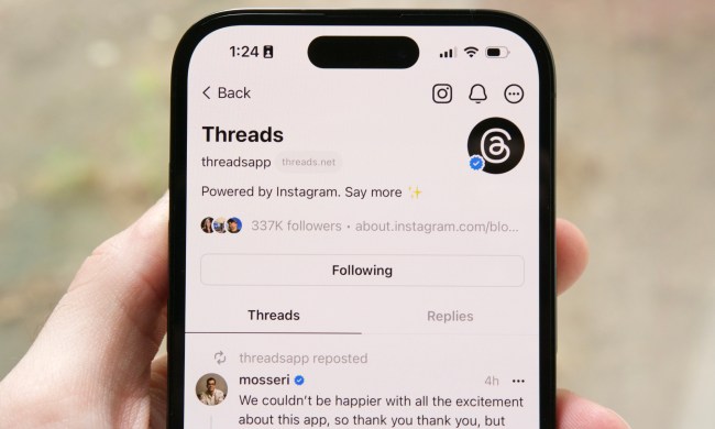
X rival Threads could be about to get millions of more users
Threads – Meta’s rival to X, formerly Twitter – is hoping to get a big boost after launching in the EU, a market with nearly half a billion people.
WhatsApp now lets you send self-destructing voice messages
WhatsApp has offered self-destructing photo and video messages since 2021, and now it's expanded the feature to voice messages.

YouTuber gets more than just clicks for deliberately crashing plane
YouTuber and former Olympic snowboarder Trevor Jacob has been jailed for his part in a video stunt that involved crashing a plane.
How to delete or deactivate your Facebook account
Whether you want to be free of Facebook forever or just need a break from it, we've got you covered. Here's how to delete or deactivate your Facebook account.

X now offers audio and video calls, but it’s easy to turn off
X, formerly Twitter, has added audio and video calls as part of efforts to transform the platform into a multipurpose super-app.
Discord is getting a big update that gives users more ways to pay
Discord's fall updates focus on changes to user safety, the monetization of profile customization, and third-party app usage.
X begins charging $1 a year for new, unverified accounts
As part of a test by the firm formerly known as Twitter, new X accounts in two countries will be charged for things like posting, reposting, and replying.

TikTok sued by Utah over alleged child addiction harm
The action by Utah's Division of Consumer Protection is the latest in a string of moves by U.S. bodies to crack down on the popular app.
X, formerly Twitter, may be about to test 3 subscription tiers
A new report suggests X, formerly Twitter, is looking to introduce three new subscription tiers, while it's not clear if a free option will remain.

Meta pays big bucks to end office lease that still had 18 years left
The move is a sign of the times, with tech giants and other large companies responding to the popularity of remote working since the pandemic.
Facebook’s rebrand isn’t quite as drastic as Twitter’s
Facebook owner Meta has unveiled a new logo and some other design changes for the social network, though the new look is much like the old one.
X, formerly Twitter, looks set to become subscription-only
Elon Musk has said that as part of efforts to tackle the issue of bots on X, formerly Twitter, all users may be asked to pay a small monthly fee.

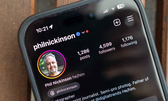
How to use Meta Threads on the web
Meta's newest social media platform, Threads, is now available on the web. Here's how to access it, what to expect, and how to use it.

Snapchat hopes its new AI selfie feature will be a moneymaker
After jumping on the generative-AI bandwagon earlier with year with its My AI chatbot, Snapchat has now launched an AI selfie feature called Dreams.
X says it’s squashing the bug that deleted Twitter images and links
X, formerly known as Twitter, says it’s working to restore images and links that suddenly and rather mysteriously disappeared from the platform in recent days.
X seems to have deleted years of old Twitter images
X, formerly known as Twitter, appears to be having trouble showing images posted on the social media platform between 2011 and 2014.
X CEO reveals video calls are coming to the app formerly known as Twitter
X, formerly Twitter, in adding video calls as part of its efforts to turn the platform into a so-called everything app offering a broad range of services.

Meta’s Zuckerberg ‘not holding breath’ over Musk cage fight
Plans for the proposed cage fight between Mark Zuckerberg and Elon Musk have ramped up, though Zuckerberg suggested he's still not sure if Musk will go for it.

Elon Musk’s big bright ‘X’ sign removed following complaints
Elon Musk's sign atop his X Corp headquarters in San Francisco has been taken down following complaints by local officials and nearby residents.
Social Media News


Social Media Guides


Social Media Features


