Implementing a pivot table in Google Sheets will compress the data within your spreadsheet into a custom table. As such, the tool is practical and convenient for those who want their data outlined via an easy-to-understand format.
Say you’re a student, or someone who uses Google Sheets regularly, and want to refer to an abbreviated version of all your data — look no further than the pivot table. Even if you don’t have a detailed spreadsheet, you can still utilize the feature to enhance that sheet by making it more accessible.
Using the Pivot tables tool
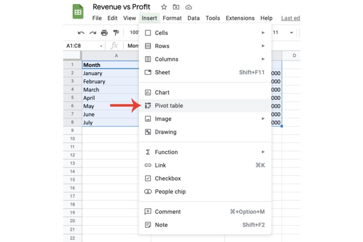
Step 1: Select the data that will be added to the pivot table.

Step 2: Now click the Insert tab > Pivot table.

Step 3: Choose where you want to insert the pivot table via the New sheet and Existing sheet options. I’ve selected New sheet for this demonstration. Click the Create button once you’ve selected a location.

Step 4: Google will now create a new sheet where your pivot table will be based. Conveniently, Google Sheets provides a Suggested section where they’ll do most of the work.
However, in some cases the algorithm won’t be able to suggest anything, as is the case with mine.

Step 5: Don’t worry, though: You can fill in the pivot table yourself and customize it per your requirements.
There are four components that will determine what your pivot table will showcase. In this demonstration, I’ve used a variation of them.
I’ve used the Add button for Rows to insert the Month, Revenue, and Profit sections of my spreadsheet. You’ll need to use the Add button to add any specific column or row. In my case, I clicked the Add button three times for Rows to include the Month, Revenue, and Profit.

Step 6: Within the Values section, I chose Revenue again, in addition to adding Profit. I chose the SUM option in the Summarize by section, as well as selecting % of column in the adjacent Show as area.
On my pivot table, I can now see which month accounted for what percentage of the overall revenue and profit. With this, I can determine, for example, which months the company should pay attention to and others they can improve.

Step 7: As such, if you want to insert the pivot table on the main spreadsheet, then there’s no need for the Revenue and Profits rows anymore. Remove them by clicking the X button on its section and then repeat the steps above for adding a pivot table into the main spreadsheet where the data is located.
If you have many years of revenue and profits and implement the pivot table as explained above, then you can quickly scan the table itself to see which month made the most revenue and profit instead of scouring through all the data manually to find out the answers.
As you can see via the image below, without even looking at my original data, I can determine that July had the highest revenue and profit compared to all other months.
Using a variation of different fields will allow you to see what is relevant and what isn’t, so don't worry if you don't get it right on the first go. For example, you can use the Average option in Values to calculate the average value of certain data.
With this in mind, pivot tables can prove to be an extremely useful feature of Google Sheets.

How do I update a pivot table in Google Sheets?
Step 1: You don’t need to update anything in regard to the pivot table once it’s been created and you’ve filled it in. Simply make any edits within the cells you selected to form the pivot table. Google Sheets will do the rest by updating the pivot table to implement the changes.
Step 2: For example, I will be changing the value of two of my cells to a higher revenue and profit amount. As you can see within the pivot table, it has updated the entire table alongside those two fields.

For more on Google Sheets, check out our guides on how to merge cells and make a graph or chart.
Editors' Recommendations
- 5 web browsers you should use instead of Google Chrome or Edge
- How to get Android apps on a Chromebook
- How to right-click on a Chromebook
- How to create folders and move files in Google Drive
- How to delete your Discord account


