However, it also contains subtle touches that alter the look and feel of the operating system. Here, we take a look at what’s different compared to past versions of the OS.
New, flat icons
Windows 8 tacked on an entirely new interface with a drastically different look, but aside from removing the Start menu, it didn’t do much to change the classic desktop. Some of what users interact with today is still fundamentally the same as what you’d find in Windows Vista, which introduced the “Aero Glass” design. Full of transparency, Aero looked nice at the time, but it’s beginning to show its age.
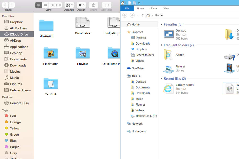
Windows 10 updates the desktop with an overhaul that impacts desktop icons, network settings, homegroups, and some folders. The new icons have a flat look which is reminiscent of the design approach taken by recent versions of Android and iOS.

The look is also distinct from Windows 8’s “Metro” style, which was borrowed from Windows Phone. On mobile devices, Metro’s minimalism created an elegant and intuitive aesthetic. On the PC though, many users complained that it was too simple. Desktops and laptops have big screens. Why waste it on vast expanses of empty color?
In Windows 10, we see icons that are flat, offer more detail, and maximize the potential of modern displays. Empty space has been abandoned for smaller, more complex objects. They’re still high-contrast and readable, but finer than the fat tiles that dominate Windows 8.
Blue seems to be Microsoft’s new favorite color. It was also the color of choice at the company’s Windows 10 debut event, and it dominates many new icons as well. This may draw comparisons to Mac OS X, which also has many blue icons, but the similarities end there.
Aside from color, the look of icons in each operating system is very different, and Microsoft arguably pursues flatness more aggressively by abandoning all gradients. The combination of simplicity and liberal use of blue brings the Windows 95/98 era to mind, albeit with greater detail and contrast.
The flattening process is not yet complete, however. Folders, drives, and library icons look as they did before. In the taskbar, however, the new Home folder has a different look than other folders do, and the pursuit of flatness extends to the icons for Search and Task View. We’re confident that most of the Aero icons that remain will eventually be replaced.
Slimming frames
Microsoft has also made a subtle change to every windowed application. Windows 10 says goodbye to borders by eliminating them everywhere, save for each window’s title bar.
This is the next step in an evolution that has been going on for years. Windows 8 kept the Aero-style icons of Windows Vista and 7, but it ditched the transparent look of those operating systems in favor of a flat, chunky alternative that emulated the look of the Start screen. The Start screen no longer occupies the spotlight, however. Microsoft has ditched borders almost entirely, and now frames windows with a tiny, barely perceptible stripe of color.

Technically, the windows are not completely borderless, but the contrast of the tiny new frames against the title bar, which hasn’t gone on the same diet, tricks the eye into ignoring the borders at a glance. The end result of this change is a more delicate look than Windows 8, which went out of its way to scream “Look at me! I’m fun and approachable!” Windows 10 will have none of that nonsense.
The new Start menu is a work in progress
So far, the aesthetic design that Microsoft is going for with Windows 10 seems clear. Flat is in, chunky is out, and blue is the color of choice. Open the Start menu, though, and things get confusing.
The obvious problem is the inclusion of a miniature Windows 8 Start screen. This “Metro” design element doesn’t gel with the finer look of Windows 10’s desktop. Individual tiles, and the gaps between them, look too large in the new Windows environment.
Adding live tiles to the Start menu only highlights the difference between Windows 10’s two halves, and serves little useful purpose. Yet, getting rid of them entirely would be tantamount to admitting that the entire Windows 8 experiment was of zero use to people without a touchscreen device. It’ll be interesting to see if Microsoft can swallow its pride on this point.
Still, the Start menu doesn’t look right, even if the live tiles are ignored. By default, it’s rendered in a color based on theme, yet it’s the only menu in Windows 10 that this theme applies to. When compared to Windows 7 directly, it becomes clear that the former version of the menu was easier to read, and more compact than this new incarnation.
There’s also a big fat scroll bar which appears when “all apps” is opened, and the Search function in the Start menu itself clashes with the Search button that’s located directly to the right of the Start menu in Windows 10. Problems like this indicate that Microsoft hasn’t firmly decided what it wants to do with this part of the OS from a design standpoint.
Old Windows still lurks
Firing up Windows 10 and using it for the first time is dramatically different from Windows 8. Adding the Start menu and placing search back on the desktop has eliminated most needs for users to mess with the “Metro” interface at all.
But it’s not all gone. The Wi-Fi menu, for example, has not reverted to its former state or to a new, flatter Windows 10-esque look. Plus, Windows 8 apps feature prominently in desktop search results, even when there’s another desktop-oriented menu or application that does the same job. Microsoft will need to address that issue before Windows 10’s release next year, as it could be extremely confusing for inexperienced users.
Aero isn’t dead entirely, either. In addition to the icons, the taskbar retains its glassy appearance, and the new Task View makes significant use of transparency. We hope that Task View will be revised before Windows 10’s release, as its current design is a strange mash-up of elements from Windows Vista, 8, and Win 10’s new aesthetic.
Conclusion
Microsoft was not kidding when it said the Windows 10 Technical Preview is a very early release. We haven’t seen much in the way of bugs, but the new operating system is clearly unfinished. Still, it’s obvious that Windows 10 hopes to set itself apart from previous versions.
While the desktop experience is emphasized in Windows 10, Microsoft isn’t just reversing the changes made in Windows 8. Instead, the company is moving in a direction that takes what worked in both Windows Vista/7 and Windows 8/8.1, and merges them into a more cohesive package. This process will help determine whether Windows 10 is a clear step forward in the evolution of the OS.
Editors' Recommendations
- How to change keyboard language in Windows
- How to make Windows 11 look like Windows 10
- We just got a preview of what Android apps on Windows 11 will look like
- Microsoft reveals the brand new look of the Windows 11 Snipping Tool
- Happy sixth birthday, Windows 10: Looking at its past, present, and future