Everyone loves a beautiful space image, and it seems like every week there’s a stunning new visual for us to marvel at, from Hubble photographs of distant nebulae to the entire universe imaged in the X-ray wavelength.
But how do scientists get from a bunch of ones and zeros captured by a telescope to the images we love and admire? And how do you visually show something like an exoplanet which is so far away we can only barely detect it?
We spoke to two of NASA’s top illustrators and image processors to find out.
Photographing Jupiter
Plenty of NASA missions have cameras on board, which capture images that can be processed and shared with the public. Missions like the Juno craft sent to Jupiter collect an enormous amount of data which show the planet in rich, beautiful detail.
Many of the images you’ve seen from Juno were processed by Kevin Gill, a software engineer at NASA’s Jet Propulsion Laboratory. He explained the image processing involved, which begins with data arriving from the spacecraft in grayscale, as the camera takes images using one of three filters: Red, green, and blue.
Gill’s job is to take these three filtered images and overlay them to create a true-color image. But there’s a complication, as a craft like Juno spins as it takes images. So distortion caused by this spinning has to be corrected for as well. For some jobs Gill will use specialty image software, like that produced specifically for the Cassini mission. But with images like those from Juno, he performs processing using off-the-shelf software like Adobe Photoshop.

Gill’s personal pipeline for processing data from craft like Juno or Cassini is even available as open source software on Github, and NASA makes huge amounts of its data publicly available, so anyone who is interested can perform this kind of processing themselves at home.
The images created by image processors like Gill are important for scientific research, and are used for tasks such as correlating with radar or other types of imaging. But there is a public outreach purpose as well.
In fact, the JunoCam camera on Juno was added purely for public outreach, making it one of the first missions to have this emphasis on the visual element of science communication. “We’re seeing stuff a lot of times for the first ever time,” Gill said. “So there’s an opportunity for scientists and the public alike to see brand-new, dynamic interactions between things.”
The role of artistry
In the case of some tasks, like creating a realistic image of Saturn from Cassini data, true colors and accuracy are most important, Gill said: “With Cassini, if I want to tell a true color story, I need to approach it pretty scientifically. I want to make sure it’s accurate to what the camera produces and what is actually out there.”

But with other projects, the aim may be to use color to bring out specific features. “There’s a bit of artistry involved … Knowing the different color balances and what’s good for being visually appealing, what makes for a good attention-grabbing image.”
There is a degree of personal signature to each image processor’s individual work, so experienced processors like Gill can identify who processed a Juno image just by looking at it and seeing the choices made in color and calibration. “There are certain color filter combinations I like to use that I think brings out a certain story or aspect of the different planets,” he explained.
Telling a story through color
To highlight aspects of interest, image processors can work using particular styles of colorization. This can pop up an interesting feature which others can research in more depth.
Colorization helps to identify features we might otherwise miss, but Gill wants to make sure people understand what they’re seeing. “I don’t want to trick people,” he said. “If I make a false color image, I want it to be obviously false color … So if I do an infrared, you’ll see strong reds or strong blues, it’ll look false color. Because I don’t want people to be confused as to what they’re seeing.”

But there’s a real advantage to doing processing of images using data outside of the visible light spectrum. “Saturn, if you look at it in true colors, it’s kind of bland and beige with minimal features. But once you break into the infrareds, it really comes alive.”
Working in the non-visible light spectrum
Illustrating the infrared wavelength is the specialty of Robert Hurt, a visualization scientist based at Caltech who does many of the illustrations for NASA releases. Among his other work, he supported the recently retired Spitzer Space Telescope mission by processing the images captured by the telescope.
“We want to show data in the most beautiful light possible without distorting or altering just for the sake of making it look cool,” Hurt said. “It’s a process of bringing out what’s intrinsically in the data.”

Spitzer captures data in the infrared wavelength, so this requires a bit more interpretation before it can be presented as an image. The data from Spitzer’s infrared camera needs to be translated to the visible light spectrum, but this translation can be kept accurate by preserving relationships between shorter wavelengths and longer wavelengths.
The infrared data is effectively shifted to fit into our color vision spectrum, which Hurt says is a natural way to present it: “Color is a wildly diverse concept which expands across the spectrum,” he said. “There’s nothing particularly special about what we call visible light, other than it’s biologically interesting to us.”
Color calls out physical processes
Sometimes colors need to be not just shifted, but changed to bring out the visibility of particular features. Even then, the colors need to accurately represent some aspect of the phenomenon, such as variation in brightness.
“When you look at colors in a picture, color is equivalent to physics,” Hurt explained. “If this part of the area looks red, and another part looks green, it’s because there’s different physics operating in those two areas … Color is our way of calling out different processes.”

Visible light is only a small slice of the entire light spectrum, from 0.4 microns in wavelength to 0.7 microns, so on average looking in the visible light wavelengths will show similar physical processes. That’s why images from visible light wavelength instruments like Hubble tend to show subtle variations with delicate pastel colors, primarily picking up light from stars.
But when you look beyond this narrow band and into other regions like infrared, you can see entirely different processes. The main camera on Spitzer spanned the wavelengths from 3.5 microns to 8 microns, with other instruments able to see in the 24 micron range and above. This means it covers a much broader band than visible light instruments, so it can pick up a wider range of processes such as light from illuminated dust clouds or the thermal glow of warm dust.


“By sampling over a greater part of the spectrum, you have this opportunity to pick up more variation in physics,” Hurt explained. That’s why Spitzer and other infrared images have such vivid colors once they’re translated to our visible spectrum, because they’re showing a wider range of different processes.
In practice, Hurt said, there tended to be two color palettes used by Spitzer: One for data from the main Infrared Array Camera (IRAC), which shows dust in shades of orange and red and starlight in shades of cyan; and one for data from both IRAC another instrument, the Multiband Imaging Photometer (MIPS), which is shifted to show dust in green and the areas where stars have formed and are heating that dust up in red. Each palette brings out different features in the data.
More than a pretty picture
These Spitzer images are created primarily for the benefit of the public, Hurt said, “but because what we’re doing is trying to create a scientifically valid representation of the data, it actually has utility across the field.” These kinds of images can help researchers see their area of study in a broader context. “If you can make a really well-rendered image with really good dynamic range, where the colors that emerge from the image are actually reflective of varying proportions of light from different portions of the spectrum, then that itself can have utility.”
With Spitzer, that means showing final processed images to researchers, who might spot something there they hadn’t seen before.
Spitzer even took a survey of the entire plane of the Milky Way called GLIMPSE (Galactic Legacy Infrared Midplane Survey Extraordinaire), the results of which required a lot of complex processing to present visually as the center of the galaxy is extremely bright and the edges are very dim. Once complete, the team printed out the visualization on a 160-foot-long banner and hung it up at an astronomy conference, allowing many researchers to see their area of study literally contextualized for the first time.
Illustrating the unseen
Interpreting visual data from telescopes is one thing. But how do you go about illustrating space phenomena that we can’t see — whether that’s a distant exoplanet or a fundamentally strange object like a black hole?
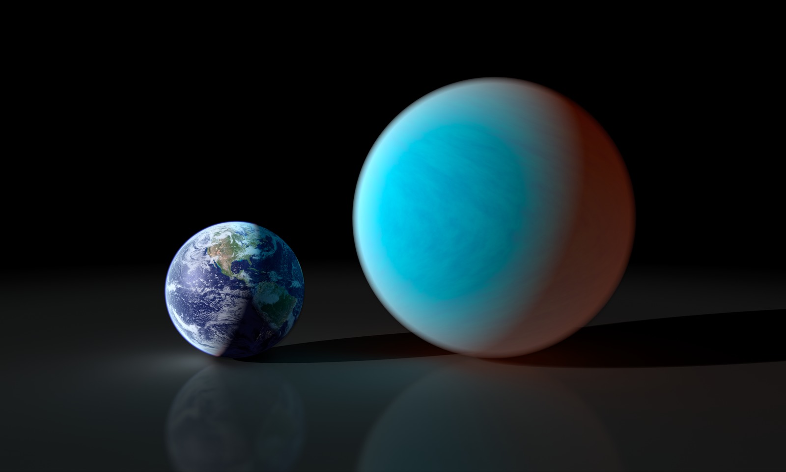
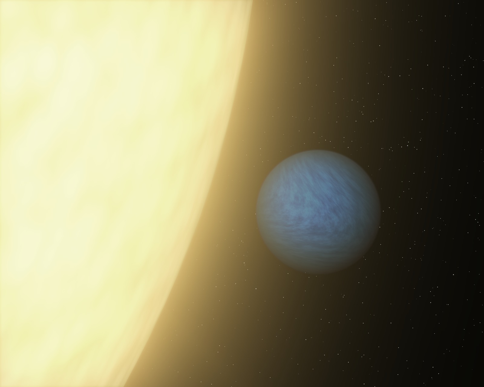
In the case of exoplanets, for example, we often know very little about a given planet — perhaps its size and its distance from its star, which would mean illustrating it as a featureless gray ball. But we can speculate about further features, based on factors like its density, its mass, and whether its orbit is tidally locked.

This is where illustrators often confer with researchers who use computer modeling to identify what models would be consistent with the data. And that might mean a water-covered ocean world in the habitable zone, or a hot lava world where metals are molten, or even a very low-density cotton candy puff planet.
“What I want is something that looks as cool as what [readers] saw in Guardians of the Galaxy or Star Trek, but by looking at that picture, I want that to help them understand the article they’re reading,” said Hurt, who illustrates for NASA as well as doing image processing.
“It’s trying to find that compromise between technical accuracy and what actually effectively communicates an idea … That is, for me, the fun part. Finding that balance in what you’re doing to tell that story.”
Illustration reflects the scientific method
The art of illustration also reflects the way that scientific knowledge changes over time, especially in the case of exoplanets where we are quickly gaining new insights.
The planet 55 Cancri e, for example, orbits very close to its star and is one of the hottest rocky worlds we know. It was first discovered in 2004, but Hurt has illustrated it multiple times since then and every time has been different.
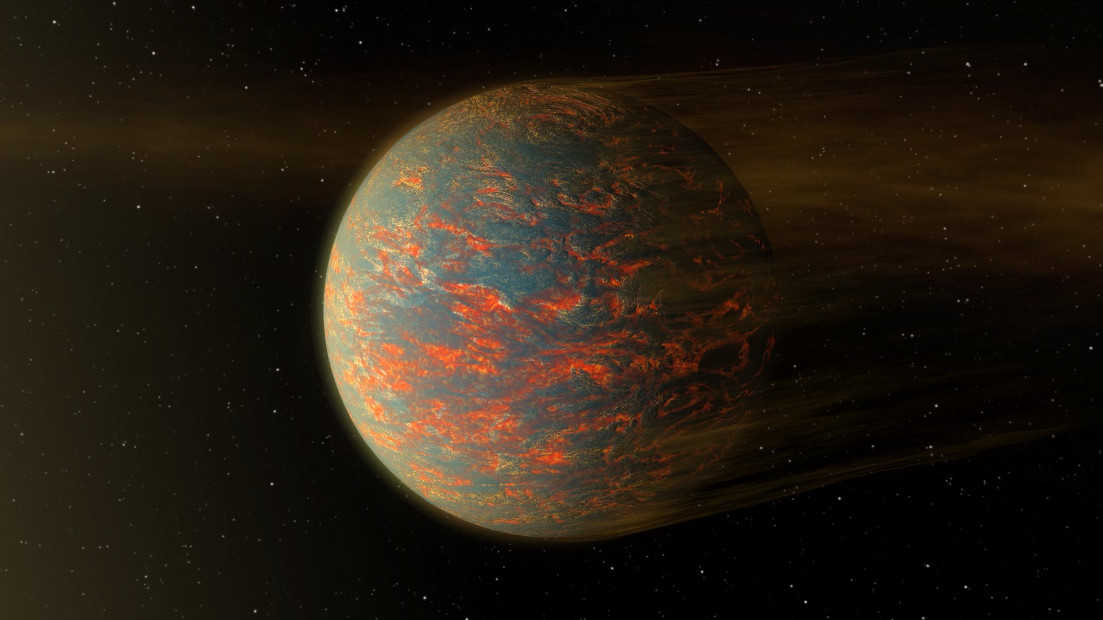
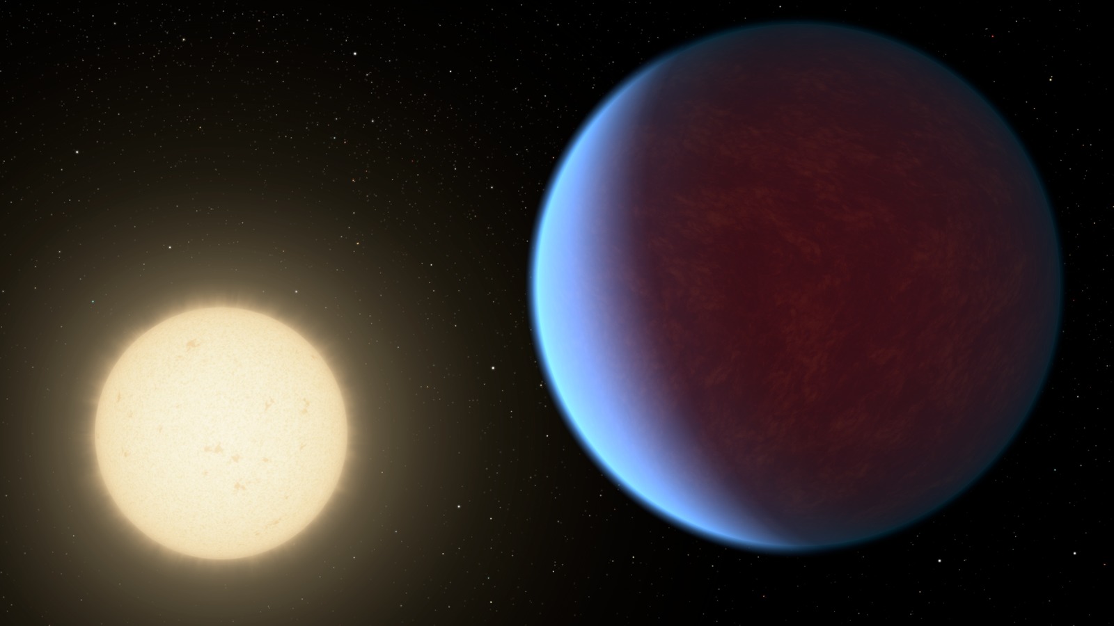
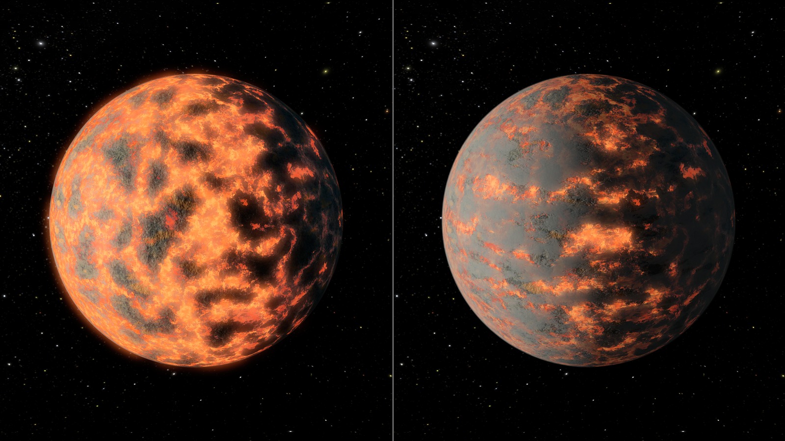
Does it have an atmosphere? Is there lava on its surface? Is it covered in volcanoes giving off gases which obscure the view? “All of these have been plausible hypotheses based on the data at different stages, and each one has gotten its own unique illustration,” Hurt said.
This results in multiple illustrations which show the progress of scientific knowledge over time: “The fact that the art changes one year to the next, I don’t see as a flaw,” he said. “That actually becomes a visual record of our evolving scientific understanding.”
Pop culture plays a role
As illustrations are designed to be communicative, they need to speak to the public in a language they can understand. And pop culture has a big impact on how we think about and picture space.
Black holes, for example, are one of the universe’s most dramatic and mind-bending phenomena. Their gravity is so strong that nothing, not even light waves, can escape their gravitational pull. And that makes them visually strange, to say the least. They bend light that passes nearby to them, resulting in a bizarre warped appearance.
Historically, black holes were generally shown in illustrations as plain black bowling balls, even when scientists knew that wasn’t accurate. Hurt wanted to show gravitational warps around them in his illustrations, but many people, especially those in communications and not science, said it was visually confusing to see these warping lines around them.

“Well it should be confusing!” Hurt said. “This is what it actually looks like.” The strangeness of seeing an object warping gravity around it is part of the story that these images are telling. “I want you to be curious as to why that looks weird. Let’s use the art to explain something.”
But then the movie Interstellar came out, with support from astrophysicist Kip Thorne and visual effects company DNEG. They developed code to simulate relativistic light distortion around a black hole, using even more accurate rendering than astronomers have access to, which led to the publication of two papers. This movie showed the gravitational distortion around a black hole, and this became part of the public’s vernacular.
Now, you see images of black holes with light distortion everywhere, even in the opening credits of animated comedies like Star Trek: Lower Decks. The prominence of black holes illustrated with gravitational warping has changed the public’s understanding of the phenomena.
Predicting the science
Images of space aren’t just beautiful to look at or helpful in understanding complex phenomena: They can even predict and inspire scientific findings.
Hurt illustrated the entire Milky Way in 2008, based on the most up-to-date information available, but there were some sections where he had to make assumptions or use artistic interpretations to fill in gaps in our knowledge.

Since the publication of this image, more research has been done, some of which tests the assumptions that Hurt made. For example, there’s a small section of an upper region of one of the spiral arms which he filled out based on assuming symmetry with the other arms.
Years later, researchers mapped the region and found that it corresponded almost exactly with what Hurt had drawn. “That was the best of all worlds,” Hurt said. “When your artwork actually can predict subsequent discovery.”
Editors' Recommendations
- Martian dust is a big problem for astronauts. Here’s how NASA fights it
- How NASA is building a new breed of spacesuit for the first expedition to Mars