The Calendar app links up with Gmail to create events based on the ticket stubs, flight bookings, and other event invites that are already sitting in your inbox. That way, you don’t have to go create a new event in the calendar app, manually enter your information, and all that jazz. Like a good personal assistant, Google’s calendar app will do that for you. If the calendar event is actually a reminder to get ready for your next flight, Google will update the event with real-time flight info, so you’ll know if the flight is delayed or ahead of schedule.
If it just so happens that you need to manually enter an event, like a friend’s birthday party or a meeting at work, the calendar app will help you find and add all the people you want to invite to that particular event, using something called “Assists.” When you type in the first few letters of a name, that person’s contact info will show up and you can add it to the event. This proves remarkably helpful when you need to get a hold of someone to let them know you’re late or running behind. The app will also suggest places and people based on the type of event, so if you always run in Central Park with your friend Sarah, Google will suggest her name and the spot where you always meet up as soon as you type “run” into the create an event tab.
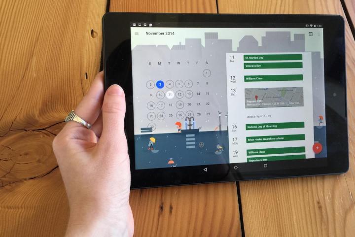
In addition to these cool new features, Google also completely revamped the calendar app’s design. As with many Material Design-inspired apps — including Inbox — you simply tap on the round, red plus sign in the bottom right corner. You can now view your calendar in the very appealing “Schedule” view, which shows you what you’ve got on your plate for each day of the week, month or year. You can scroll through schedule view quickly to see what’s coming up. If you don’t like it, you can always elect to view events by the day, week, or month.
One of the most unique and fun things about the new calendar is the changing themes for each month. Just like a real calendar, Google created a different image to have in the background for each month. November, for example, has a rainy gray color palette and shows a bunch of city-goers walking about with umbrellas amidst tall buildings, park benches, lamp posts, and pigeons. April shows cherry blossoms blowing in the wind and June shows a cheerful beach scene. Of course, these whimsical arty touches look best on a tablet when held horizontally, but they also appear on the smartphone UI.
Events also sometimes get a personal touch, so if you’ve got a birthday coming up, Google will show you a cake, if you’ve hot drinks with friends on your agenda, Google will show you some cute martini glasses, and so on. It’s these little touches that make Google’s new calendar app distinctive and fun to use.
Editors' Recommendations
- How to get Android apps on a Chromebook
- The 1Password Android app just got a huge upgrade
- Google is launching a powerful new AI app for your Android phone
- Google just redesigned one of its biggest apps, and it’s bad
- Our 5 favorite iPhone and Android apps by Black developers


