The clock keeps ticking down to Apple’s Worldwide Developers Conference (WWDC) on June 5. This is where we expect Apple to unveil its headliner mixed reality headset, as well as the usual slew of software updates for iPhone, iPad, Apple Watch, and Mac.
Though it was originally rumored that iOS 17 would primarily focus on bug fixes and improvements, a later report said it could bring some “highly requested features from users.” And this week, there was another report that suggests iOS 17 will be bringing some big changes to the Control Center.
Control Center first launched in iOS 7, which came out in 2013. It underwent a big overhaul in 2017’s iOS 11 release and has since remained unchanged. So with this news that we may see some changes coming to Control Center in iOS 17, this could breathe some fresh air into one of iOS’s most convenient but ever-stagnant features.
Let’s have some consistency
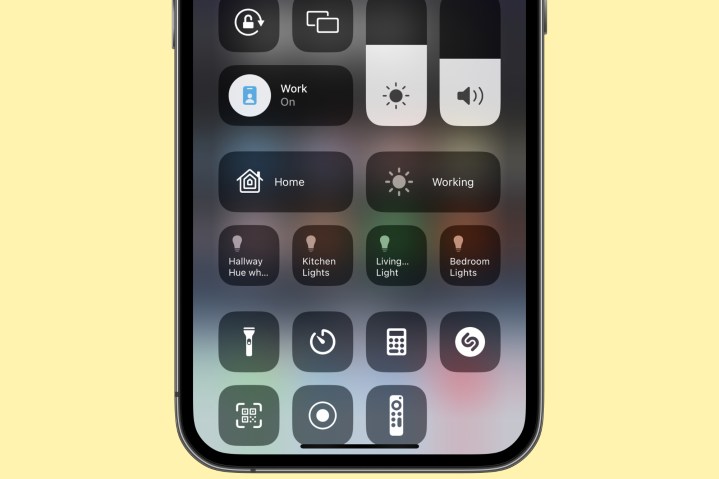
Those who have smart home devices (and maybe even Apple TVs) in the house may have noticed this, but there is a bit of inconsistency in the Control Center. I personally don’t have this problem, but some of my colleagues have experienced this issue.
If you enable Show Home Controls in the Settings app, you’ll get buttons in Control Center for controlling your smart home gear. However, this setting will only show recommended controls based on scenes and usage history — you can’t just pick and choose which specific controls you want. This leads to inconsistency because it won’t always show the controls that you actually want, which can be frustrating.
For some people, this may work, but Apple should make it possible to just add specific Home controls. Consistency is key for a lot of people.
Another thing that my colleagues noticed was the Apple TV button in Control Center. Digital Trends’ Andy Boxall, who hasn’t used his Apple TV in months, has an Apple TV button in his Control Center, while DT’s Mobile Section Editor Joe Maring — who uses Apple TV daily — does not. How does that even make sense? It doesn’t, and there doesn’t seem to be any rhyme or reason for why it even shows up in the first place.
Again, with certain functions, there’s a lot of inconsistency in Control Center — and Apple needs to rectify this if it’s making significant changes to it in iOS 17.
Show AirPods battery life more clearly

If you use wireless earbuds like AirPods with your iPhone, you’ll know that they’re connected via a small headphone icon in the status bar. But what about battery levels? There’s no real easy way to see the remaining battery life on AirPods unless you use the battery widget.
Apple could improve this by showing the battery level of AirPods on the volume slider instead. It already shows an AirPods icon when connected to indicate that you’re controlling AirPods volume, not iPhone volume. You can even toggle between Noise Cancellation or Transparency, and turn Spatial Audio on or off by expanding the slider.
So why not just include battery levels on that volume slider instead, or even let us add the battery widget into Control Center? It’d be such a simple change, and it’s something that absolutely should happen in iOS 17.
Let us change the default Control Center options

In the current implementation of Control Center, basically, the top half is full of options that you can’t change. This includes connectivity (airplane mode, cellular, Wi-Fi, Bluetooth, etc.), now playing, rotation lock, screen mirroring, Focus modes, brightness, and volume sliders.
After that, you can add controls in Settings > Control Center for things like the flashlight, camera, calculator, dark mode, low power mode, Apple Wallet, quick note, and more. In fact, you can add all of the options there are, and it will just turn your Control Center into a scrollable screen, as not everything can fit at once.
But what if you never use rotation lock? I mean, I use it frequently, but my colleague Joe doesn’t, so he has no use for it. I never use screen mirroring, so why do I need it there? Apple should let us change the default controls in Control Center — if we don’t use something, have the option to remove it, as that space could be used for something better.
Please, add 5G toggles
If you expand the connectivity controls right now in Control Center, you can do things like quickly changing Wi-Fi networks or connecting to Bluetooth devices by doing a long press on that item. One thing that never made sense to me is the fact that the Cellular Data toggle only lets you turn cellular data on or off.
Ever since the iPhone started using 5G instead of just 4G/LTE, I’ve been having connection issues. I use T-Mobile, and sometimes while I have a 5G connection, it’s actually slower or less reliable than LTE, so I need to switch back to just LTE to load anything. Other times, it can be the opposite. Especially in places like Disneyland, I frequently have to go to Settings > Cellular > Cellular Data Options > Voice & Data on my iPhone 14 Pro to “fix” my connection issues.
Apple has had 5G on the iPhone ever since the iPhone 12 series, and it’s still a pain in the arse to switch between LTE/5G. There really needs to be a faster way to do so, and Control Center is the perfect place for it. Just like how you can expand the Wi-Fi control to change networks, let us quickly turn 5G on or off from the Control Center.
Please, Apple, for the sake of my sanity.
Make the Control Center editable in … Control Center
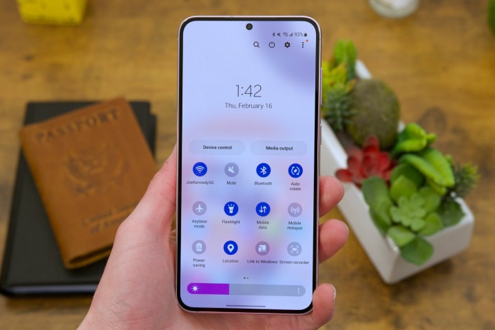
After using Android phones for a few months, another thing that I have noticed that is done better is the Quick Settings panel, which is the Android equivalent of Control Center. And while it has many of the same functions, there is one thing that it does better than Apple: you can edit the Quick Settings panel directly in the panel itself.
On iOS, you have to go into Settings > Control Center to make the changes you want. This is stupid and a waste of time. Simply add an “edit” button somewhere in Control Center, and let us rearrange the order of the buttons and add or remove things right from Control Center itself, rather than making us go to the Settings app.
Control Center is long overdue for changes
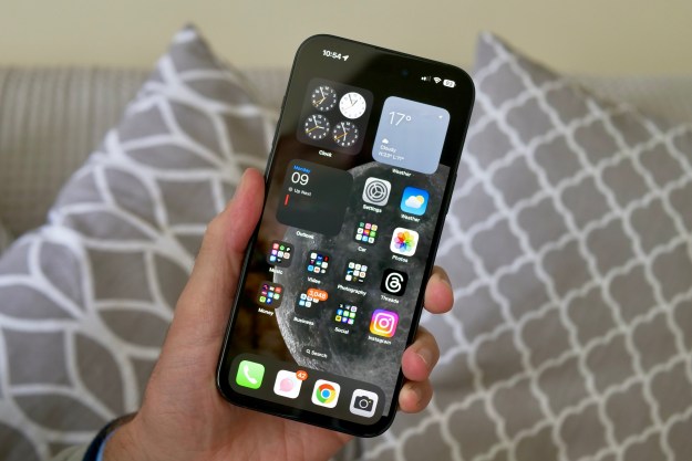
Control Center is a feature of iOS that I use daily, multiple times a day. It lets me quickly access most things I need, like Wi-Fi, Rotation Lock, Dark Mode, and more without having to go into Settings. It’s supposed to make your life easier.
But it’s been years since the last major change, and a lot of new things have come out on iOS and iPhones since then. Control Center is getting stale, and it is definitely due for a refresh.
Hopefully, Apple delivers with iOS 17.
Editors' Recommendations
- iPhone SE 4: news, rumored price, release date, and more
- Here’s how Apple could change your iPhone forever
- Why you should buy the iPhone 15 Pro Max instead of the iPhone 15 Pro
- iPhone 16: news, rumored price, release date, and more
- This is our best look yet at the iPhone 16’s big design changes