
Google Maps is one of Google’s biggest, most interesting projects. Google is regularly making changes to Maps, and the product that users see today is vastly different to the one rolled out eight years ago. During its “Redesigning Google Maps” session at Google I/O 2014, designers Jonah Jones and Annette Leong detailed the journey to the current version of Google Maps and what is coming in the future.
Google Maps initially launched in 2005, and recently underwent the product’s biggest re-design, which Google announced last year. The changes and overhauled design rolled out slowly and are now the default Google Maps experience. Google Maps is now “dynamic and full screen” and “adapts to every click.” It is also more streamlined and simpler for the average Joe to use.
Maps had begun to become cluttered and was in need of a redesign to make it possible for users to easily access all of the information contained within the app. The app’s design team realized that it needed to make some changes to help users make the most of Maps.
“The best design, people won’t even notice it. It will work and get out of the way,” Jones said.
“We felt the existing mapping products were basically taking an old, scanned map” and adding pins and a search bar. Addressing this was part of the first of three lessons that Google Maps lead designer Jonah Jones took from the project: “Think big.”
The second lesson Jones focused on was “question everything.” As an example, Jones walked through the visual changes from the original Google Maps to how it appears today. That process consisted of questioning why things were done another way before and figuring out how to make it better. Google took inspiration from how a person might draw a map “on the back of a napkin,” only showing the important landmarks rather than showing all of the possible information. This is visible in the new Google Maps, which highlights important roads and blends less relevant paths into the background. That way, users don’t suffer from information overload and simply see what they need to see.
“The best design, people won’t even notice it. It will work and get out of the way,” Jones said.
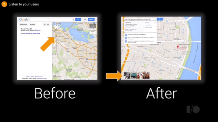
Additionally, the search bar has been improved. Previously, the search results not only yielded less-than-relevant results on the map, but also displayed the information twice: once in a side bar and once with the pin on the location. Annette Leong walked through some of the previous design iterations before they landed on the current design, with the results displayed below the search bar and easy to hide so as to not take up extra space on the map. That way, users can read the map more easily.
The final lesson explored during the “Redesigning Google Maps” session was “listen to users.” This applied directly to the speed of Google Maps, which users often complained about. While the new Google Maps performed faster than previous iterations, people with older computers found that the burden of the new Google Maps took too long to load. The solution to the problem was to load the maps tiles first, so as to improve the perceived speed and allow users to access the information they want.
Google also found that people weren’t using Google Street View the way they wanted to. Most people didn’t navigate using the system, actually moving around on the street. A simple change in the cursor that appears on Street View increased Street View usage by three times its previous usage rate. Leong also detailed the plight of “Pegman,” the small, yellow stick figure that can be planted on the map to activate Street View. Google took it away briefly, but received enough user requests to bring him back, and he is currently still available in the new Google Maps platform.
Google’s designers left the audience with the takeaway of the three lessons of design and encouraged the developers within the audience to take the advice of their overhaul of a product designed for a billion users and apply it to their own projects.
Editors' Recommendations
- The 6 biggest announcements we expect from Google I/O 2024
- This Google Pixel 8a leak just spoiled everything about the phone
- A new Google Pixel 8a leak just revealed three huge upgrades
- We finally know the exact date of Google I/O 2024
- How to use Google’s Gemini AI app on your Android phone


