iOS 14 is Apple’s latest and greatest mobile operating system, and it brings with it a series of features that have long been asked for and could prove to be extremely useful. Perhaps the headline feature of the new operating system is home screen widgets, which breaks Apple’s tradition of only allowing app icons on the home screen, instead offering users information at a glance — and without the need to swipe over to the Today view.
On paper, it’s an awesome feature. After all, why force users to open apps or swipe to the left every time they need access to a quick and easy feature? Turns out, however, that while iOS 14 widgets take a step forward in versatility, they take a major step backward in functionality.
Two steps forward
I don’t hate iOS 14‘s widgets — and indeed, Apple’s product-wide approach to widgets. Android widgets have long allowed developers to pretty much completely customize how they want their widgets to look, feel, and act. The result? Android widgets are often ugly, often have to take up large portions of the screen to offer any real functionality, and sometimes simply don’t work at all. Widgets on iOS 14 and MacOS Big Sur don’t really have that problem. Apple’s controversial tight grip on iOS as a whole extends to widgets — and that means that there are standard widget sizes, nicely rounded corners, and an overall design language that fits right into how the home screen looks as a whole.

The fact that widgets look and act the same on MacOS Big Sur is also a great idea. Ultimately, this will help ensure that widgets are easier to use across platforms, and as the line between computer and mobile devices continues to blur across Apple’s product lineup, it makes sense as a decision from Apple.
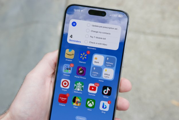
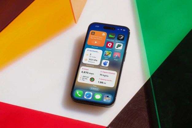
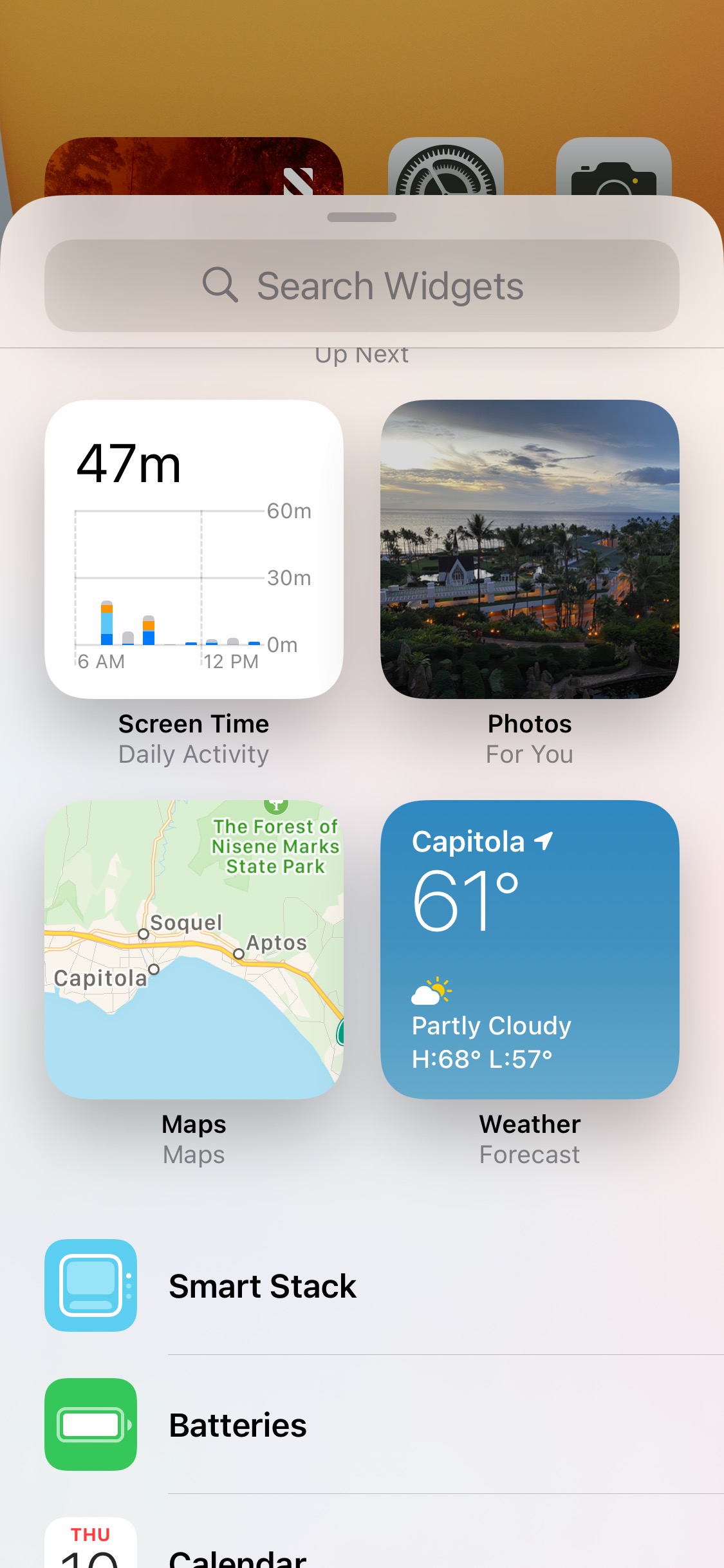
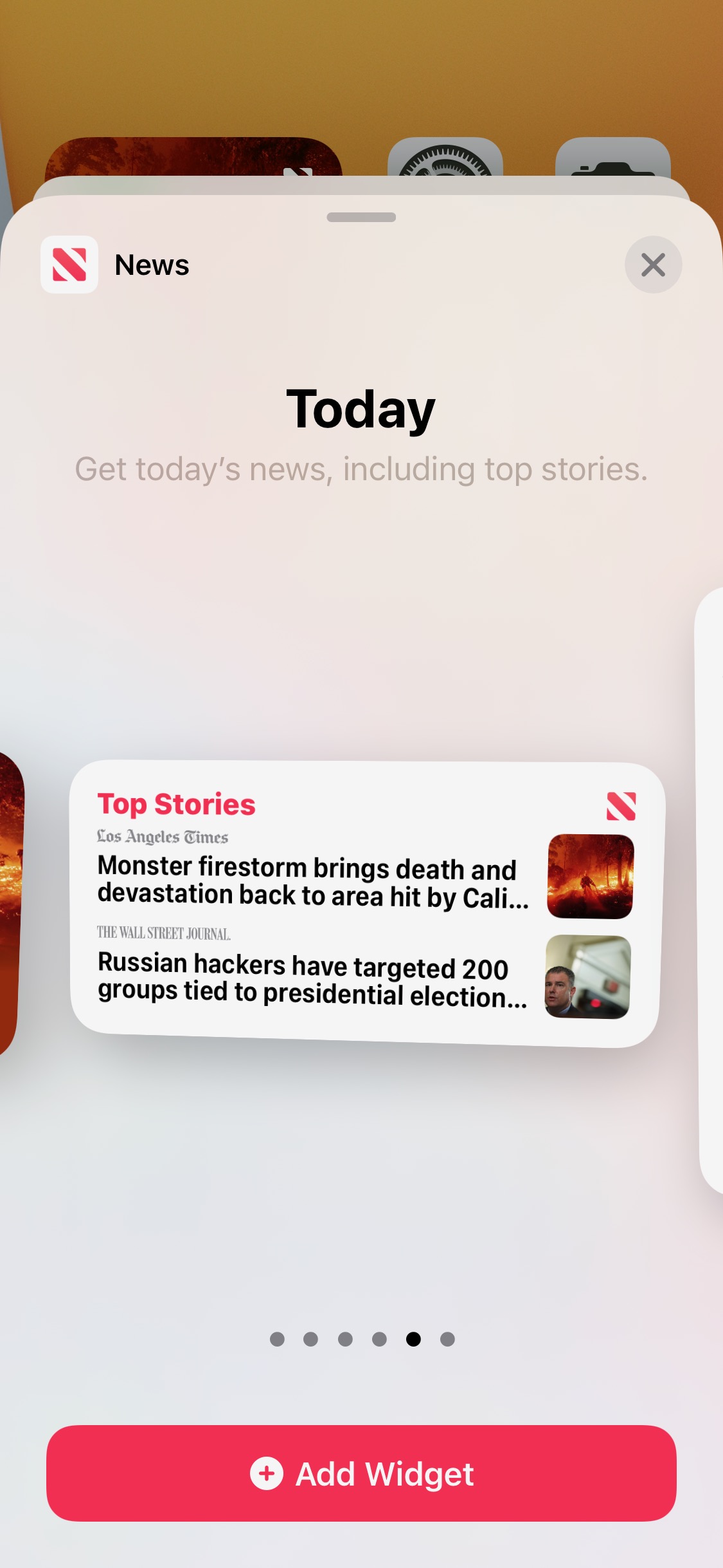
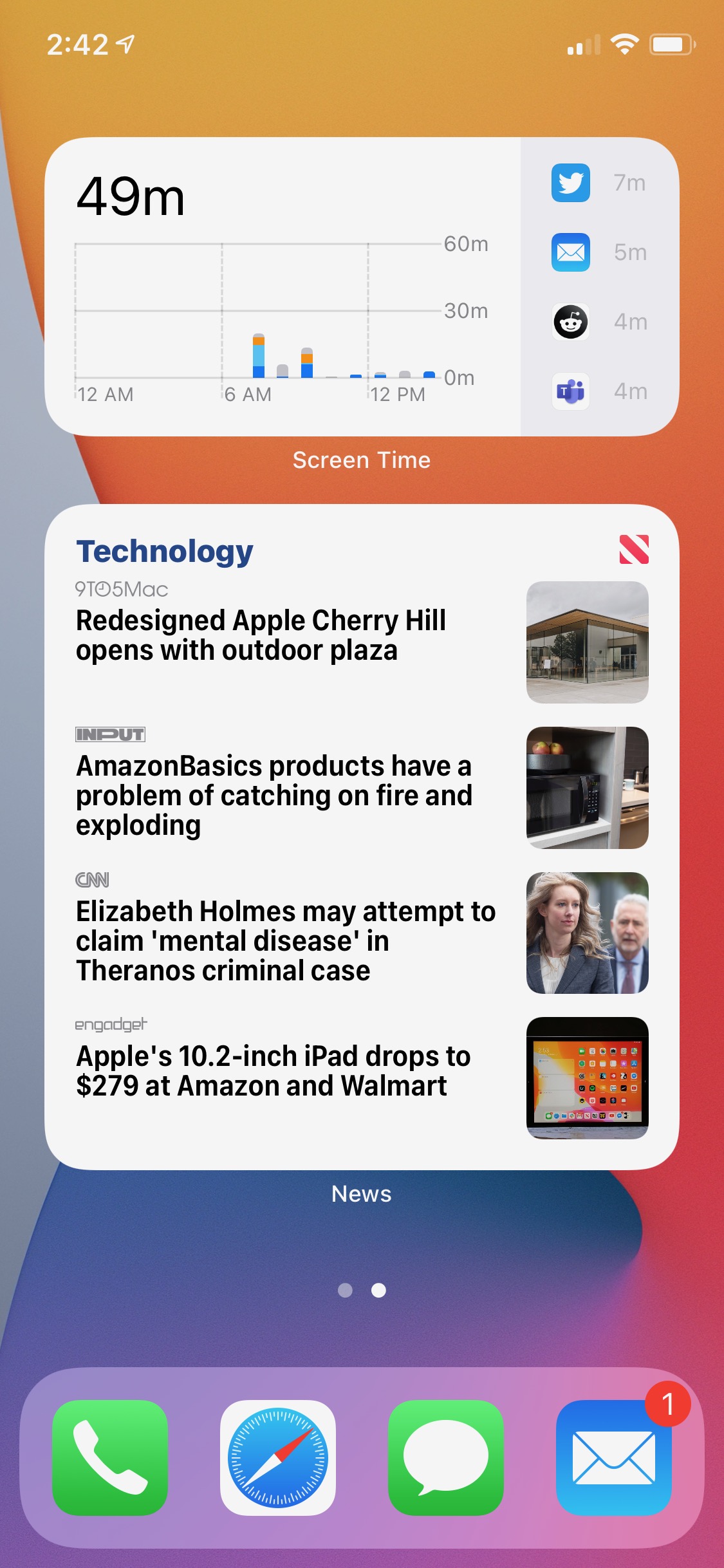
Configuring and using widgets is pretty easy to do. You’ll simply hold down on the home screen and tap the “+” icon on the top left. Then you can scroll through the widgets, and once you’ve found one that you like, select the size of widget that you want. Generally, there are three widget sizes — a 2 x 2, a 2 x 4, and a 4 x 4. Also, the smart stack is arguably the best widget once you get used to it — but you don’t have to use a “smart” stack if you don’t want. You can also just make a “stack” by placing one widget onto another of the same size. It’s a nice touch — and allows you to optimize home screen real estate. And, if you hold down on the widget after it’s placed, you can edit it — which allows you to tweak things like topics in the news widget or lists in the reminders app.
One step back
The problems with iOS 14 widgets start with the fact that Apple seems to have missed the point of widgets in the first place. Widgets should be a way to achieve tasks without having to open an app. On iOS 14, the only thing you can use widgets for without opening an app is looking at information. For example, you can see the weather forecast without opening the weather app. Or you can see upcoming calendar events without opening the Calendar app.
As soon as you actually want to do something, however, widgets are essentially just deep links — and accomplishing a task still requires you to open the associated app. For example, Apple’s smart stack will periodically recommend that I continue playing a podcast that I was listening to on my Mac — but when you tap on it, it requires opening the actual Podcasts app. You can’t even check off a reminder in a widget — even though you can see a list of reminders for the day. That’s actually a step back for Apple. Widgets on iOS 13 couldn’t be added to the home screen, but at least you could interact with them without having to open actual apps, like checking off reminders.

The problem extends to MacOS Big Sur too. As mentioned, Apple is unifying its design language across platforms, in anticipation of the switch to Apple Silicon on Macs. The result is that widgets on MacOS look and act exactly the same way as they do on mobile — and as someone who keeps track of all my work tasks with Reminders, this means having to constantly open the Reminders app to check off my tasks.
This is purposeful too — Apple’s developer guidelines on widgets show that the company sees widgets as a way to get places within an app, and not as a way to avoid having to go into apps altogether. According to the company’s developer documentation, “widgets display relevant, glanceable content, letting users quickly get to your app for more details.” In other words, don’t expect to see a Calculator widget in iOS 14, like you had in iOS 13.
Of course, none of this means that widgets will never get better. Sure, most of them seem to have gotten worse for now (despite the fact that you can put them where you want), but considering new widgets represent somewhat of a design shift for Apple, that’s arguably to be expected. Not to mention the fact that integrating interactive widgets so much deeper into the operating system may have had too much of an impact on battery for Apple’s liking. Still, I’m hoping that Apple builds more helpful stock widgets and encourages developers to do the same for third-party widgets, soon.
Anyone else looking forward to iOS 15?
Editors' Recommendations
- Here’s how Apple could change your iPhone forever
- This one thing could make iOS 18 the best iPhone update in years
- This could be our first look at iOS 18’s huge redesign
- We now know when Apple is adding RCS to the iPhone
- iOS 18 could make my iPhone look like Android, and I hate it