
Apple’s iOS 14 added a number of long asked-for features to its operating system, including a default way to organize apps in the form of the App Library, and, finally, the ability to add widgets to the home screen. Along with that ability, Apple redesigned widgets and how they work, giving them a modern flair, and some smart features.
But while they look nice, they don’t really … do much now. And that’s a problem.
Apple’s philosophy around widgets drastically changed with iOS 14, and while that’s mostly for the better, it also means that they can’t really do much except offer “glanceable information.” That means that you can no longer check off reminders in the Reminders widget — you can only see your reminders. Nor can you control your podcast or music playback. Turns out, this was all purposeful.
Design over function
Apple doesn’t just want its own widgets to put glanceable information ahead of interactivity — it requires third-party developers do the same. It’s specified in Apple’s developer documentation.
“Widgets present read-only information and don’t support interactive elements such as scrolling elements or switches. WidgetKit omits interactive elements when rendering a widget’s content,” says the documentation.
To play devil’s advocate, it does kind of make sense that Apple would do this. Home screen widgets are something that smartphone nerds like me have long wanted from iOS, and the company wants to make sure they’re done right. That’s to say, they should blend into the rest of iOS in a way that Android widgets just don’t. Android widgets are highly functional, but let’s be honest — they often look terrible.
That said, in their current iteration, widgets are little more than deep links into apps. For example, they can have a button to perform an action, but the action itself requires you to be booted into the app. Otherwise, they can just display a simple bit of information, and in any case, tapping anywhere on the widget gets the same result: Just launching the app.
iOS 14 widgets are little more than deep links into apps.
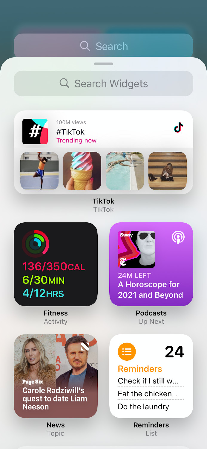
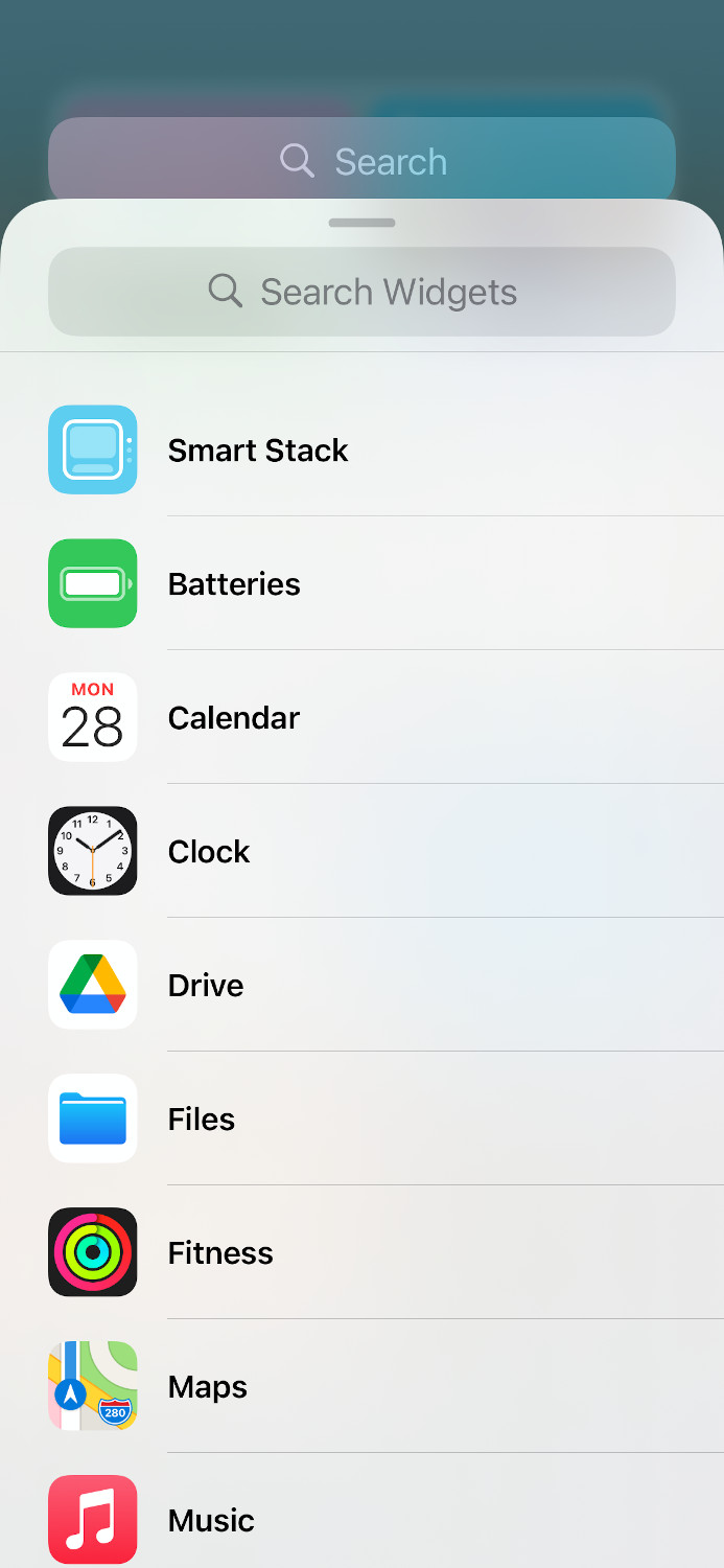
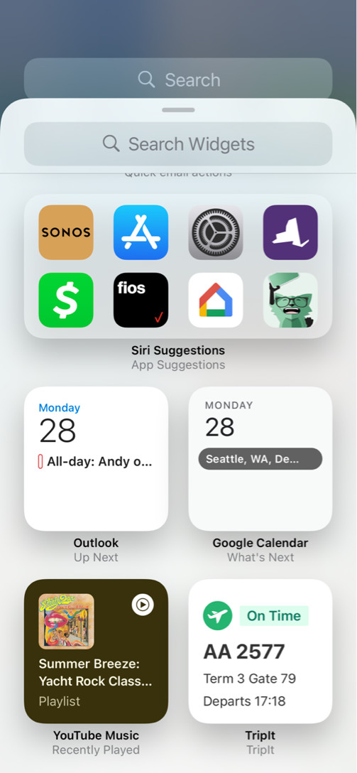
It’s possible that this is the reason that only some third-party developers have actually built widgets for their apps. I admittedly rely heavily on Apple’s own apps, and as a result, the only third-party widgets I have available to me are TikTok and Reddit. Digital Trends Section Editor Andrew Martonik has a few more widgets, including Pocket Casts, Gmail, Outlook, and YouTube Music, but still none of them offer much more than the ability to see a tiny amount of information at a glance. For the most part, you get little more than you’d get by long-pressing an app icon.
It has implications beyond iOS too. Apple is big on making its ecosystem feel coherent, and to that end, it redesigned widgets on the Mac to match those on the iPhone — meaning that widgets on macOS are a lot less functional now too. Considering the Mac is supposed to be Apple’s productivity operating system, that’s a little frustrating. iPadOS 14 has similar limitations, plus added frustration of even fewer default app widgets and the inability to put widgets anywhere on the home screen.
The future of iOS widgets
We shouldn’t expect widgets to suddenly gain tons of functionality any time soon. There are other reasons to prevent widgets from being more functional — like conserving battery life, and keeping a simplified home screen experience. And, the fact that it’s built into Apple’s developer guidelines means that it’s a hard line for now.
That doesn’t mean we can’t hope. Eventually, it would be nice to see Apple combine the functionality of iOS 13’s widgets with the sleek design and home screen placement options of iOS 14’s widgets. I would love to check off my to-do lists or write a new note straight from my home screen and see what developers could do with fewer limitations. Perhaps in a few more generations of iOS.
Editors' Recommendations
- An Apple insider just revealed how iOS 18’s AI features will work
- iPhone 16: news, rumored price, release date, and more
- iPhone SE 4: news, rumored price, release date, and more
- Here’s how Apple could change your iPhone forever
- There’s a big problem with the iPhone’s Photos app


