

Dear Apple: Thanks for the Memojis and all. You created tools to let us stop wasting our time on our iPhones and then gave us an even sillier way to spend our time. But no matter: In general, the iPhone is a perfectly-crafted piece of hardware.
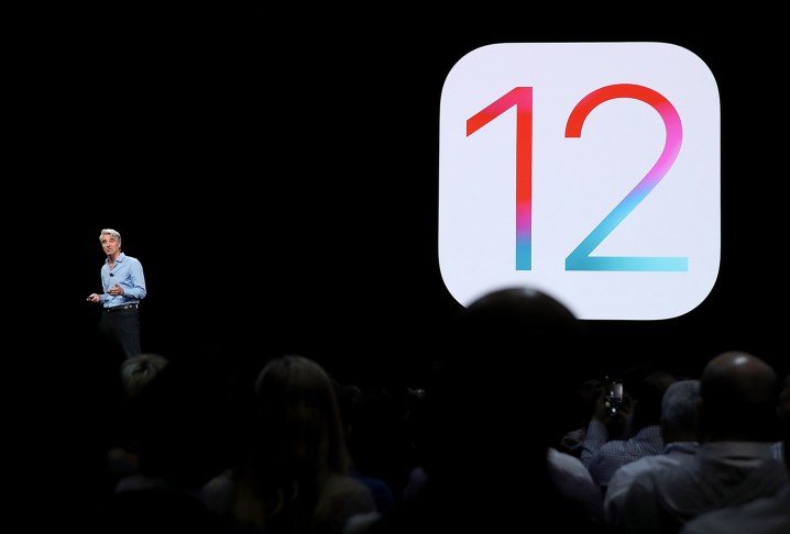
But that software? Mmmm … It’s getting a little funky, my friends. Despite all the fanfare at Monday’s WWDC event in San Jose where Apple announced iOS 12 — which promises to make your iPhone faster and less annoying — there’s still a bunch of basic, obvious stuff that’s wrong with the iPhone.
Here’s my list of five glaring failures in the platform that iOS 12 won’t do a darn thing about. Should I hold my breath for lucky 13?
1. What’s up with Wi-Fi?
Every morning, I get on the subway and try to log on to the public Wi-Fi system. Every day, it’s a crapshoot. The Control Center makes it easy to turn Wi-Fi on and off, but that’s really only half the battle, isn’t it? I need to select a network and join it. Walk into a hotel and try to get on the network, and you’ll have to unlock your phone, open the Settings app, invariably back out of whatever submenu you were in, scroll to the Wi-Fi section, wait for it to populate, and finally click to select a network.
What the hell.
Siri can detect that I order the same mocha Frappuccino every morning and proactively help me order one, but the iPhone can’t let me quickly access the Wi-Fi menu?
2. Settings in general are terrible.
And speaking of the Settings menu, why is it so miserably designed? Each individual app has a submenu within the Settings menu, but most also have settings built into the apps themselves, and in general those are far more useful. Still, features replicate. Take the Facebook app, for example. Want to hush Facebook notifications? You can do it either from the app’s settings menu or the iPhone’s main Settings app. Or from the Notifications subsection of Settings, which takes you to the same place as the app. Do they all do the same thing? Who knows?
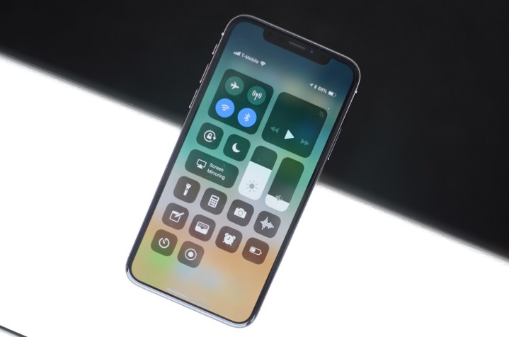
The Settings menu is grouped into sections, but the groupings are just weird to my eyes. Gray bars separate subsections, but Apple doesn’t name them – that would be too easy. The first big group is clearly “Networking,” but beyond that it devolves quickly into “stuff we connected for some unclear reason.” Sure, Notifications and Control Center go together, I guess. “Controls.” Under that is really common stuff? Toward the bottom is the third-party apps you’ve installed, but some Apple apps are ghettoized there too. Like I said, weird.
3. Why don’t volumes work in any logical way?
Up late and bored a few nights ago, I grabbed my iPhone X to check the news. The insomniacs among us likely share a similar routine: In the Control Center, I turned the volume to zero. Then I clicked that little half moon icon: Don’t disturb me, but far more important, don’t disturb my wife, who’s fast asleep. Then I flipped the little hardware switch on the left side of the phone, which sets the ringer to silent. Three different ways to turn off the volume. Three. Different. Ways.
Feeling safe, I popped open the browser and hit my favorite news site, and followed a link in a story. YouTube opened. A video started playing. Loudly.
I … I don’t understand.
4. Force touch exists.
The 3D touch settings feature that Apple created adds really interesting functionality. Press and hold the camera button and you’ll get the option to rearrange icons – and the same holds true for every icon on the home screen. Deep press the icon and you’ll get a neat submenu with some common features. It’s cool, but you’d have no way to know it’s there other than randomly trying.
The Control Center is a key issue here. If you were trying to find the mystery shortcut to Wi-Fi (which I’m still convinced exists somewhere), you might consider deep pressing the Wi-Fi button. Do so and you’ll stumble across a handy submenu with some extra features. That doesn’t work on the Do Not Disturb icon, however. The Timer and Flashlight submenus actively make me want to use these features; the Alarm menu is nonexistent, despite how obviously useful it could be.
Apple: Give us a little icon to show when there’s more down there. Please.
5. Deleting iMessages leaves me iAnnoyed.
I know, I sound like a cranky old man when I complain about text messaging, but that’s my whole point: Things that ought to be no brainers with the iPhone at this point have been over-engineered and over-designed to the point that the simple has become complex. Take iMessages. Say your ex sends you a boozy message or 18 at the crack of dawn – something really classy. To delete it, you can swipe left from the main screen, but this will delete the entire messaging history. Maybe you want to save one or two?
Click a message to enter, long press an individual message, find the “more” menu at the bottom of the screen, and you can delete individual messages or all of them. Why not a Force Touch? Who knows? Why is it multiple steps like this? Who knows? Why is that person still texting you, anyway?
My point is, the basics should be obvious. How to make a phone call. How to turn the volume on and off. How to silence an annoying notification. And too often, iOS buries them through complications that have us jumping through hoops. I’d love to see the simple things addressed, before Apple continues development on animated dancing icons.
I’m holding my breath until iOS 13 comes out. I’m looking forward to some notifications about it. If it can find them.
Editors' Recommendations
- Nomad’s new iPhone case and Apple Watch band may be its coolest yet
- 5 phones you should buy instead of the iPhone 15
- Why you should buy the iPhone 15 Pro instead of the iPhone 15 Pro Max
- Here’s how Apple could change your iPhone forever
- There’s a big problem with the iPhone’s Photos app