
“Over the past few months, we’ve been hard at work refreshing the user experience,” the team announced in a blog post. “Today, we’re excited to start rolling out a more seamless way to navigate Tinder for our users around the world.”
First and foremost, Tinder is allowing you to explore profiles more easily simply by tapping on the edge of a photo in order to move onto the next picture, or vice versa. If you tap on the bottom of a fellow user’s profile card, you can smoothly transition over to their complete profile view. This new interface promises to be more intuitive and faster than the previous iteration, and promises to help you find “everything you want to know about a potential match –from their bio and shared connections, to their anthem, top artists, or Instagram feed — quicker and easier than ever before.”
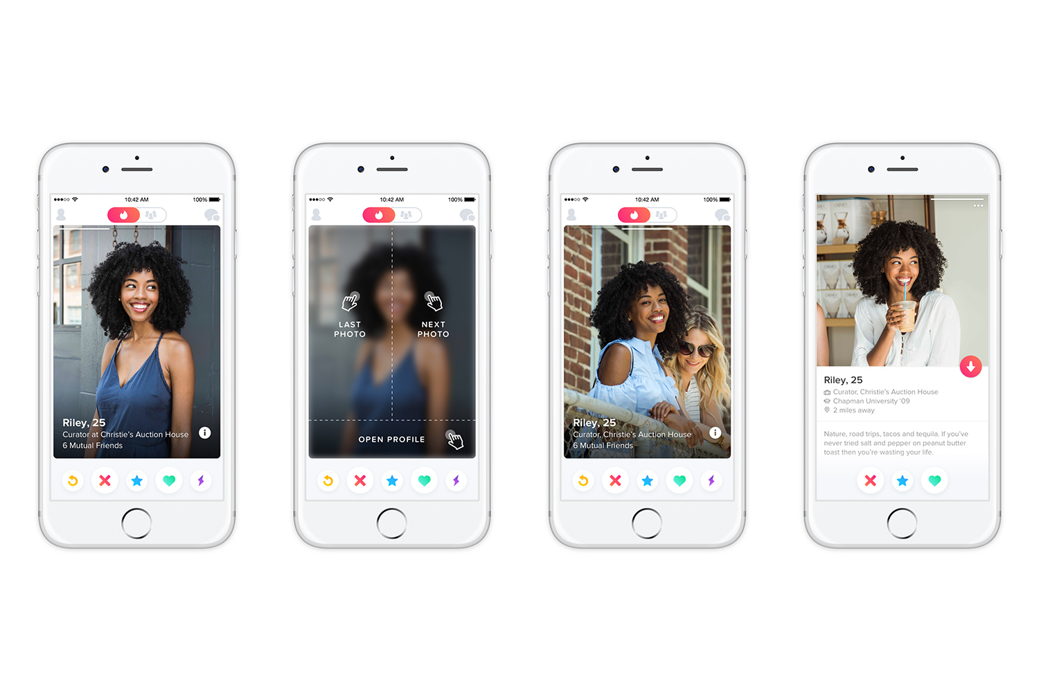
Then, of course, there is Tinder’s renewed focus on users’ looks by allowing photos to take up more real estate on the app. Now, when you are checking someone out, you will be able to check out a picture that extends right to the edge of your screen (because you should not need to squint at your potential significant other).
And finally, there is what you cannot see. Tinder notes it introduced new technology to power its app. “With a new look and feel, a new app architecture, and Apple’s new open-source programming language, we set out to reinvent the Tinder card stack,” the team notes in its tech blog. And if you’re interested in learning more about exactly how the engineers at Tinder allow you to swipe right (or left!) you can check out their engineering posts.
Editors' Recommendations
- You can bid for Twitter’s bird statue right now
- You can now augment Google Lens photo searches with text
- Forget waiting! Here’s all the CES 2022 tech you can buy right now
- You can soon react to WhatsApp messages with emojis, but it’s broken right now
- Here’s where you can pre-order the Pixel 6 and 6 Pro right now