In 2017, just in time for the 10th anniversary of the iPhone, Apple revealed the iPhone X alongside the iPhone 8 and iPhone 8 Plus. While the iPhone 8 series retained the Home button, the iPhone X was the first iPhone to get rid of the classic button altogether and introduce Face ID to replace Touch ID.
But along with it came the notch at the top of the display, which housed the selfie camera and Face ID sensor. My initial thought upon seeing the notch for the first time was, “Wow, that’s ugly.” I didn’t even buy the iPhone X at the time, instead opting for the iPhone 8.
It’s now been five generations of iPhone since the iPhone X, and last year, the iPhone 14 Pro and iPhone 14 Pro Max eliminated the notch in favor of the Dynamic Island. In the notch’s place, we now have an elongated, pill-shaped cutout at the top of the display, and it can change to show you various things like timers, music/podcasts that are playing, and more.
But it’s been almost a year since the Dynamic Island was introduced, and I’m still not getting much out of it. In fact, it’s gone from something that I was really excited about to a huge disappointment.
Dynamic Island app support is bad … still
I started my career out reviewing apps, so I’ve got hundreds — maybe even a thousand — apps in my downloads. Sure, a lot of them may not even be on the App Store anymore, but I still have plenty of apps that are current and up to date.
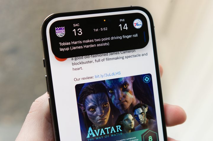
The problem is that the apps that I use most, the ones I depend on daily, barely use the Dynamic Island at all. I’m not a sports person, so I have no use for viewing sports scores, even though that’s one of the most popular uses of the Dynamic Island. Of course, I’m not sure what kind of information could be displayed in the Dynamic Island for apps like Outlook/Spark, Microsoft Teams, Ivory for Mastodon, Threads, or my other social media apps. Still, for most of the day, my Dynamic Island is just there, blank, like a deserted wasteland.
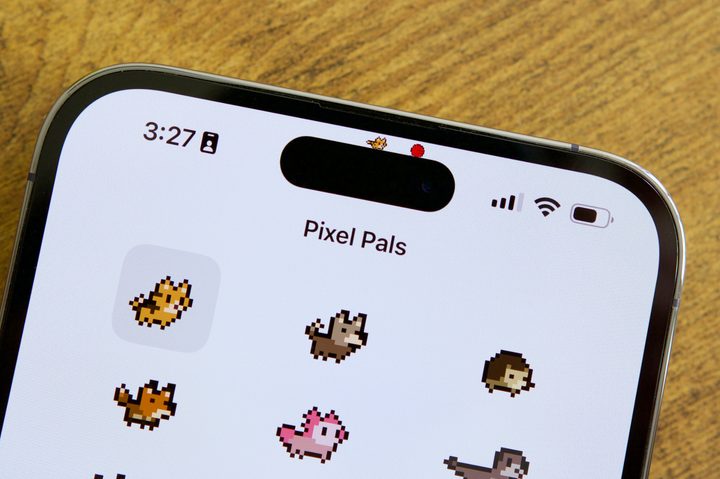
I did notice that Instagram now uses the Dynamic Island to tell you the progress of an upload, like when uploading things to Stories, but that only lasts for literally a few seconds before it disappears. I also have Pixel Pals, which uses the Dynamic Island to house a cute little pixelated pet, but that’s not what I would call “informative” or even a necessity.
One app I use that I’m shocked doesn’t use Dynamic Island yet is DoorDash. Now, I don’t use DoorDash as often as I did during the pandemic, but every now and then, I want to order food and not leave the house (I’m lazy). Each time I do so, I shake my head in disappointment because there’s no real-time tracking as a Live Activity or some kind of status indicator in the Dynamic Island. This is the kind of app that would be perfect for both features, but nope.

At the moment, I only really get use out of the Dynamic Island when I’m playing music from Apple Music, using turn-by-turn directions in Apple Maps, authenticating with Face ID for Apple Pay, and maybe if I need a timer that isn’t on my Apple Watch Ultra.
I know some apps I have, like Uber and Flighty, use the Dynamic Island and Live Activities, but I barely fly or need an Uber right now. I would just like to see more of the apps that I use daily have support for a key selling point of the iPhone 14 Pro and iPhone 14 Pro Max. It’s been a year, and there’s still barely anything.
Is the Dynamic Island the new Touch Bar?
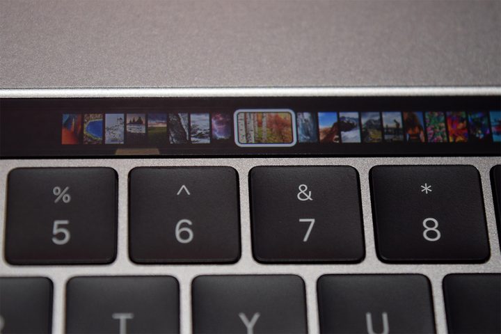
The Dynamic Island so far reminds me of the Touch Bar on 2016-era MacBooks. The Touch Bar was interesting in that it added a touch panel above the keyboard for quick access to various functions in applications, but as novel an idea as it was, a lot of people didn’t care for it.
There were some big reasons why people didn’t like the Touch Bar, aside from the fact that it replaced the entire function row of keys on the keyboard itself. Despite the name “Touch” Bar, you couldn’t do anything on it without having to look down at it since it’s a touch panel — it always changed appearance and function depending on the active app, and you didn’t exactly get physical feedback since it was just a glass surface. For “pro” users, touch typing is a thing, so having to look down at the keyboard to do something was considered disruptive.
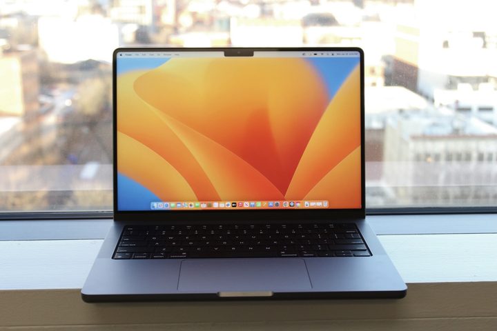
After a few years of MacBooks with a Touch Bar, Apple finally decided to eliminate the hardware feature in 2021 with the 14-inch and 16-inch MacBook Pros. This also marked the return of the function row on the keyboard.
I feel like the Dynamic Island could go the same way as the Touch Bar. It’s quite limited in space, so any information that is displayed there will always be extremely condensed or minimal. And again, there just hasn’t been enough support from third-party developers, even almost a year later.
Not the iPhone upgrade I hoped for
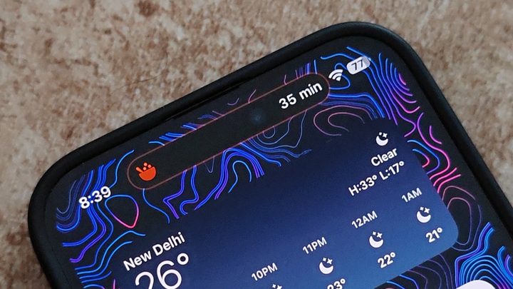
When Apple revealed the Dynamic Island, it was exciting because it was finally replacing the ugly notch, and what you could potentially do with it seemed so cool. But it’s a year later and I’m still only getting any use out of it with native apps, so one of the main reasons I wanted an iPhone 14 Pro has been squandered. I originally thought it was fun and whimsical, but now I just see the Dynamic Island as boring and unimaginative.
The rumors for the iPhone 15 lineup say that the Dynamic Island is going to be on all the models, not just the Pros. Maybe we’ll see the Dynamic Island become useful once it’s standard across the lineup and more accessible by people … or maybe it’ll continue to be just as limited as it is today. I certainly hope it’s the former because, as it stands right now, it still feels like a lot of wasted potential.