 Yesterday we thought we were losing it when we headed over to Instagram and something seemed not quite right. Slightly … different. A hint of … change. But we couldn’t quite pin down what it was.
After concluding that we’re not crazy, we heard from Instagram that yes – our eyes doth not deceive! The Web viewer display has been updated to “make it more consistent with the mobile experience and give people more space to engage with the content.”
Last week Instagram introduced Web embeds for photos and videos, and the new icon for this feature is likely the biggest change in the updated look.
But we won’t bullet out the rest of what’s new for you in text because … honestly, it’s all so understated that a comparison picture is the best way to illustrate the upgrade. Feast your eyes on the (slightly) different Instagram Web viewer.
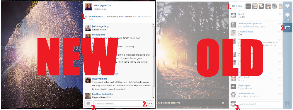
1. Now instead of the profile pictures of the people who liked your photo being displayed, you’ll only see their user names. You’ll also notice your profile picture and caption (if there is one) will sit above your photo’s “likes.”
2. This “dot dot dot” icon now pulls up the embed tool as well as the ability to flag something as inappropriate.
3. You now can “leave” a comment instead of “add” one – and you’ll see the heart button here instead of in the top right hand corner.
There are a few changes – subtler yet – like how captions on your own photos are displayed, and an ever-present scroll bar (which just sits idly there if there aren’t enough comments to scroll through).

And yes, it does look a whole lot more like the mobile UI.
Editors' Recommendations
- How to deactivate your Instagram account (or delete it)
- How to download Instagram photos for free
- Meta brings cartoon avatars to video calls on Instagram and Messenger
- Instagram Threads: what you need to know, and how to sign up
- Instagram and Messenger get more parental supervision tools