
Google unifies search bar, eliminates the black bar

google-revamped-search-bar
Image used with permission by copyright holder

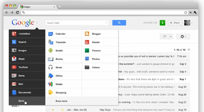
In its latest attempt to unify the design of its services an eliminate clutter, Google today introduced the “Google bar,” a single area up top that will be the same over all its services. For some time, Google has had a thin bar running on the top of its services, showing the most important apps like Calendar, Gmail, Google+, etc, with links to each service. In the last six months, it changed the color of that bar to black and added a Google+ notification and sharing button to it. Well, those who hate the black bar can rejoice. It’s now being merged with the search bar below it. 

Today Google unveiled its new Google bar. The new bar appears thicker than the old one, but does the job of two. All Google services are now able to be discovered by hovering over the Google logo on any screen. To the right of that will always be a search bar, and then the Google+ buttons will be on the right, but this time notifications will be in a pleasant green instead of that nagging red that Google has been favoring lately. 

google-bar-nov-2011
Image used with permission by copyright holder

Google has created a little video on its blog page, if you care to see the bar in action. So, what do you think? Combining the bars seems like a step in the right direction and falls in line with the recent redesign of Google News (all news categories are now in a drop-down menu). Still, I think there’s too much black. Having any dark black and grey looks pretty ugly next to Google’s typically light and white designs. 

Google did not say, but we assume that this change will begin taking effect for users immediately, or in the near future. We haven’t yet experienced the new design. 

Editors' Recommendations

Jeffrey Van Camp
Former Digital Trends Contributor
As DT's Deputy Editor, Jeff helps oversee editorial operations at Digital Trends. Previously, he ran the site's…
X (formerly Twitter) returns after global outage
A white X on a black background, which could be Twitter's new logo.

X, formerly known as Twitter, went down for about 90 minutes for users worldwide early on Thursday ET.

Anyone opening the social media app across all platforms was met with a blank timeline. On desktop, users saw a message that simply read, "Welcome to X," while on mobile the app showed suggestions for accounts to follow.

Read more
How to create multiple profiles on a Facebook account
A series of social media app icons on a colorful smartphone screen.

Facebook (and, by extension, Meta) are particular in the way that they allow users to create accounts and interact with their platform. Being the opposite of the typical anonymous service, Facebook sticks to the rule of one account per one person. However, Facebook allows its users to create multiple profiles that are all linked to one main Facebook account.

In much the same way as Japanese philosophy tells us we have three faces — one to show the world, one to show family, and one to show no one but ourselves — these profiles allow us to put a different 'face' out to different aspects or hobbies. One profile can keep tabs on your friends, while another goes hardcore into networking and selling tech on Facebook Marketplace.

Read more
How to set your Facebook Feed to show most recent posts
A smartphone with the Facebook app icon on it all on a white marble background.

Facebook's Feed is designed to recommend content you'd most likely want to see, and it's based on your Facebook activity, your connections, and the level of engagement a given post receives.

But sometimes you just want to see the latest Facebook posts. If that's you, it's important to know that you're not just stuck with Facebook's Feed algorithm. Sorting your Facebook Feed to show the most recent posts is a simple process:

Read more