The colorful Google logo is one of the most recognizable global brands ever created. Sure, it looked a bit rough in the beginning, but Google’s clever refinements over the last two decades show an interesting transition that now results in the crisp, clear icon we know and love today.
If you’re feeling nostalgic or simply curious about the brand’s visual timeline, here’s a look back at how the Google logo has changed over the last 20 years. Enjoy!
Humble beginnings
The very first version of the Google logo was never going to win any design awards. Likely created using one of the standalone 3D text generators sold in the 1990s, it’s a real reminder of just how ugly the early days of the internet could be.

In its defense, this logo was only put in place while the search engine was still a research project carried out by Larry Page and Sergey Brin at Stanford University. Once the pair decided to launch Google officially, Brin whipped up a better design himself using the popular open-source image editor GNU Image Manipulation Program (GIMP).

As you can see, several elements of the now-familiar design are already in place. The color order is a little different, but that would be amended in a new version that was used from October 1998 onward.
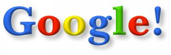
Like its predecessor, this iteration uses the Baskerville Bold typeface, but tweaks the 3D effect on the lettering, and adds an exclamation point — a response to Yahoo’s similar branding at that time, according to a report from Gizmodo.
While it’s long since been replaced as Google’s primary branding, this logo is surprisingly still in use. If you travel back in time by searching for “Google in 1998,” you’ll see it featured as part of a special throwback interface.
Intelligent design
As Google grew in notoriety, the decision was made to upgrade its branding. Page and Brin decided to call upon the services of designer Ruth Kedar, who made her name creating widely lauded sets of playing cards. By the late 1990s, she was installed as a member of the art faculty at Stanford.
Kedar produced several different concepts for the new version of the logo. Many of them used imagery to express core components of the Google experience, such as a target to evoke its precision or a magnifying glass to signify that it was indeed a search engine.

These designs show things falling into place. The basic color scheme is there, albeit with some minor edits. The top two examples even use Catull, the typeface Google used in the logo for over a decade.
Of course, none of the logos above made the cut. The company decided that adding too much visual flair would ultimately turn out to be restrictive.
“This is where we started simplifying,” Kedar explained in a 2008 interview with Wired. “The idea was, ‘Can we create the sense of playfulness without having recognizable or identifiable objects that are going to end up limiting us?'”
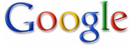
Above, you can see the design Google finally selected. It was in use from May 31, 1999, to May 5, 2010 — the company’s longest-serving logo to this day. This specific design carried Google to the top of the search engine market, but the changing face of the internet eventually forced the company to change its long-standing look.
Going flat
In the past decade, we’ve seen all kinds of companies replace detailed logos with newer iterations based around flat blocks of color. Google can count itself among that number, but its transition took place in two distinct stages.

After changing to brighter colors and a more subdued shadow effect in 2010, Google made significant changes to its branding in 2013. The 3D effect on the lettering was eliminated, and some minor typographic changes were made — note the tweak made to the way the straight line meets the curve on the e.
This iteration would turn out to be a relatively minor revision, however, compared to what was coming two years later, namely a new typeface.
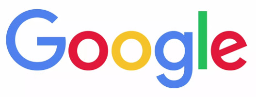
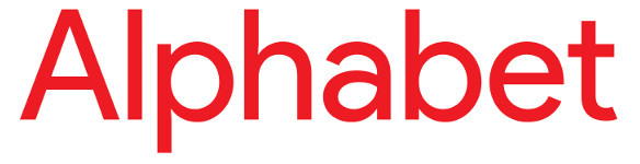
Google created this font — called Product Sans — in-house. It highlights the lack of shadow and the high contrast of colors in the logo, while also providing a more modern font appearance that doesn’t look like something cranked out of a typewriter. This has become the Silicon Valley trend, used by everyone from Microsoft to Motorola. A slightly amended version is also used in the logo for its parent company, Alphabet.
The latest Google logo maintains the visual identity of its predecessor, but the new typeface makes it look more modern. It is accompanied by a version of the stylized G character that’s used for app icons and the like.
What’s next for Google’s branding? Only time will tell. But if there’s one thing that we can learn from the changes made over the last 20 years, it’s that the company isn’t afraid to tweak things to keep up with the times.
Google Doodles
Google Doodles were originally conceived in 1998 by Larry Page and Sergey Brin as a way of showing they were out of the office and attending the Burning Man festival. In 2000, they tasked their webmaster Dennis Hwang to create a doodle to mark Bastille Day and it was so well received that he was appointed Google’s chief doodler.
While Google Doodles initially only featured major holidays, they now commemorate notable events like the 50th anniversary of the moon landing, the birthday of Joseph Antoine Ferdinand Plateau, and even Virtual Reality Doodles. With a dedicated team of illustrators and engineers behind Google Doodles, you never know what useful information or interesting presentation you’ll discover on the Google homepage.