

Samsung pulled an Apple earlier this year with the launch of its latest smartphone software. Merely weeks after Google introduced Android 16 ahead of its usual annual schedule, Samsung also dished out its next-gen One UI 8 software based on Android 16.
At the moment, the software is limited to Samsung’s seventh-generation foldable phones. I have been testing it for a couple of weeks now on the Galaxy Z Fold 7, and a few of the changes have stood out for me. Dive in to see what Samsung has fixed and lifted this year.
The improved multi-tasking experience
When it comes to multi-tasking, the One UI experience has remained one of the best out there historically. But as more form factors, such as foldable, evolved and Google started paying serious attention to large format screens with Android 12L, Samsung’s software started to feel stagnant.
The likes of OnePlus surprised us with the handy Open Canvas system for split-screen multitasking on foldable phones, while Vivo delivered what appears to be a Stage Manager-like approach on its latest foldable phone. With One UI 8, Samsung is finally catching up.
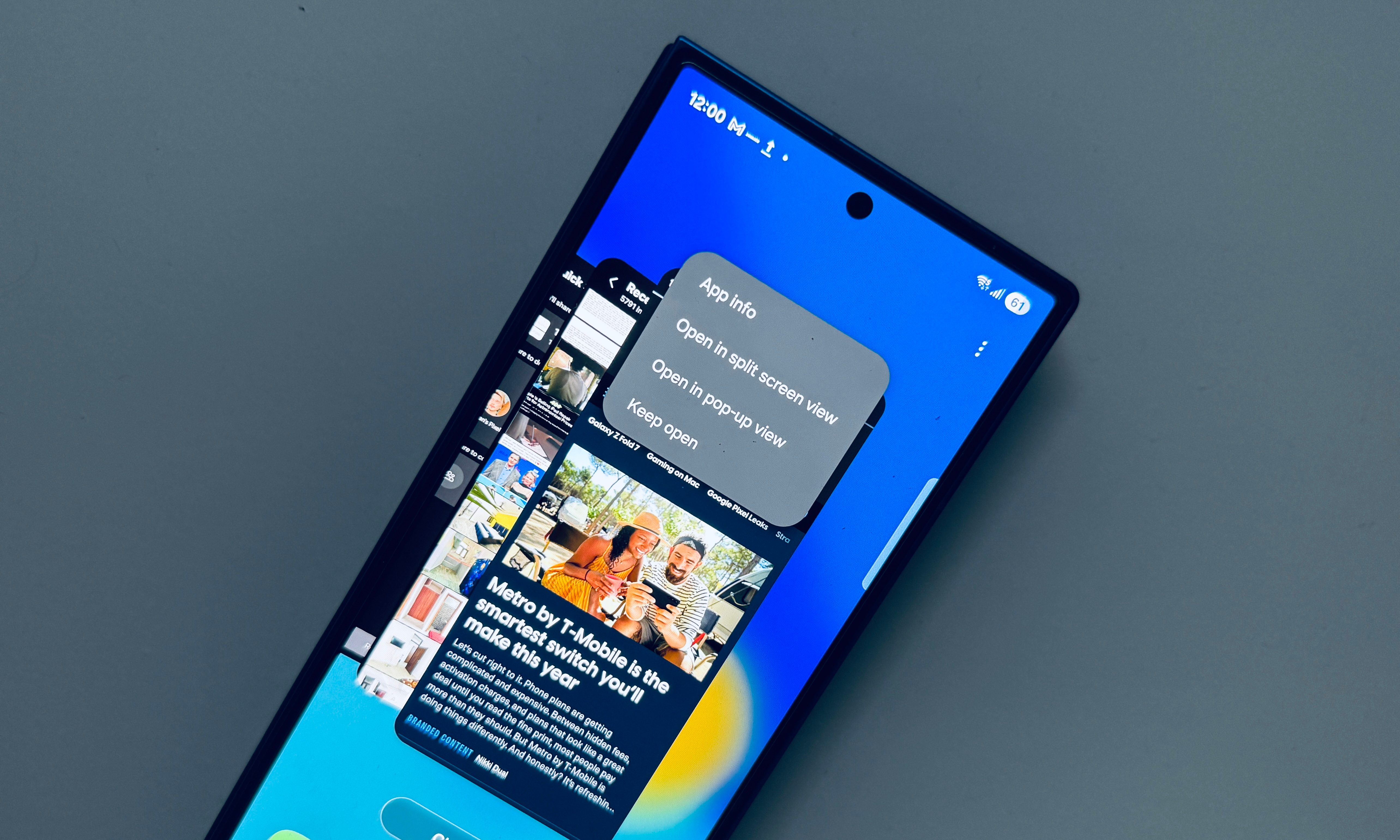
The change in question is a 90:10 split-screen format, and it’s ideal for using two apps simultaneously on the cover screen. Simply put, when you split the screen across the interface of two apps, the secondary app window can be shrunk to such an extent that it only takes up a 10% portion of the screen alongside the top or the bottom edge of the screen.
That leaves you with more space and an almost natural view for the foreground app. It is further helped by the fact that the Galaxy Z Fold 7’s tall aspect ratio still keeps the slightly shrunk app window feel completely normal, without any weird UI distortion.
More importantly, you don’t have to adjust the horizontal divider bar every time you want to bring the secondary app into focus. You can simply tap on the bottom or top bar, and it will instantly take the center stage on the phone’s screen. It’s snappy, more convenient, and thoughtfully executed.
I often run into scenarios where I have to reference information in one app and then feed into another. This approach lets me interact with either split-screen app in near full view on the Galaxy Z Fold 7’s cover display without any odd cropping or crushed UI elements.
A more convenient camera app

There’s a new trend in the smartphone world these days. Phones are getting slimmer and lighter. However, they are not necessarily getting smaller. The most noticeable downside of the latter trend? Well, to reach for items in the upper half of the screen, you really need to stretch your thumb, use the other hand, or adjust the phone in your hand twice.
The situation gets worse with the camera app, which needs as much space for the viewfinder as possible, especially if you are shooting in 9:16 or full-screen view. Now, imagine taking a picture when the phone is unfolded and it’s being used in a tablet-like view.
Well, Samsung has finally addressed that aching conundrum. So far, flicking on the viewfinder area switches between the front and rear sensor in the camera app. Now, you can customize this flick gesture to open the core camera controls and adjustment tools.
Technically, these tools are still located in the upper right corner of the screen, and are still difficult to reach one-handed. But now, you can simply flick on the screen and bring them down as a sliding carousel, right above the shutter button.
You can now easily toggle the flash, enable timer, change aspect ratio, adjust the resolution, change exposure settings, pick between photo styles, and do more. Even the Settings section shortcut is pulled down, letting users quickly dig into the hub.
File sharing is easier
Whether you have experienced the convenience of AirDrop, or not, sharing and receiving files on Android remains a hassle. Over the years, Android’s Quick Share has landed some upgrades (and a rebranding, too), but it’s nowhere near as seamless as Apple’s wireless file sharing system.

In One UI 8, Samsung has completely overhauled the user interface for Quick Share. There are now prominent Received and Send buttons at the bottom. The sending page gets a cleaner interface for selecting files. Additionally, devices that you frequently share data with, appear in a dedicated carousel.
So, if these devices are nearby, you no longer have to go through the find and scan hassle. Moreover, generating a QR code or URL link is now more easily accessible on the send page, whether it’s a single file or a whole bundle. When receiving files, you just have to stay put in the Receive section of the app.

When you’re on the Receive page, the wireless connection lanes are automatically enabled, and depending on your visibility preference, the device will appear automatically on the sender’s phone or tablet. In my experience, it has worked flawlessly atop One UI 8 each time I’ve attempted file transfer.
As usual, if Bluetooth connectivity is not working, you can choose to share the files over the internet, as well, a process that would require Wi-Fi or cellular data. Alternatively, if you want to avoid accidentally sending a large cache of files and eating up your data limits, you can set up sharing to WiFi mode only.


