The Mac has always had a small, dedicated base of developers that’s led to some unique, beautiful applications. But compared to what’s available on the iPad, it’s lagging far behind.
Project Catalyst is Apple’s way of helping developers port their iPad apps over to the Mac. To convince developers of how easy the process is, Apple has started with some of its own apps in the most recent version of MacOS, Catalina.
The problem? Even Apple’s own attempt at the process has left me a bit concerned about the future of the platform.
Goodbye iTunes, hello Catalyst
Steve Jobs once said that design is “not just what it looks like and feels like. Design is how it works.” When it comes to Project Catalyst, Apple would do well to take note.
MacOS Catalina is here, and Apple’s use of Catalyst is front and center. The beloved (and overstuffed) iTunes desktop app has been replaced by three new apps: Apple Music, Apple Podcasts and Apple TV. As Apple wanted it to be, the three new apps have proven to be a great use case for what Catalyst could do.
Sadly, I found these apps to be a real mixed bag. The results ranged from familiar (Music) to downright shoddy (TV). While Music and Podcasts used similar layouts, with sidebars housing most of the navigation, TV completely broke with this style. It used tabs instead of a sidebar, and a layout almost totally devoid of text. It didn’t feel like it was made by the same company as its sibling apps; when that comes from a company so obsessed with design as Apple, it’s a worrying sign.
It’s not like Apple has just suddenly forgotten what makes good design. It still has world-class designers on board who are working hard across all its system. The problem with Project Catalyst is that it attempts to bridge the gap between two very different platforms. Both MacOS and iOS have their own design styles and flavors, with each being distinct and recognizable. You know when you’re looking at an iOS app because its entire design is focused on touchscreen controls; on a Mac, its designed around a pointer and keyboard shortcuts.
These guidelines are important because they show what Apple considers good design to be.
Apple publishes its Human Interface Guidelines to point developers in the direction of consistency in order to aid users. The idea is that users should be able to quickly feel at home in an app because its shortcuts, menus and other conventions feel familiar. When an app’s functionality runs counter to these guidelines, it feels jarring.
As tech pundit John Gruber pointed out over 15 years ago, these guidelines are important because they show what Apple considers good design to be:
“It’s not pedantry that inspires Mac aficionados to gripe about Apple’s violations of the Macintosh Human Interface Guidelines. It’s not that the HIG is simply a list of rules to which a bunch of us nerdy Mac experts demand blind adherence only for the sake of following rules. It’s that the guidelines outlined in the HIG form a cohesive whole describing a philosophy of design.”
So when its Apple’s own apps that break with its guidelines, it feels even worse — and that’s the problem with Project Catalyst.
How the rest of the world works
If you want a great example of what design inconsistency looks like, head over to Windows. Starting in Windows 8 and furthered in Windows 10, Microsoft’s operating system broke with the detailed icons and window styles of the past and ushered in a new flat-design era to its platform. Well, sort of.
Here’s an example of what I mean. The Wi-Fi menu in Windows 10’s Settings app uses large sliders to toggle options on or off. It has a simple three-color palette, with a left-hand sidebar housing other settings and a right-hand sidebar with deeper options.
Click ‘Change adapter options’, though, and you get a new window in the old Windows style. There are small color icons, buttons at the top of the window where there were none before, and a distinct lack of sidebars. It’s a jarring break from the Windows 10 style, and suggests that Windows’ developers simply didn’t care enough about Windows 10’s design language.
That’s how it feels to use an app like Apple TV. It’s so out of place, not just compared to the other Project Catalyst apps but compared to Apple’s apps as a whole, that it feels like it was made by an inexperienced intern on their first day at the office.
But isn’t that just the design?
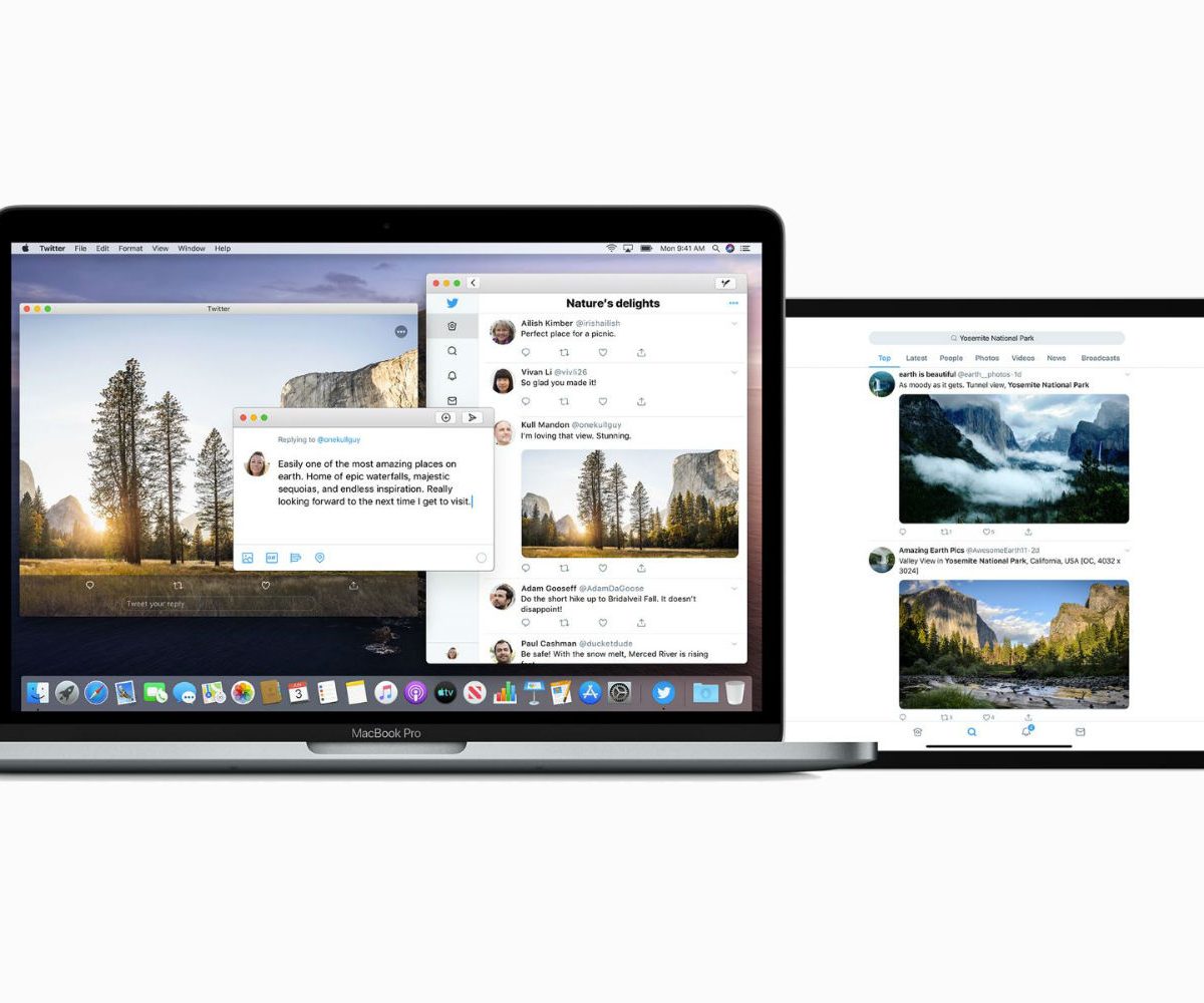
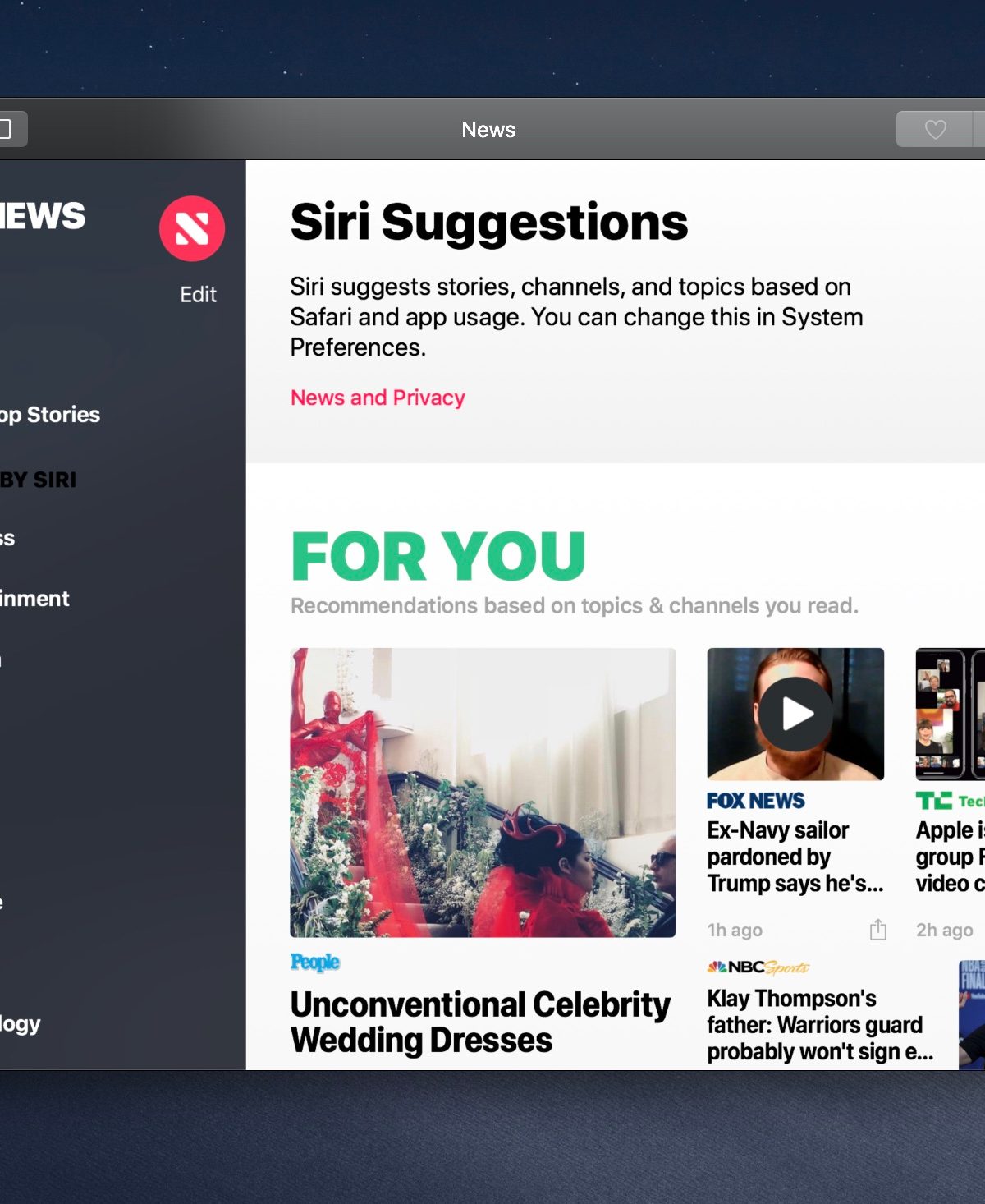
But Music, Podcasts and TV weren’t the first cross-platform apps from Apple that fell under the Project Catalyst masthead. News, Home, Stocks and Voice Memos came before them, and first alerted the world to the potentially shaky ground Project Catalyst apps were standing on.
Consider this point made by developer Benjamin Mayo. Most Mac apps have the app name in the menu bar and nowhere else. The News app, however, has ‘News’ in four places: the menu bar, the apps’ title bar, at the top of the left-hand column and at the top of the main window.
As Mayo says, this is probably because on iOS there are no menu bars or title bars, so apps have to add their branding somewhere else to let users know what app they’re using. That suggests News was simply ported across wholesale from iOS with few considerations for Mac design conventions. That’s a decision made not by some inexperienced third-party developer, but by Apple itself.
“People were saying, ‘Obviously this technology is causing them to do things that don’t feel Mac-like.’”
In an interview with CNet’s Jason Hiner at WWDC in June this year, Apple’s software chief Craig Federighi said improvements were on the way: “We’ve looked at the design and features of some of those apps and said we can make this a bit more of a Mac experience through changes that are independent of the use of Catalyst, but are just design team decisions.”
But that doesn’t necessarily inspire confidence considering what Federighi said next: “When I read some of the initial reviews of those apps, people were saying, ‘Obviously this technology is causing them to do things that don’t feel Mac-like.’ Honestly, 90% of those were just decisions that designers made.”
If Apple was having design issues due to limitations in early versions of its fledgling Project Catalyst framework, that would be understandable. But the fact that the weird design and grating navigation conventions were actual choices made by Apple’s designers is worrying.
Ultimately, Apple has put itself in an almost impossible position. It’s trying to merge two very different platforms in a way that feels consistent and natural, and clearly hasn’t decided what that should look like yet. Hopefully it’ll work it out soon, because a lot of designers will be taking cues from what it does next.
Apple is a world leader in design — it’s time it remembered why.