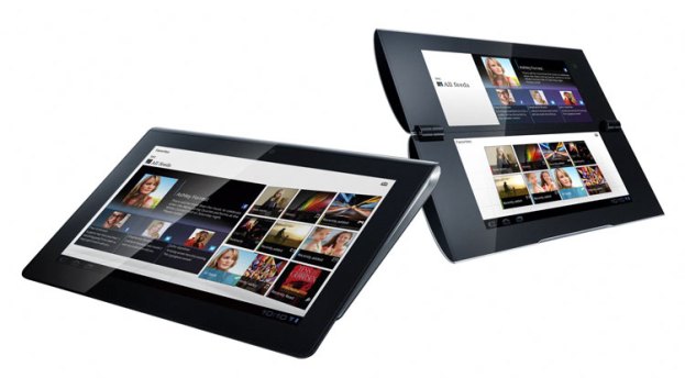
In the smartphone space, few people have seen Google’s default Android user interface. This is because nearly every manufacturer of Android phones customizes the UI to a crazy degree, changing fundamental things about the operating system that go beyond mere design flourishes. Until now, Android Honeycomb, Google’s tablet operating system, hasn’t seen much customization. Most every Android tablet that has come out has used the default Android 3.2 design…until now. Carrypad has snagged some screen grabs from Sony’s upcoming S1 and S2 tablets, which appear to look quite different from stock Honeycomb.
These screen grabs were supposedly taken from Sony’s support site. They have since been taken down and we cannot verify their accuracy. We won’t post the first image, as it simply shows that the tablets will run Android 3.2. There is also a couple images showing a custom Wi-Fi connection app and Sony’s custom music player.
Homescreen

Sony has changed the icons to have a purple tinge to them and added several hotkeys to the upper left side of the tablet as well as a favorites button. Below is the original Android Honeycomb homescreen (Sony’s tablet will probably still have widgets.)

Apps menu

This is the apps menu, which now has a white background, appears to scroll down instead of page from left to right, has some sorting options, and every icon has a border. The actual Android Honeycomb apps screen is below.

Keyboard

Sony has also modified the keyboard pretty heavily, adding a number pad to the right and some direction keys. We’re not so sure this is a great layout, as it’s already difficult to type on 10.1-inch tablets with a keyboard that stretches across the whole screen. These keys would be even smaller. For reference, the default Honeycomb keyboard is below.

What do you think of the new designs? Our initial impression is that they look a bit like Sony is modifying Android just for the sake of it, but we’ll withhold judgement until we’re able to try out the tablet for ourselves.


