It’s that time of year when you may consider buying an older relative a tablet or phone that’s designed for “seniors.” Images of older folks smiling as they use their new senior-friendly tablet make them tempting, and you could be forgiven for thinking this is all that’s needed for older people to enjoy all the online world offers.
But it’s not. These products may effectively facilitate access to the internet, apps, and operating systems. But at this point, another, far more serious wall is hit: Terrible interface design. It’s a massive, misunderstood problem — and it’s not one that can be solved by throwing a GrandPad in granny’s direction.
Good design, marred by small problems

I have seen how poorly thought-out design affects older people’s confidence when using technology (through helping my parents navigate around apps and the internet on the devices of their choice). Both my parents use Apple iPad tablets, plus my father uses a Chromebook. Both have graduated to these machines after Windows-based laptops became overkill. They use Google Assistant on a Nest speaker, and my mother has an Android smartphone. They’re not tech newbies and don’t require specialist equipment. What they need to make their life online more enjoyable and easier is thoughtful, more inclusive design.
A great example of the problem is the QVC shopping app on the iPad, which my mother uses fairly regularly. On the whole, the app is inclusively designed, with large buttons and panels, lots of white space, and fairly obvious Add to Basket buttons when you want to buy something. It’s, therefore, frustrating when other important aspects of the app go in the opposite direction completely.
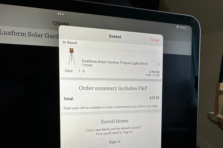
One issue perfectly encapsulates the problems faced in many apps and online stores. Say an extra item gets accidentally added to the basket in QVC’s app. The option to reduce the number ordered of a particular item is, by far, the smallest button in the entire app and not only easy to miss, but also not so easy to adjust. You can’t pinch and zoom, the Bold Text option in iOS doesn’t apply to apps, and the only real way to know something isn’t right is when (or if) you notice the price is higher than expected.
In the app, the basket — arguably the most important part of the app for both the user and the company — is a pop-up window, not a separate screen. Why not make it bigger, more obvious, and more usable? The QVC app is not the worst or only offender, but it stands out because, for the most part, the app is otherwise well-designed, right up until you get to a crucial part of the shopping experience.
Just the start of the problem
The thing is, I would never have noticed the problem if it wasn’t something I had been asked about by my mother. For me, it wasn’t an issue, and it probably wasn’t for the designer either. But it absolutely is for some people. I hear myself say, “This bit isn’t very obvious, so you’ll have to remember quite a few steps,” quite a lot when I explain how to use apps and an operating system, as I point out minuscule buttons, or go through multiple steps and menus to get to somewhere that should be far less arduous to find.
A further example shows how language (often marketing-led) highlights a different design issue that is equally hard for older people to overcome.” I configure iOS on my parent’s iPads to update automatically, and if it’s a major version update, it often requires privacy agreements to be accepted, iCloud configuring, and security tools to be reactivated before it lets you back into the tablet.
What’s problematic here is not the design, but the language used and the clarity around the options provided. Not everyone understands what iCloud does, whether it’s OK to share data with Apple and third-party developers, or how much of a pain it is to force Touch ID on someone without nimble fingers. While experienced, confident users will know what to tap, and to look for the (always smaller, less obvious) Skip for Now button on unwanted options, many older people don’t want to make a mistake and end up simply not using the tablet at all.
Fear of the unknown

In a way, this is why I force iOS to automatically update. If I didn’t, then it probably wouldn’t happen at all for the same reasons as above: The process is filled with technical language and various agreements, all amplifying concerns about inadvertently doing something wrong. The signposts are quite clear to me, but not so much to older people. It’s a UX design problem, not a device problem. And because it’s found in all kinds of software, it can’t really be solved with a device supposedly made for seniors unless it’s incredibly restrictive in the way it can be used.
It comes down to a fear of tapping one button and going down a rabbit hole of equally confusing options, as well as problems identifying buttons and options due to sight issues, tiny buttons that aren’t made to help those with dexterity problems, or confusing icons and nomenclature. It’s apps, operating systems, and the web that are more of a barrier to use than the actual device. It’s not a problem everywhere, but one that’s limited to only certain apps or services, and when it only pops up once in a while, it can be incredibly frustrating. If you see how to deal with these problems once, then don’t face them again for weeks or months, the solutions are easily forgotten.
All this comes before dealing with signing into apps and websites, the endless passwords and security systems, little tick boxes to avoid data collection and email lists, and non-standardized language across apps. Calling your service something clever is great for branding, but not so good if the person using the app isn’t aware you call subscriptions something different from everyone else. They’re all small considerations, but fixing them would help older people feel less intimidated and frustrated by everyday life online.
It’s not the device or the person

These design issues aren’t the same ones that can be cured, or minimized through accessibility settings. They’re not ones that specifically affect people with serious disabilities who need assistance using a device in general. They aren’t ones that are suddenly going to go away with a stylus, big volume buttons, or a custom version of Android or by paying a monthly subscription for a helpline.
There’s a place for devices like the GrandPad, but it’s not necessary for fairly tech-savvy people who want more from their tech. but are put off by design elements that haven’t been thoroughly optimized for people of all ages and technical abilities. I firmly believe the iPad and iOS are excellent products for older people, thanks to Apple’s speed and seamless integration across multiple devices, comprehensive accessibility settings for the operating system, strong privacy, and overall simple usability.
It’s what lies beyond the iPad where the problems occur, whether it’s inside an app, on the web, or when something unexpected occurs. I don’t think the solution is to create online spaces specifically for older people, as no one wants to be made to feel feeble. I’m also not the person to say what the actual solution is, as they don’t affect me personally. However, I do recognize what the problem is.
Only the people truly affected by them can show where improvements need to be made. Instead of making specific devices for old people, software developers and manufacturers need to ensure people of all ages and tech ability are consulted and considered, with the aim of ensuring the process of using software — from top to bottom, whether it’s an app or a website, on mobile or the desktop — is truly inclusive.