  1. Home
  2. Phones
  3. Mobile
  4. News

The Google Home app is getting a long-overdue feature

Add as a preferred source on Google
The Google Home logo on a Pixel phone.
Joe Maring / Digital Trends

According to the sleuths over at Android Authority, the Google Home app is about to get a much-needed feature that I’m honestly shocked hasn’t been added yet: a search bar.

If you’ve never used the Google Home app before, it’s sort of the command center for all things smart home in the Google smart home ecosystem. If you only have a few smart home devices, it’s easy enough to navigate — but if you have an extensive smart home setup, you could have upwards of 50 devices listed in the app. If you don’t take time to organize and label them, it gets unwieldy fast.

Recommended Videos

The upcoming change was discovered as part of an APK teardown, during which Android Authority looks at in-progress code and tries to discern what it’s for. Some of what is presently in development may not make it to the final release, so take these findings with skepticism.

A screenshot of a new search bar feature in the Google Home app.
Android Authority

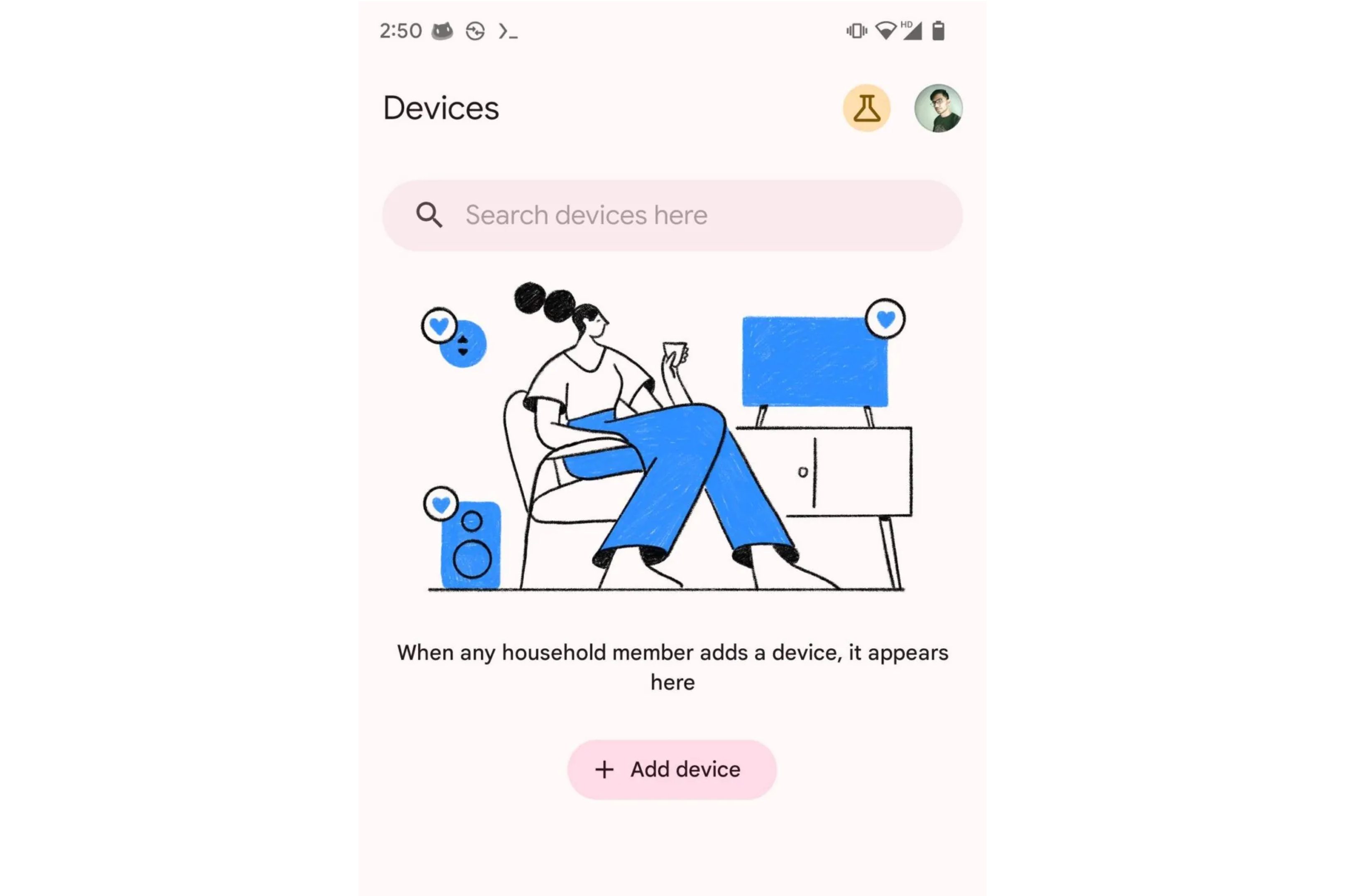
The above screenshot shows the search bar’s location within the app. Google is also preparing Material You themes for the app to better fit into your phone’s customization settings. According to Android Authority, once this update rolls out, the Google Home app will use your current wallpaper to determine the background color and UI accents.

This change will make it dramatically easier to look through your smart home device list and find exactly what you’re looking for. However, it’s unclear how the search feature will work or its criteria. It’s also worth noting that the search bar follows another big Google Home update that significantly redesigned the app’s thermostat controls.

When setting up a new device, please take a few seconds to give it an easily recognizable name instead of leaving it as the default. It’s hard to remember to search for “Sensor 04027.”

Patrick Hearn
Former Technology Writer
Patrick has written about tech for more than 15 years and isn't slowing down anytime soon. With previous clients ranging from…
Android desktop mode made me miss my laptop in record time
I tried writing and publishing from Google’s phone-to-monitor setup, and the future of mobile computing immediately started sweating.
Computer, Electronics, Laptop

Android 17 desktop mode has a very simple pitch. Plug your phone into a monitor, add a keyboard and mouse, and watch the slab in your pocket pretend to be a computer. I wanted to give that pitch a fair shot, so I tried using it for an actual workday instead of a cute demo.

The goal was boring on purpose: write an article, edit it, build the page in WordPress, upload whatever needed uploading, and publish the thing without running back to my laptop like a coward.

Read more
After test-driving iOS 27, my iPhone still doesn’t feel like it has made a substantial leap
Siri learned new tricks. Safari got smarter tabs. My morning routine didn't change at all.
iOS 27 new star rating feature in Photos

Every June, after Apple wraps up its annual WWDC keynote, I install the latest iOS beta on my iPhone, watch the progress bar crawl to completion, and wait for the inevitable restart. For years, picking up my phone afterward felt almost identical to how it did before the update. 

I saw the same grid of icons, the same Control Center, and the same version of Siri until iOS 26 finally broke that pattern in 2025.

Read more
Android 17 makes a strong case for ignoring Android version numbers entirely
When the most noticeable change is a better Quick Settings button, the annual update cycle starts looking more like branding than progress.
Android 17 logo.

Android 17 finally separated the Wi-Fi and mobile data buttons, and I hate how much that improved my mood. For years, Android treated internet access like one mysterious blob, as if Wi-Fi and cellular data were emotionally codependent. In Android 17 Beta 3, Google split the old combined Internet button into separate Wi-Fi and mobile data tiles, making each connection easier to switch off with a single tap.

That’s a good change, which is also why it’s a little damning. When one of the cleanest wins in a major OS update is “the buttons make sense again,” the celebration gets awkward fast.

Read more