
If millions of lines of code are the buttresses of Google’s Android operating system, Material Design is the architectural flourishes that dot its outer walls. The aesthetic philosophy was introduced at Google’s I/O developer conference in 2014, and characterized by its use of responsive animations and transitions, grid-based layouts, and depth effects such as shadows and lighting.
It’s slowly grown to subsume Google’s other products — Gmail, YouTube, Google Drive, Google Docs, Google Maps, Inbox, and more have all received material design makeovers in recent years — and in 2015, the Mountain View, California-based company began hosing a contest to highlight the best of Material Designs mobile expressions. The second annual Material Design Competition commenced earlier this year, and on Wednesday, Google announced the winners.
The competition this year wasn’t any less fierce this time around, but clear victors emerged in the competitions categories of Brand Infusion, Charming Engagement, Creative Navigation, Expressive Layouts, and Focused Efficiency.
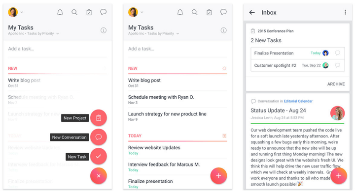
Taking the cake in the Brand Infusion category was organizational app Asana, which Google credited with maintaining “visual focus” and ensuring “users [stayed] concentrated” on accomplishing tasks and goals. “[Asana’s] … short, frequently repeated interactions … make efficiency feel rewarding,” Google wrote. “Content is never overwhelmed by the wide range of available actions because they are organized intelligently and are easy to trigger.”
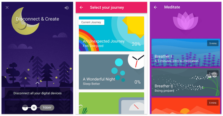
The digital trophy for Charming Engagement went to Fabulous, a self-described “happiness trainer” that encourages healthy decision-making with positive feedback loops. The app makes a “charming” first impression, said Google, and thoughtful touches like “crisp state transitions” and “goal completion animations” keep at its core mission: motivating. “Bold notification styles, a well-developed soundscape, and email reminders that feel personal and direct … are carefully considered,” said Google.
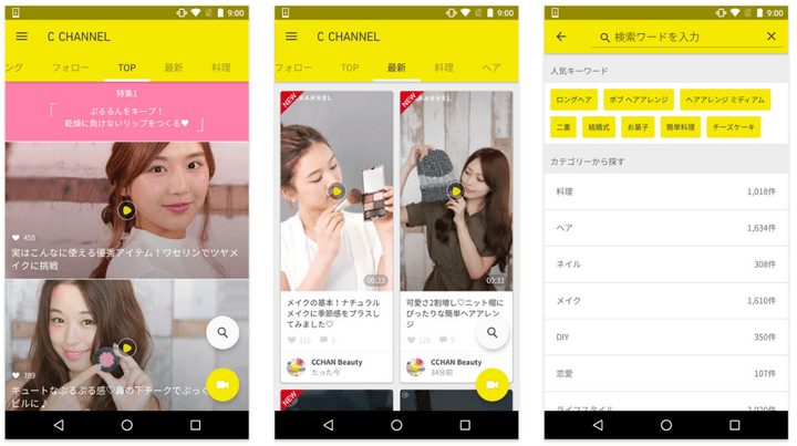
Google crowned C Channel, an app for the eponymous Japanese and Thai video sharing platform, the winner in the Creative Navigation category, crediting its “positive vibe” and “gestures” as the touches that put it over the top. “[More] content usually means more problems,” Google wrote, “[but] the app neatly balances a blend of studio-created and user-submitted videos covering fashion, food, and more.”
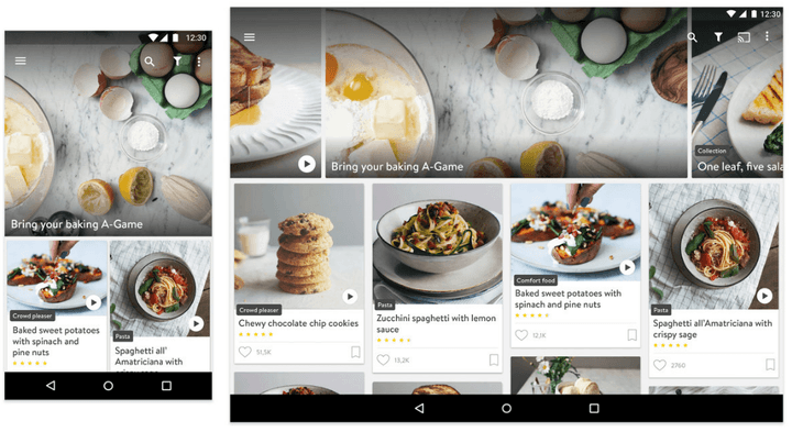
In the Expressive Layouts segment, Kitchen Stories earned the adoration of Google’s design team with an “effective,” “easy-to-scan” layout for recipes that adapts neatly to screens and devices of varying sizes. Content is organized not only “neatly,” Google said, and smartly: the recipe interface minimizes the number of taps and swipes required to progress, ideal for “messy fingers.”
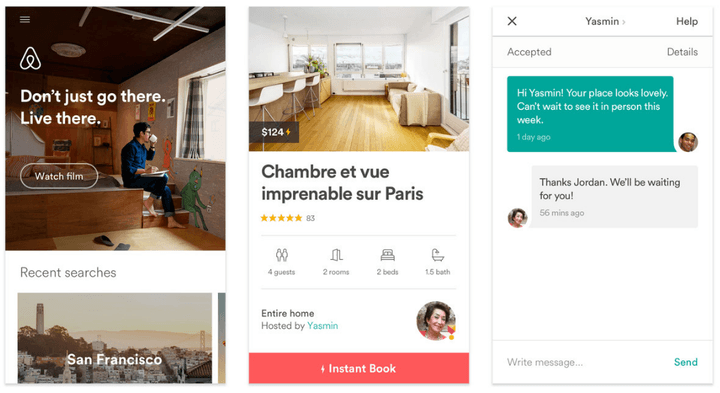
And in the all-important Focused Efficiency round, Airbnb came away victorious. Google said the reason came down mostly to efficiency that didn’t sacrifice “precision” in design. “Essential tasks are satisfied … routing users clearly and briskly from sign in, to browsing, to booking a reservation,” Google said. “By neatly segmenting larger goals into smaller steps, Airbnb is able to sidestep the appearance of complexity, making the overall experience feel comfortable.”
The five winning apps will be featured at the SPAN LA design conference on October 27, Google said.
The Material Design Competition follows on the heels of Google-hosted apps contest: the Indie Games Festival. That contest, which wrapped up in September, saw three game developers awarded tickets to Google’s I/O 2017 developer conference, a Tango Development kit, and a Razer Forge TV bundle.


