  1. Home
  2. Phones
  3. Mobile
  4. News

Motorola quietly announced a new (and very cheap) Android phone

Add as a preferred source on Google
The Motorola E14 being shown in black and purple.
Bryan M. Wolfe / Digital Trends

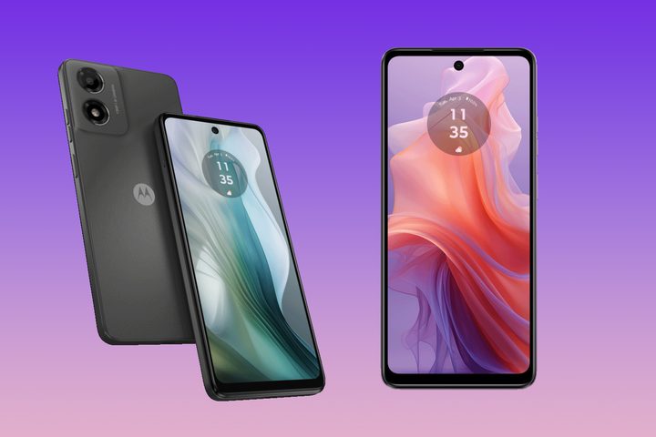
Motorola has introduced a surprise smartphone tailored for budget-conscious shoppers. The Moto E14 is debuting in the U.K. and Europe; we don’t expect to see a U.S. launch.

The Moto E14 is a simple device priced at 70 British pounds (about $88). It features a Unisoc chipset, the same one found on its predecessor, the Moto E13. The Moto E14 has 2GB of RAM and is limited to Android 14 Go Edition, a lightweight version of Android.

Recommended Videos

Motorola’s smartphone features a 6.56-inch IPS LCD panel with HD+ resolution. It has a 90Hz refresh rate and is protected by Gorilla Glass 3. The device has an IP52 rating, making it water-repellent and able to survive light rain and dripping water.

The Moto E14 offers 64GB of built-in storage using UFS 2.2, an upgrade from last year’s model, which used eMMC. A microSD slot is available if you need more storage.

The Motorola E14 in its green and purple colors.
Motorola

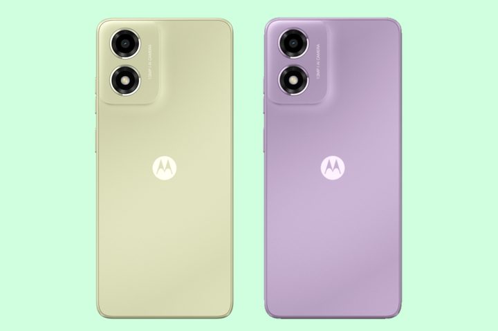
The Moto E14 features a 5,000 mAh battery that lasts up to 40 hours on a single charge. It also has 15-watt wired charging, which isn’t particularly fast, but fine for a phone this cheap. If you live in a qualifying region, the phone is available in three colors: Pastel Green, Pastel Purple, and Graphite Gray.

The Moto E14 may not attract a lot of attention, but its low price is certainly appealing. If you are a student seeking an affordable handset or someone needing a second phone, the Moto E14 is definitely worth considering.

If you prefer Motorola, but desire more features, consider some other newly released options: the well-received Moto G Stylus 5G, the less successful Moto G Power 5G, and the more affordable Moto G 5G.

Bryan M. Wolfe
Former Mobile and A/V Freelancer
Bryan M. Wolfe has over a decade of experience as a technology writer. He writes about mobile.
Android desktop mode made me miss my laptop in record time
I tried writing and publishing from Google’s phone-to-monitor setup, and the future of mobile computing immediately started sweating.
Computer, Electronics, Laptop

Android 17 desktop mode has a very simple pitch. Plug your phone into a monitor, add a keyboard and mouse, and watch the slab in your pocket pretend to be a computer. I wanted to give that pitch a fair shot, so I tried using it for an actual workday instead of a cute demo.

The goal was boring on purpose: write an article, edit it, build the page in WordPress, upload whatever needed uploading, and publish the thing without running back to my laptop like a coward.

Read more
After test-driving iOS 27, my iPhone still doesn’t feel like it has made a substantial leap
Siri learned new tricks. Safari got smarter tabs. My morning routine didn't change at all.
iOS 27 new star rating feature in Photos

Every June, after Apple wraps up its annual WWDC keynote, I install the latest iOS beta on my iPhone, watch the progress bar crawl to completion, and wait for the inevitable restart. For years, picking up my phone afterward felt almost identical to how it did before the update. 

I saw the same grid of icons, the same Control Center, and the same version of Siri until iOS 26 finally broke that pattern in 2025.

Read more
Android 17 makes a strong case for ignoring Android version numbers entirely
When the most noticeable change is a better Quick Settings button, the annual update cycle starts looking more like branding than progress.
Android 17 logo.

Android 17 finally separated the Wi-Fi and mobile data buttons, and I hate how much that improved my mood. For years, Android treated internet access like one mysterious blob, as if Wi-Fi and cellular data were emotionally codependent. In Android 17 Beta 3, Google split the old combined Internet button into separate Wi-Fi and mobile data tiles, making each connection easier to switch off with a single tap.

That’s a good change, which is also why it’s a little damning. When one of the cleanest wins in a major OS update is “the buttons make sense again,” the celebration gets awkward fast.

Read more