  1. Home
  2. Phones
  3. Mobile
  4. News

New photo gives us a great look at the Galaxy Z Fold Special Edition

Add as a preferred source on Google
A person opening the Samsung Galaxy Z Fold 6.
Andy Boxall / Digital Trends

Rumors have swirled around for a while about the Galaxy Z Fold Special Edition, and now we have our first real look at the device. It looks similar to the Fold 6, but there are several noteworthy changes that make this gadget an appealing upgrade. Unfortunately, the chances of getting your hands on it are slim — Samsung is only expected to release the Z Fold Special Edition in South Korea and China.

The first element that jumps out at us is just how thin the phone is. Early rumors called it the “Galaxy Z Fold Slim,” and this width — only 4.9mm thick when unfolded and 10.6mm folded — certainly explains why. Despite its smaller size, the display aspect ratio is expected to be the same.

Recommended Videos

Another noteworthy change is the camera bump. It looks to be quite a bit higher than the camera bump on the Galaxy Z Fold 6, but otherwise looks mostly the same. The raised space is squared with rounded corners instead of the more oval shape of the Z Fold. Early rumors say the primary camera could be 200 megapixels for incredibly high-quality photos.

The first look at the Galaxy Z Fold Special Edition
Kristijan Lucic / Android Headlines

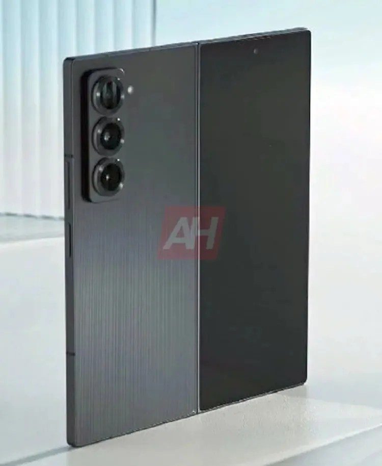
Still, of all the improvements, the most noticeable is the phone’s brushed metal back. It gives it a rugged look, although some people have theorized that the back is actually a pattern underneath glass. We won’t know for sure until we get our hands on the phone.

The Galaxy Z Fold Special Edition might release as soon as next month, but as we said before, it’s only expected to launch in China and South Korea. The chance of a United States release isn’t entirely off the table, but it’s unlikely. We certainly wish that weren’t the case, though, because what we’re seeing here looks mighty nice.

Patrick Hearn
Former Technology Writer
Patrick has written about tech for more than 15 years and isn't slowing down anytime soon. With previous clients ranging from…
Android desktop mode made me miss my laptop in record time
I tried writing and publishing from Google’s phone-to-monitor setup, and the future of mobile computing immediately started sweating.
Computer, Electronics, Laptop

Android 17 desktop mode has a very simple pitch. Plug your phone into a monitor, add a keyboard and mouse, and watch the slab in your pocket pretend to be a computer. I wanted to give that pitch a fair shot, so I tried using it for an actual workday instead of a cute demo.

The goal was boring on purpose: write an article, edit it, build the page in WordPress, upload whatever needed uploading, and publish the thing without running back to my laptop like a coward.

Read more
After test-driving iOS 27, my iPhone still doesn’t feel like it has made a substantial leap
Siri learned new tricks. Safari got smarter tabs. My morning routine didn't change at all.
iOS 27 new star rating feature in Photos

Every June, after Apple wraps up its annual WWDC keynote, I install the latest iOS beta on my iPhone, watch the progress bar crawl to completion, and wait for the inevitable restart. For years, picking up my phone afterward felt almost identical to how it did before the update. 

I saw the same grid of icons, the same Control Center, and the same version of Siri until iOS 26 finally broke that pattern in 2025.

Read more
Android 17 makes a strong case for ignoring Android version numbers entirely
When the most noticeable change is a better Quick Settings button, the annual update cycle starts looking more like branding than progress.
Android 17 logo.

Android 17 finally separated the Wi-Fi and mobile data buttons, and I hate how much that improved my mood. For years, Android treated internet access like one mysterious blob, as if Wi-Fi and cellular data were emotionally codependent. In Android 17 Beta 3, Google split the old combined Internet button into separate Wi-Fi and mobile data tiles, making each connection easier to switch off with a single tap.

That’s a good change, which is also why it’s a little damning. When one of the cleanest wins in a major OS update is “the buttons make sense again,” the celebration gets awkward fast.

Read more