Over the past few weeks, Google has been quietly rolling out a fresh coat of paint for its popular Google Maps app — and it’s been creating havoc over the holiday travel season.
While some people may understandably be frustrated at any changes made to such an established and widely used app, there seems to be more to this than just people being put off by unfamiliar colors. The many folks taking to social media to voice their displeasure with the redesign have been joined by professional user interface (UI) designers expressing similar, but more nuanced observations. Even a designer who once worked on Google Maps is pillorying the new design as a backward step for the service’s usability.
Folks on social media have described the new design as looking “like a generic map installed in a car navigation system with a CD-ROM.” Others say the new maps look “sad,” while some have applauded the changes as a nostalgic reminder of “looking at an old map at the library.”
A backward step for accessibility
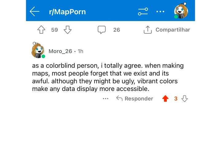
However, there’s a more important consideration to the new colors in Google Maps that the company’s designers have seemingly missed entirely — they’re not friendly to people who are color-blind. While several folks have complained that the new colors are 30,000x less accessible, that’s an even more severe problem for some people.
As one Redditor wrote: “What’s wild is who ever designed this LITERALLY has never heard of the most common form of color-blindness before.” Several posts on Reddit’s r/ColorBlind have pointed out that the new design has made it difficult, if not impossible, for color-blind people to use Google Maps effectively. One Redditor, James Connolly, has even started a Change.org petition calling upon Google to reverse the color changes on behalf of the color-blind community.
“I am one of the 300 million people worldwide who are color-blind,” Connolly said in the petition. “The recent changes Google has made to their Maps application have made it difficult for me and others like me to use this essential tool effectively. The new look is not color-blind friendly, which is a major setback for those of us who rely on this service daily.”
Interestingly, this isn’t a new problem, either. A Reddit post in r/ColorBlind from six years ago expressed concerns about poor color choices in Google Maps during its last color scheme update.
Is Google (badly) copying Apple Maps?

If you think the new color scheme in Google Maps looks a lot like Apple’s, you’re not alone. When 9to5Google first reported the change after Google began testing it at the end of August, it noted precisely that, particularly that the more vibrant blue “draws immediate comparison to Apple Maps” and would be particularly stark for those who live or travel near a body of water.
It wasn’t alone. Former Google Maps designer Elizabeth Laraki wrote a lengthy post on X (the social network formerly known as Twitter) also suggesting Google’s redesign is similar to Apple Maps — but in all the wrong ways.
“It feels colder, less accurate, and less human,” Laraki wrote, adding that, “more importantly, they missed a key opportunity to simplify and scale.”
The color palette replaces white and yellow roads with shades of gray, changes water to a teal that will be instantly familiar to fans of Apple Maps, and goes for a more pastel mint for parks and forested areas.

However, the new colors make it seem like Google is putting makeup on a bovine. While Laraki acknowledges that “major roads, traffic, and trails stand out more now,” she adds that “water and parks/open spaces blend together.” However, the biggest problem is not the new colors, but that Google did nothing to clean up “the crud overlaying the map.”
In discussing the redesign with CNBC, Laraki said, “If you’re gonna go through such a significant shift that is very noticeable to people, it seemed an interesting choice to focus so much on making these very noticeable dramatic changes to the map tiles themselves, but still leave all the crud on top of the map that is there.” She also added that it looks “more similar to Apple Maps coloring than Google Maps coloring.”
However, there’s far more to the elegance of Apple Maps than just its color choices. As Laraki notes, Google Maps still has about 11 different elements getting in the way, including the search box and “8 pills overlayed in 4 rows” to show things like the temperature, layers, quick searches, and location and direction buttons. Then there are the “peeking cards” that come out from the bottom, just above the navigation bar.
By contrast, Apple Maps provides a significantly cleaner UI that puts the map almost exclusively front and center. While five similar “pills” overlay the map, they’re much smaller than the ones in Google Maps and placed discretely around the edges — three in the top-right corner for layers, location, and 3D/2D views, one at the bottom-left to start Look Around mode, and one at the bottom-right that shows weather and an air quality index (where available).
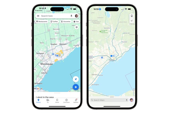
There’s also nothing at the top. Instead, Apple Maps blends right into the area beside the notch or Dynamic Island of the iPhone. The bottom features a pull-up card with a search field and other options, but there’s no navigation bar for switching between modes like in Google Maps.
In her tweet, Laraki proposes a new design that would “bury the less used features elsewhere in the app,” leaving only the search bar at the top and a redesigned nav bar at the bottom that would lose the Go, Contribute, and Update buttons in favor of the location, directions, and layers buttons that were previously overlaid on the map. Such a design would still be more cluttered than Apple Maps, but it would be a big step in the right direction.

It’s also odd that Google has made such a dramatic change without any clear public statements explaining its rationale. In an email to CNBC, a Google spokesperson said: “We’re always thinking about how to make Google Maps more accurately reflect the real world. We designed our updates based on extensive research and feedback from users — with a goal of making the map easier to use and understand. For example, the roads are now darker to look more like actual roads and provide a better canvas for helpful details like lanes.”