
Microsoft has just released Windows 8.1 Update 1, which is the company’s second attempt to rectify the problems with Windows 8, the first try being Windows 8.1 itself. Once again, many of the changes here attempt to pacify the issues raised by desktop and laptop owners who are uninterested in using the operating system’s touch-centric features. Has this new patch fixed what ails the latest version of Windows?
More desktop in your Start screen
The Start screen, Windows 8’s replacement for the classic Start menu, has received plenty of hate from desktop and laptop owners alike. While visually interesting, the blocky interface didn’t make sense to mouse users when the operating system was released. Individual tiles were too large, and there was no right-click context menu for quick changes. Windows 8.1 addressed the former issue with a smaller tile size, and now Windows 8.1 Update 1 has addressed the latter.
Don’t get too excited, though. The new right-click context menu is usually restricted to pinning / un-pinning tiles, re-sizing them, and turning the “live tile” feature on or off. With a few programs, there are one or two additional options – Internet Explorer can be opened in a new window for example – but it’s all rather basic. The context menu doesn’t provide any properties or settings for the program a tile is attached to, and customization is still restricted to tile size and placement.
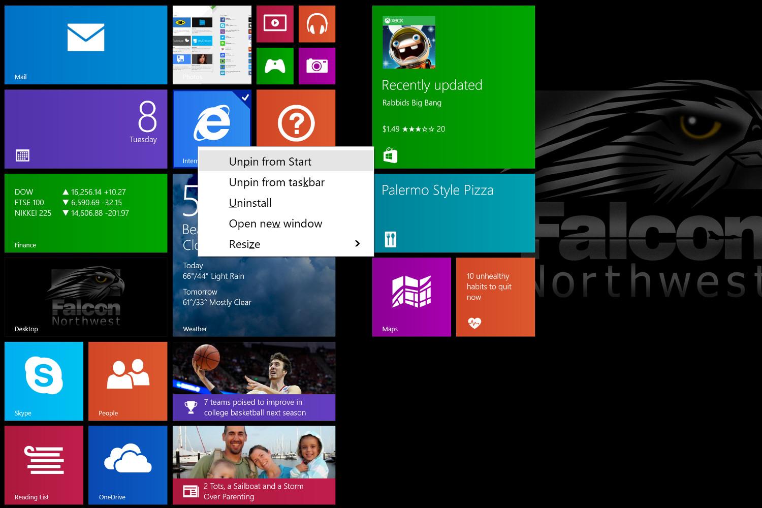
The functions provided by the new context menu were already available in earlier versions of Windows 8 via a Metro-style menu that appeared at the bottom of the Start screen. Enabling context menus for desktop users is a nice change, but is also an incredibly minor update. The app view enabled by Windows 8.1 was far more important.
The same can be said of the other update; a power button on the Start screen. Now, users can restart or shut down without opening the Charms bar when using the Modern UI. Is it useful? Sure, but this is the kind of change that should have been introduced in a minor patch a couple weeks after the original release of Windows 8, not as part of a supposedly major update.
More Start screen in your desktop
While the changes to the Start screen are trivial, a major change has come to the desktop. Metro apps can now be used there. Kinda.
Microsoft’s implementation is both straightforward and obtuse. Opening apps works exactly the same as before, but they now automatically appear on the Taskbar. That’s intuitive; users don’t have to change their behavior to make an app available on the desktop.

However, while apps can be accessed via the Taskbar, they don’t actually operate as desktop apps, because they can’t be opened in their own window. They still take up your entire display when used, and can only be minimized or split in the context of the Metro multi-tasking environment.
This is controlled via menus accessed using a new bar at the top of each app that makes an app look like a normal window, but the app behavior is the same as before. They can only be split left/right/center, maximized to take up the entire screen, or minimized to the Taskbar. There’s no way to slot a Metro app into a desktop window. At least the Taskbar can be accessed at any time by hovering your cursor over the bottom of your display and, since the apps are now on the Taskbar, they can be pinned.
The Windows Store takes center stage
We’ve been critics of the Windows Store from the very start. At release, we were dismayed by the sheer volume of junk apps, and disliked the space-wasting Metro interface. Microsoft made some efforts to fix these problems in Windows 8.1, but the Store remained out of sight (and thus, out of mind) for many users.
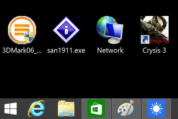
Microsoft has attempted to rectify that with Windows 8.1 Update 1 by putting the Windows Store on the Taskbar. It’s the third icon from the Start button, preceded only by Internet Explorer and File Explorer. Though some users might find this to be an annoyance, it can be easily un-pinned, and it gives developers critical eye-share. The Windows Store has to be a valid way for developers to make money if it’s to become a viable way for consumers to find great apps.
That’s just the tip of the iceberg, however. The big change can be found in Windows Search, where relevant Store results will appear automatically. Or, at least, that’s how it’s supposed to work, as demonstrated by Microsoft’s on-stage demo at last week’s Build conference.
We gave it a go by searching for common terms (like “calendar”) and for apps we knew existed. Neither provided search results from the Store. On a hunch, with the Windows Store app open, we hit up Charms-Settings-Preferences, and switched the “Recommend apps for me on this PC” setting to “On.” No dice.
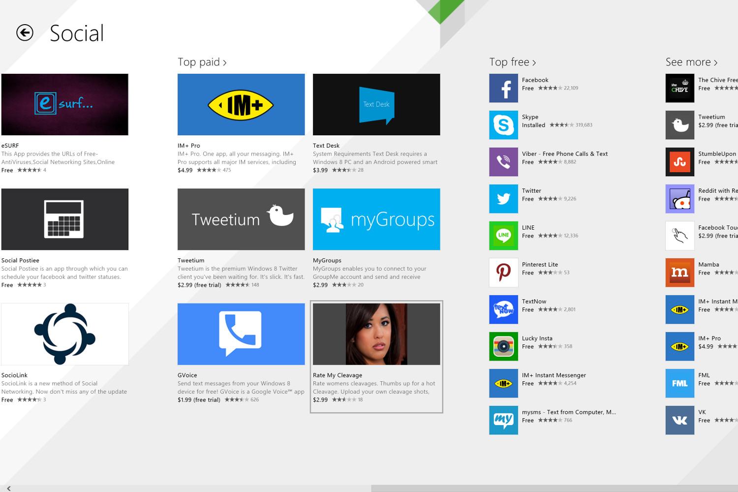
While the Windows Store changes implemented in Windows 8.1 Update 1 are positive for developers, a key piece is missing; curation. There’s still a lot of trash to sort through. Examples? We’ve got plenty. One of the top apps in the Top Paid section of Social is “Rate My Cleavage,” which costs $2.99. Several front-page security apps are actually re-skins of security software reviews available online. Plus, the vast majority of games are still half-hearted Android and iOS ports.
At least the store no longer contains apps that blatantly infringe on Microsoft’s own copyrights, so it’s heading in the right direction, albeit at a glacial pace.
Grab bag
Users with a Windows 8.1 tablet or touchscreen device will notice that not all of these changes will apply to them. The context-menu features in the Start screen, for example, are not meant to be used on touchscreen devices. Owners of such devices will likely continue to use the old Metro-style menu.
There are a few other extras worth talking about. You can now see recently installed apps highlighted in apps view, boot to desktop is now enabled by default on computers without touch, and “hot corner” features like the Charms bar now require a bit more time before they activate, which reduces the chance that you’ll accidentally trigger them.
That last change is the one we appreciate most. Laptop users navigating via touchpad should be particularly pleased by it, as touchpads have a bad habit of causing unintended hot corner activation.
Shuffling forward
The changes made by Windows 8.1 Update 1 are mostly positive. The only potential issue we can see stems from Store apps appearing in Search, which may annoy some. However, since that feature wasn’t working when we went hands-on, we don’t know if there might be an option to turn it off.
Yet, Microsoft’s pace remains frustratingly slow. Most of these features are incredibly minor changes that should have taken only a few weeks to implement. Bundling them together and calling it “Windows 8.1 Update 1” borders on the absurd. Metro on the desktop still leaves something to be desired. Users still have to deal with it to change many settings. The Store still has too many junk apps, and so on.
In other words, Windows 8.1 is still Windows 8.1. Users who liked it at release still will; users who didn’t still won’t.


