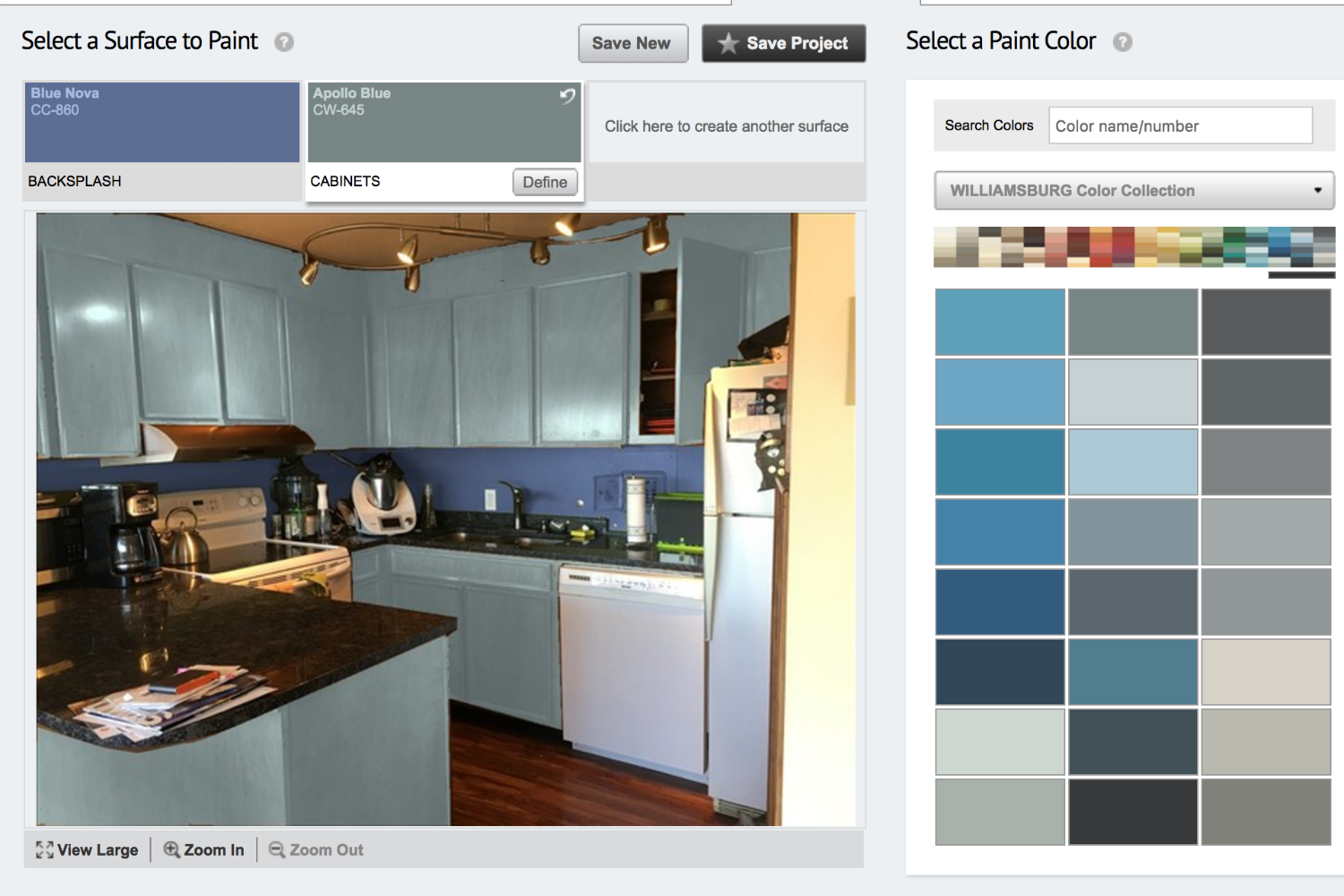
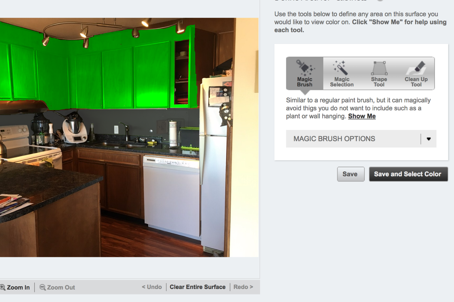
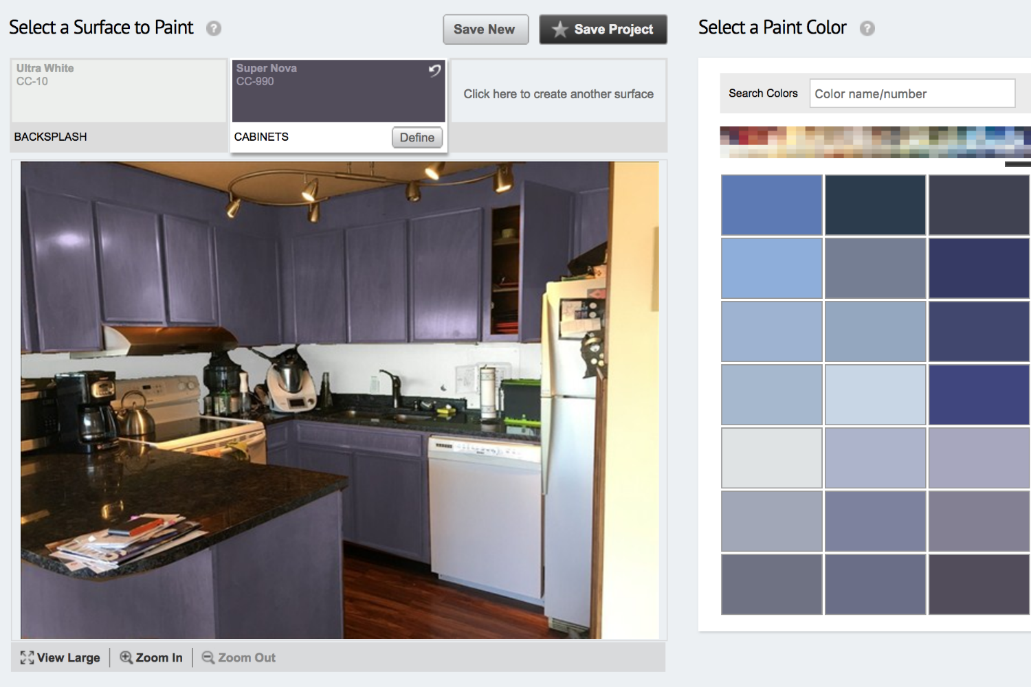
The tools are all pretty similar in how they work, but while some of them turned my kitchen into an impressionist painting, others gave me a pretty good idea of how my walls would look, whether they were blood red or soft gray. After you upload a picture of your room, you’ll get various Photoshop-eque tools that allow you to select different areas of your room. You can then start switching between different hues and see how each wall or section of cabinet will look with each color. Since I’m in the market for paint, I decided to put them to the test.
Behr Color Smart
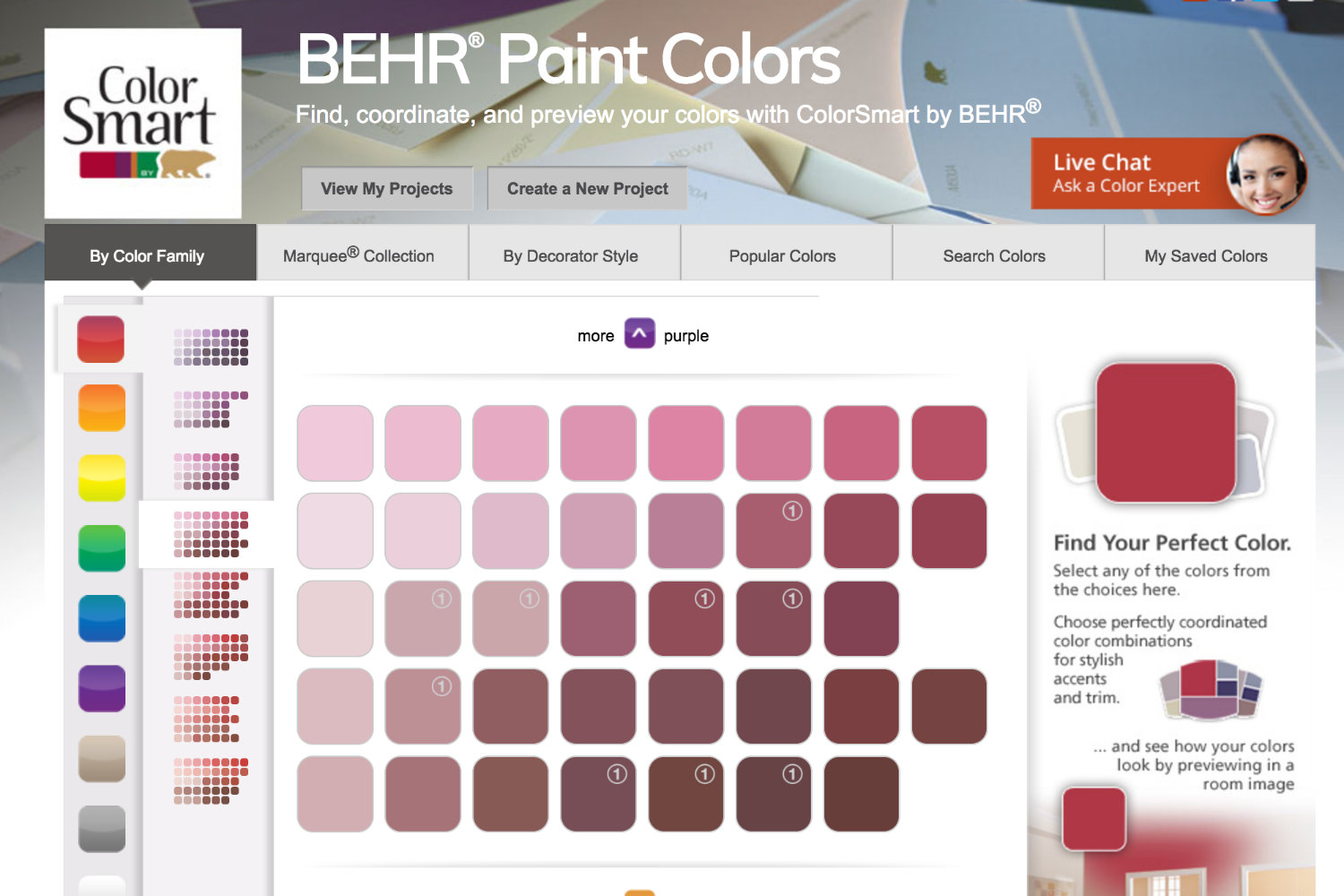
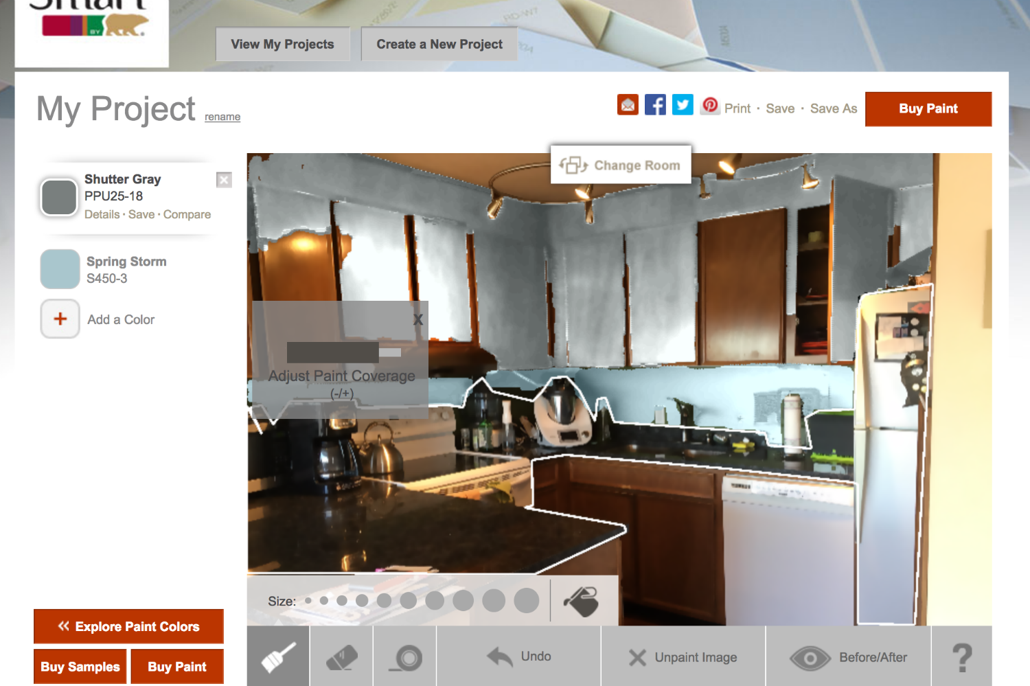
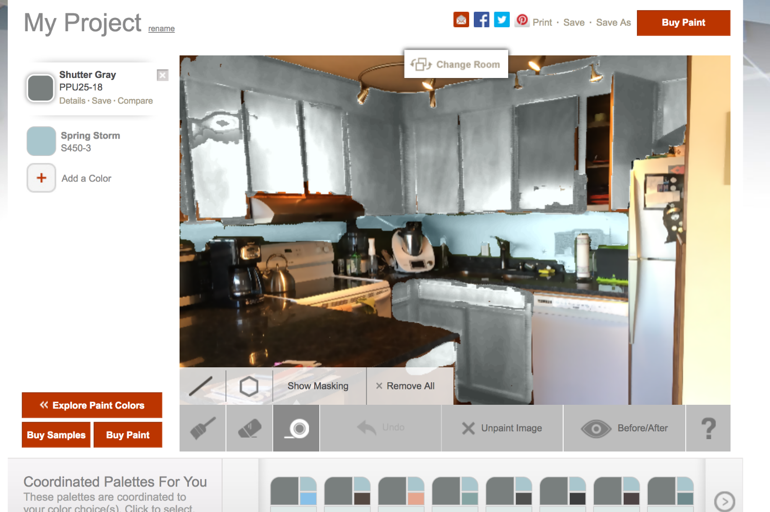
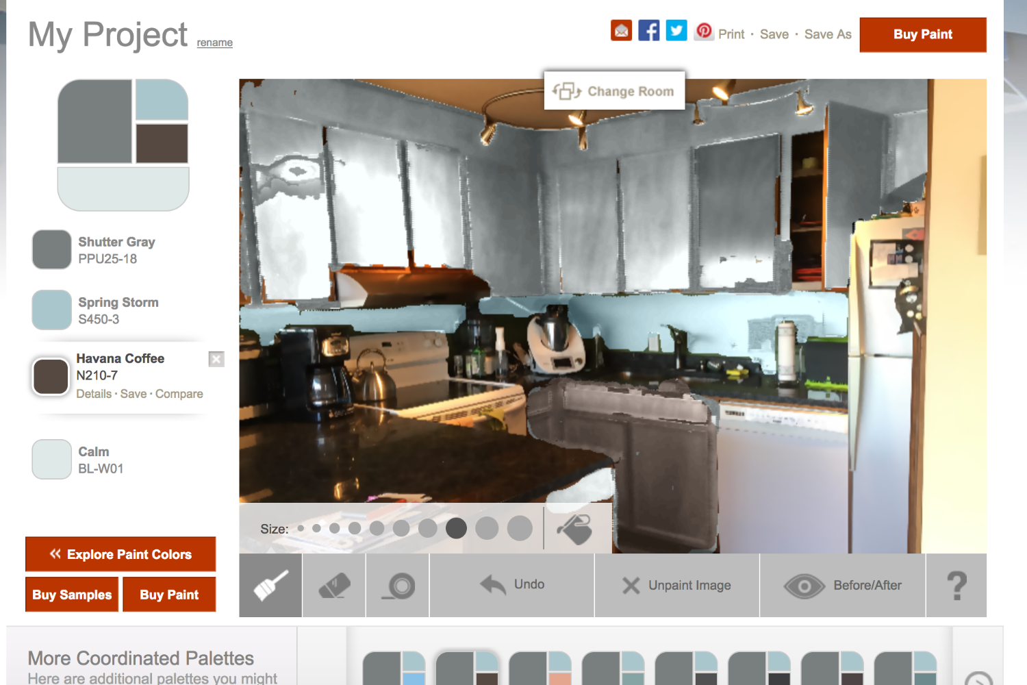
Unfortunately, Behr has one of the clunkier set of tools to work with. It’s paint bucket fills in giant globs instead of sticking to just the wall. The paintbrush has several sizes to choose from, which is nice, but it didn’t let any of the woodgrain on my cabinets show through. It turned everything into a smudgy mess. I also couldn’t figure out the point of the tape, as I could easily paint over it and ended up getting Venus Teal on the virtual countertops.
It’s too bad, because the Color Smart has a really nice palette tool at the bottom. If you find a color you love, they have several suggestions for trim and accent paints to help if you’re not color-coordinated.
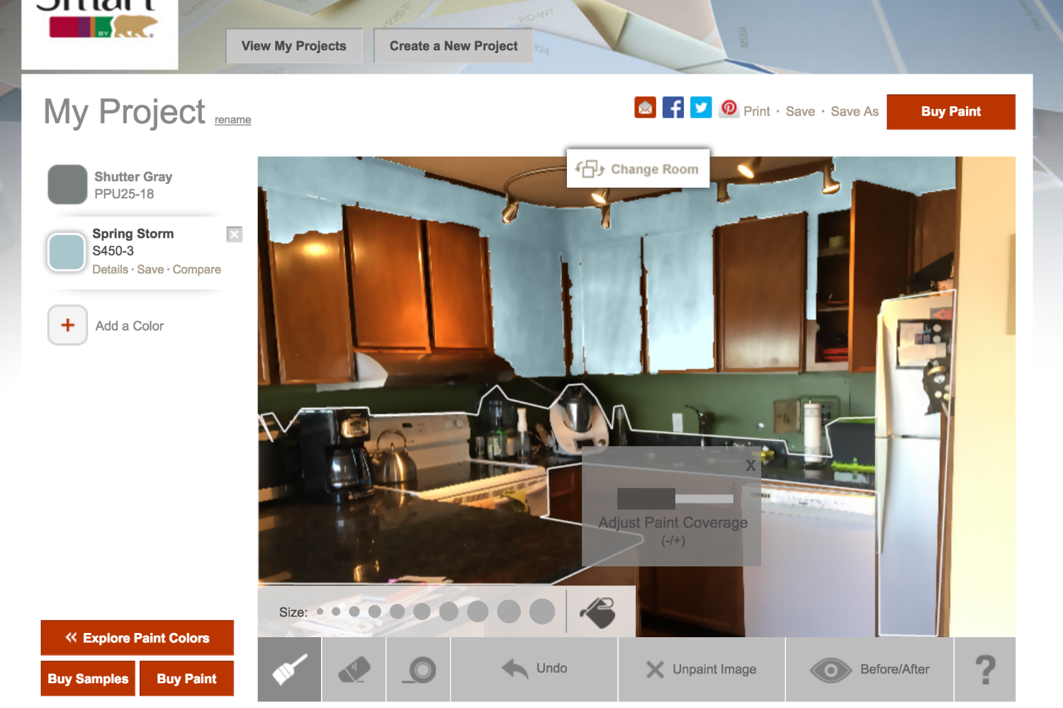
Benjamin Moore Personal Color Viewer
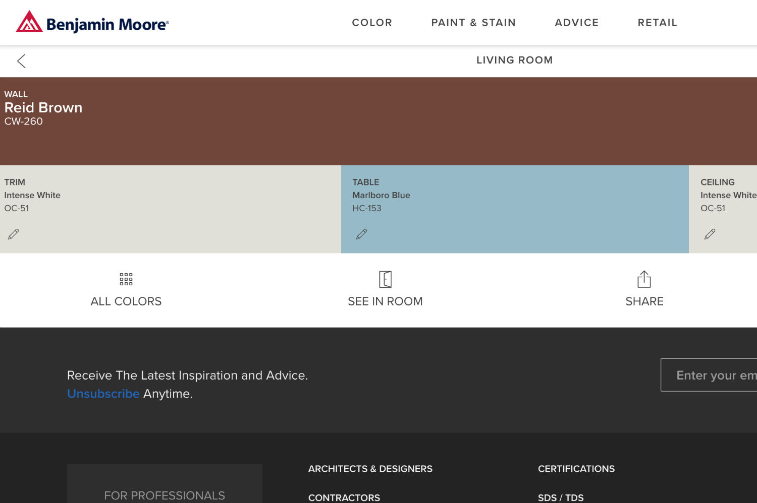
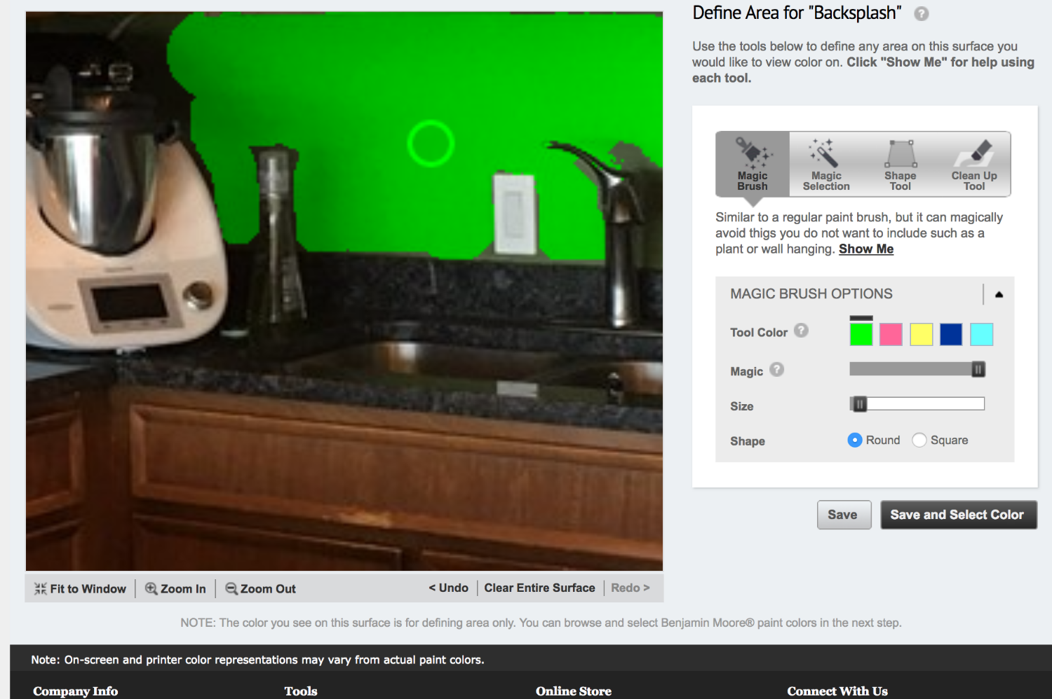
This was probably the easiest tool to work with, though it does require you to register an account. After uploading your photo, you highlight each surface you want to paint, from your ceiling to your trim to an accent wall. There’s a brush you can make round or square and adjust to various sizes, a magic wand that selects areas of similar color, and a magic shape that lets you click a bunch of points to make complicated shapes and avoid dousing your bookshelf in a new color. There’s also an eraser for mistakes. Once you have all your areas defined, you can look through various color collections and watch your ceiling transform from Blush to Beige with a mere click.
The colors seem pretty true to the swatch, which gave me a pretty good idea of how Graceful Sea differed from Atlantis Blue. The only thing missing was something within the tool to help me pick coordinating colors. If you click on the hue’s info button, it links to a page that shows you colors it “goes with,” but then you have to return to the tool and type in the color name. A small quibble, to be sure, but it’s something other tools do better.
Dunn-Edwards InstaColor
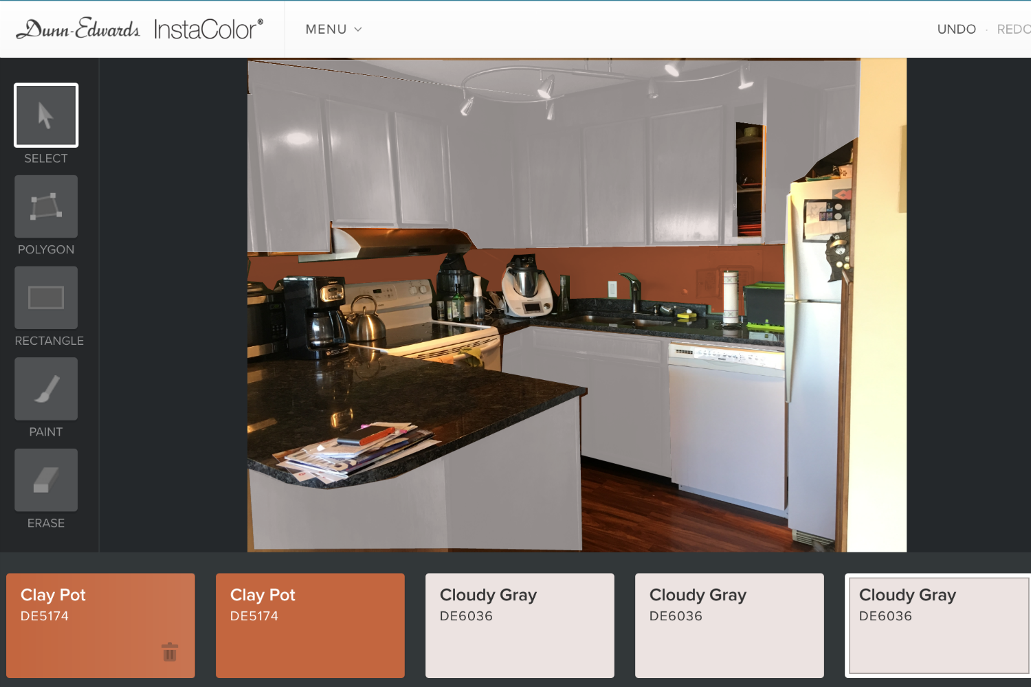
Though it has other options, I found the polygon tool to be the only reliable way to define spaces on the Dunn-Edwards InstaColor site. Still, it worked pretty well and was easy to use, though it could definitely use a zoom button. Sadly, the colors often didn’t seem to match up with the swatches. White was closer to gray, so it was hard to know what I was going to end up with. The best part of this tool is how it sets up the trim and accent options. Whenever you click on a color, it suggests one of each, and if you hover over the button, you get the name and number. When you click on either, you get a range of colors from light to dark that also work with the original hue. Even if it doesn’t give you a perfect picture of your future paint job, it’s a great way to find a color scheme.
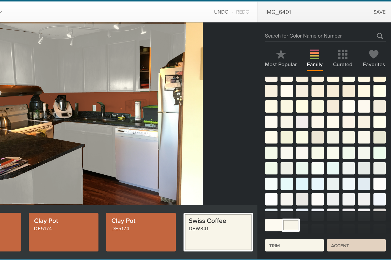
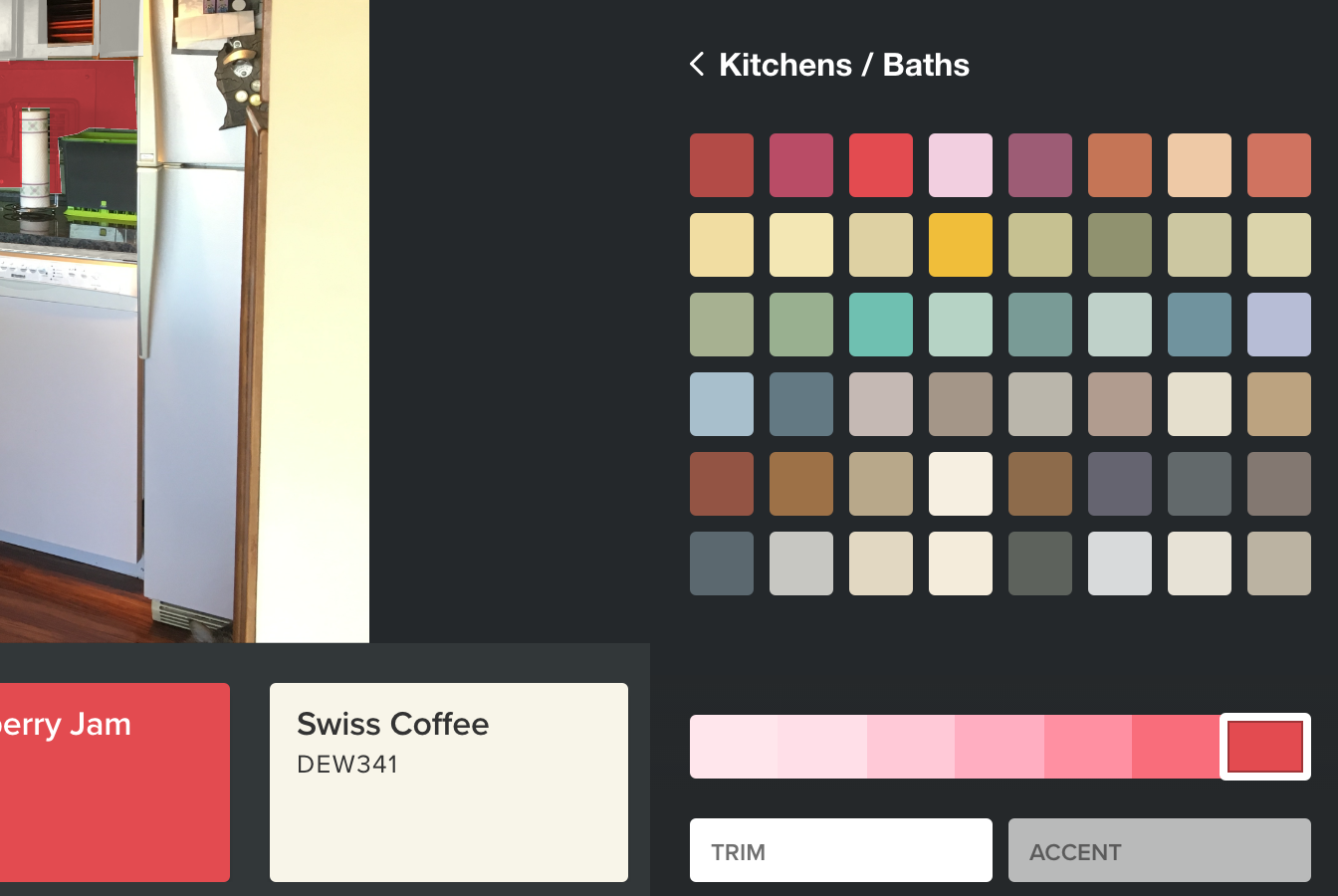
Dutch Boy/Pratt and Lambert Color Visualizer
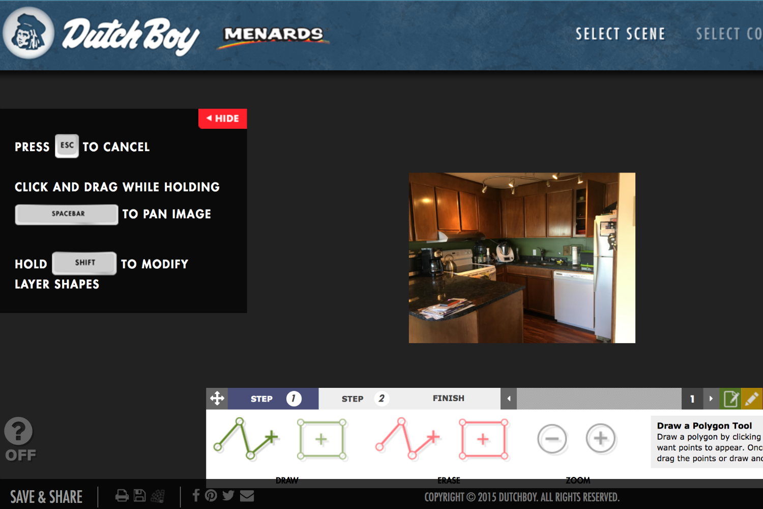
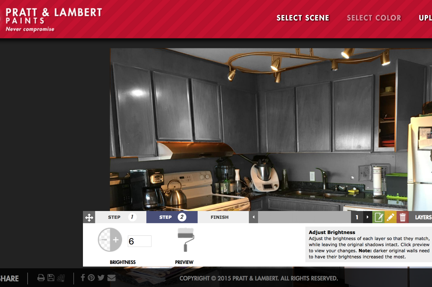
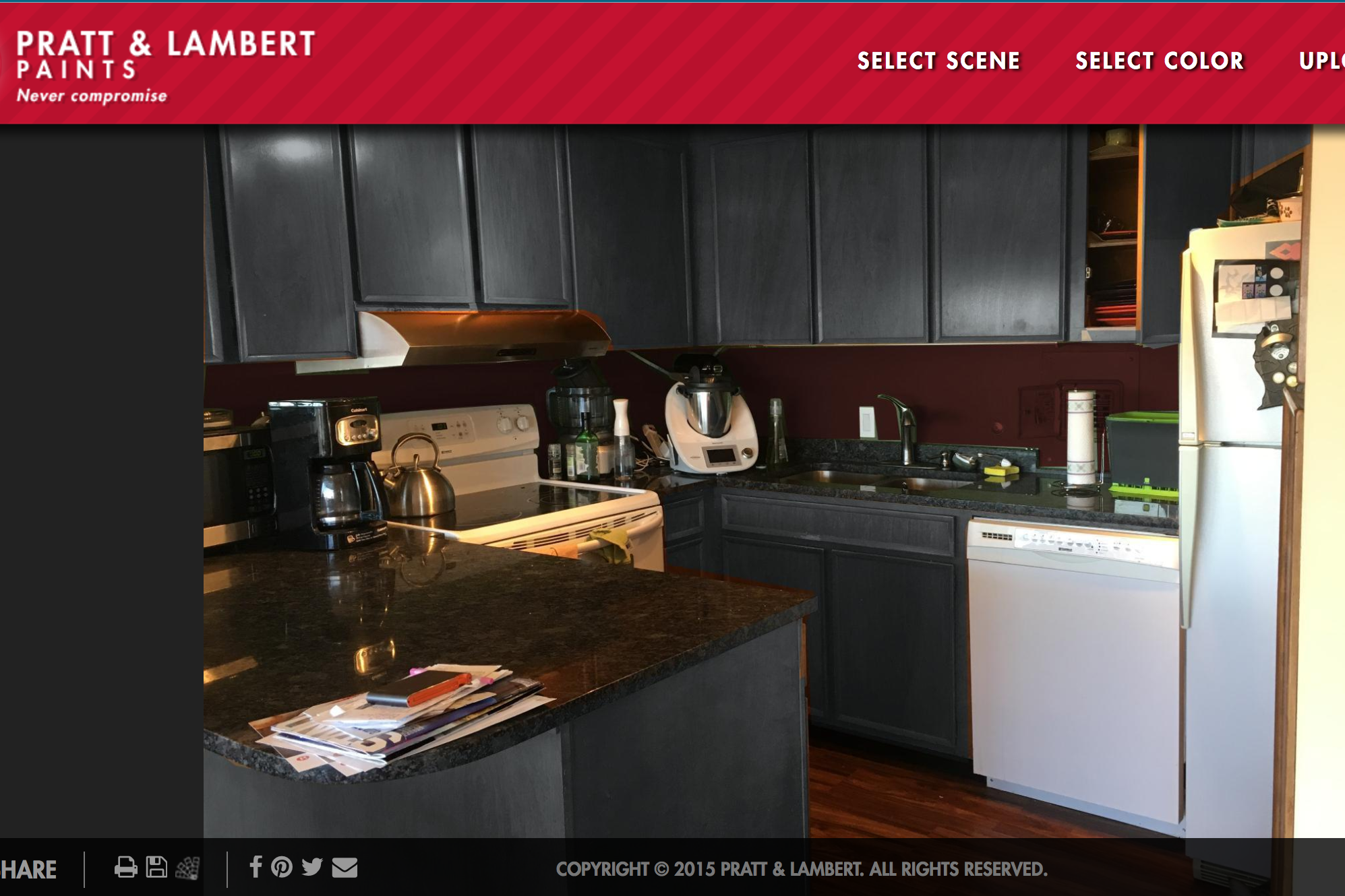
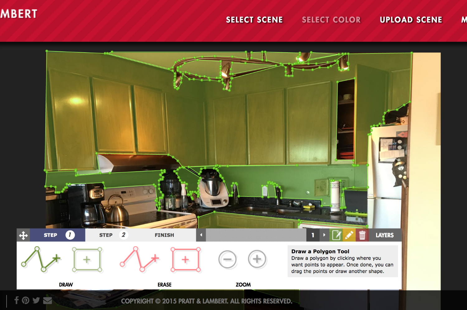
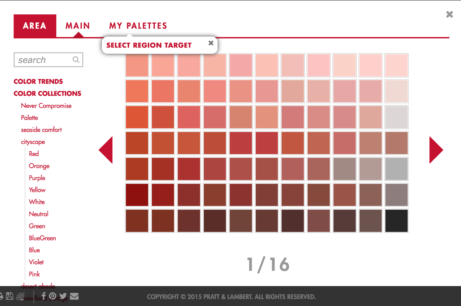
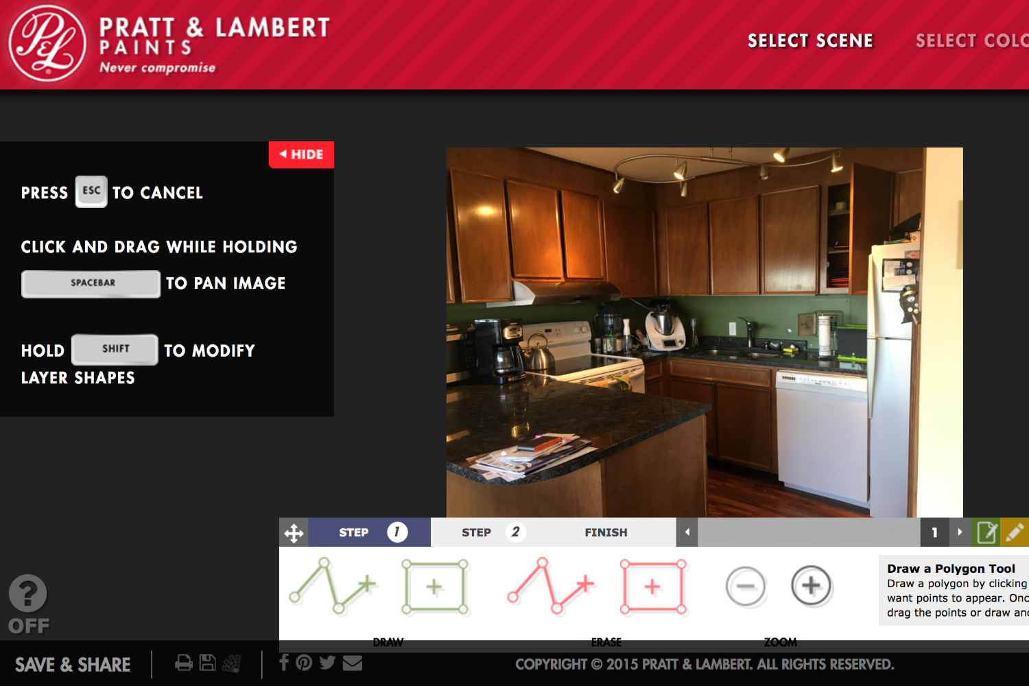
Two paint companies, one tool. The Color Visualizer is very easy to use, once you get the hang of putting little points all around a picture of your room. It gives you a lot of control, too, which helps you avoid your couch and lets you zoom in to skirt around light switches and outlets, if you want. You’ll want to make layers, because otherwise you won’t be able to independently change the color of your walls and ceiling, for example. You can also brighten or darken the walls, which is helpful for getting a more true-to-life color.
One small annoyance is that you can only select one color at a time, because a pop-up covers the image of your room when you’re making a selection. If you’re working on the ceiling and choose a taupe, it will immediately take you back to the room to show you the change. You also don’t get the name of the color from this view, and there doesn’t seem to be a way to find color palette information about it. Also, Pratt and Lambert’s selection of hues seems more robust than Dutch Boy’s.
Sherwin-Williams ColorSnap Visualizer
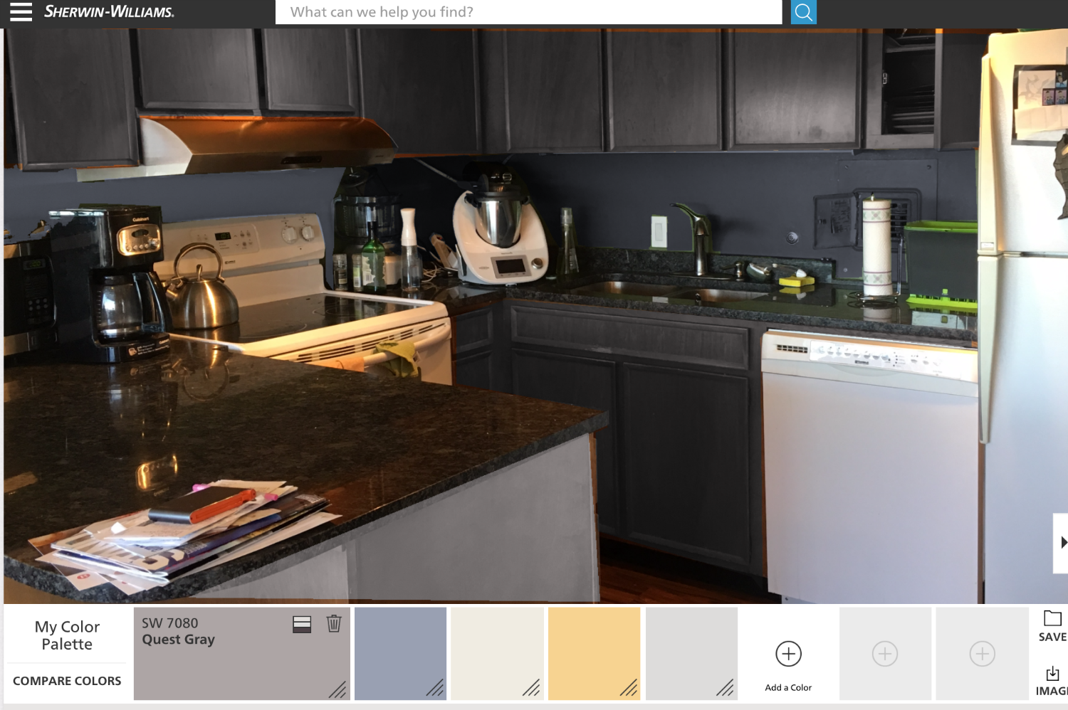
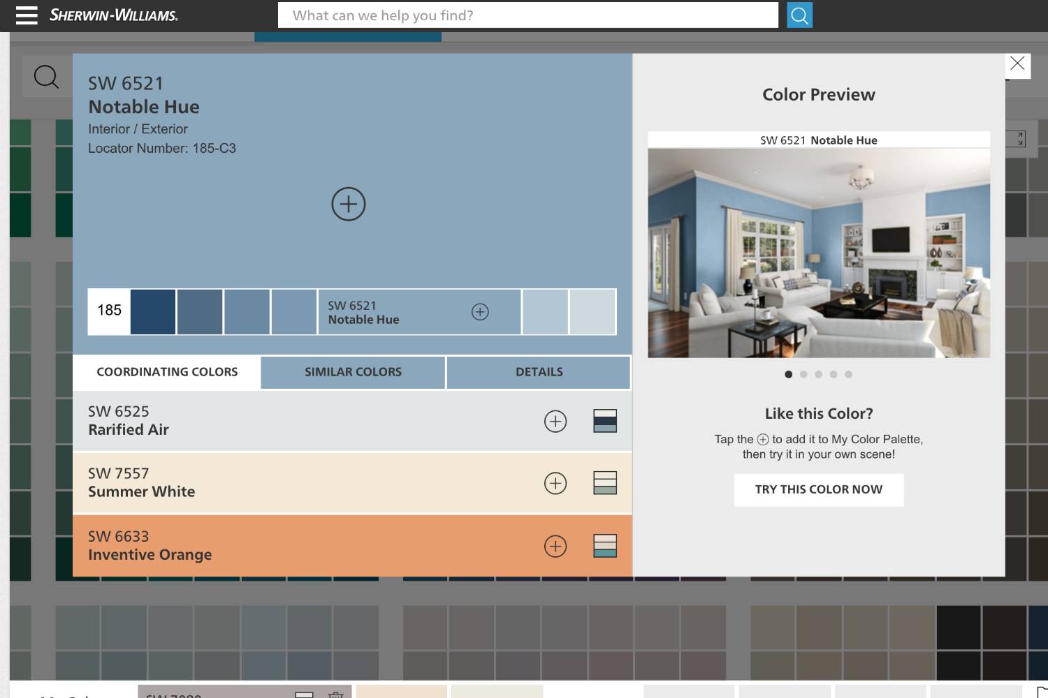
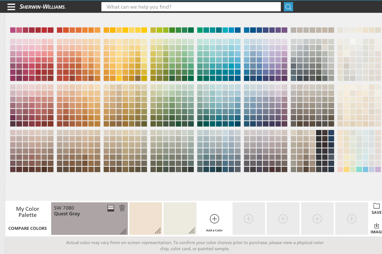
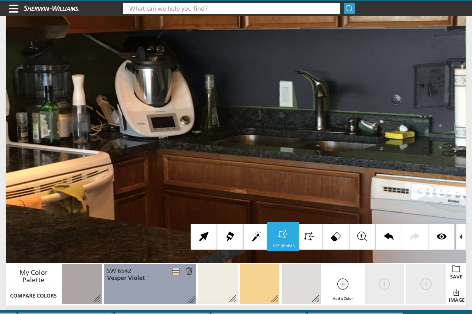
The Sherwin-Williams ColorSnap Visualizer sounds like the Dutch Boy/Pratt and Lambert tool, but it’s different. It has another fairly ineffectual magic wand, as well as a click-to-make-dots tool that works fairly well. The paint brush doesn’t have a ton of size options, but it works well with the zoom feature.
If you want to add a color to your palette, again, you’re taken away from the image of your room. If you choose a color, you’ll get coordinating hues, as well as similar colors. Along the top, there are “Get Inspired” and “Explore Color” buttons, which take you to different color collections. Unfortunately, there doesn’t seem to be a way to easily import these collections into the tool.
Valspar Virtual Painter
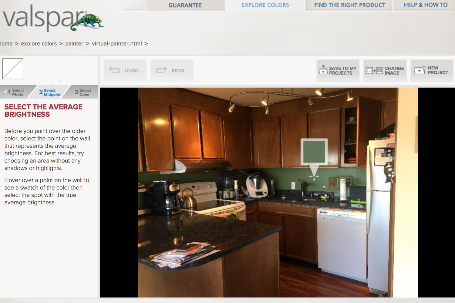
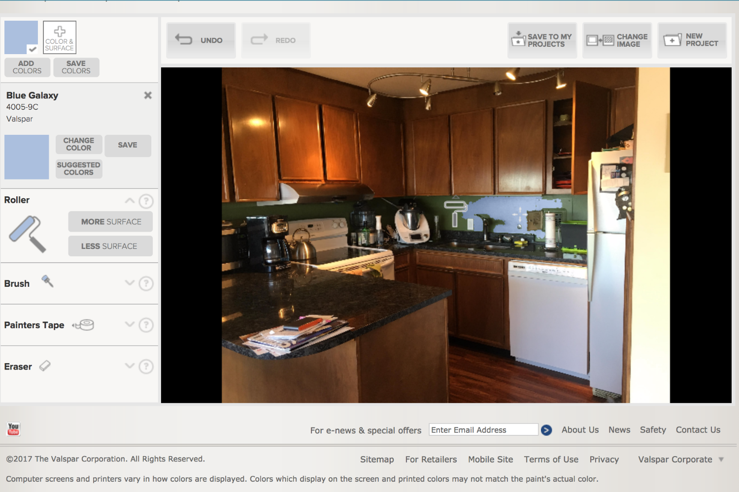
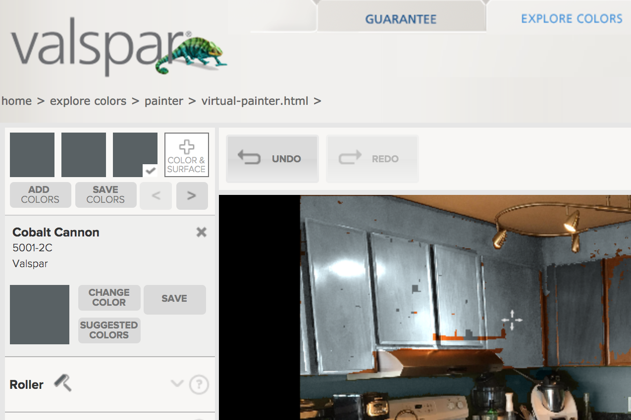
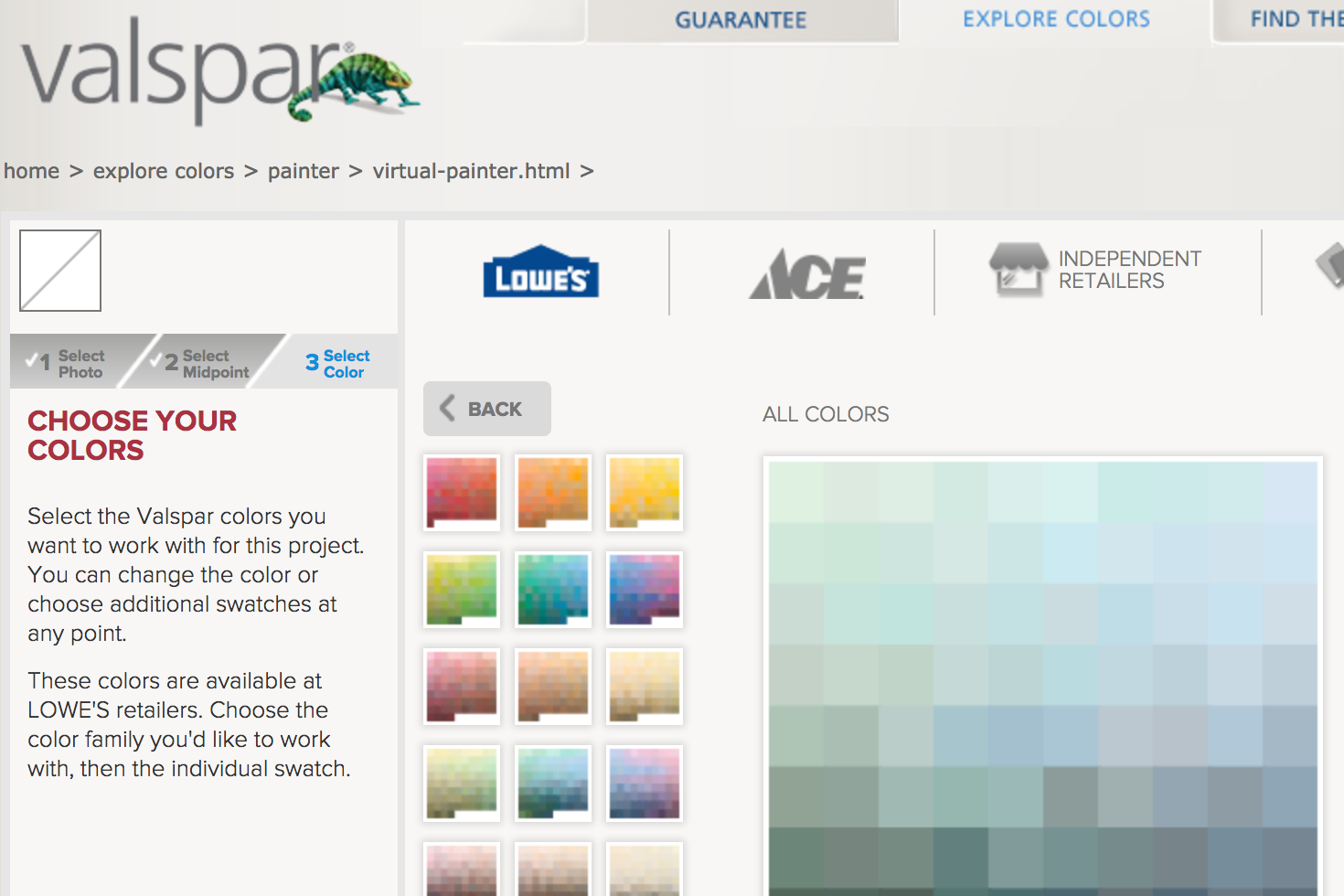
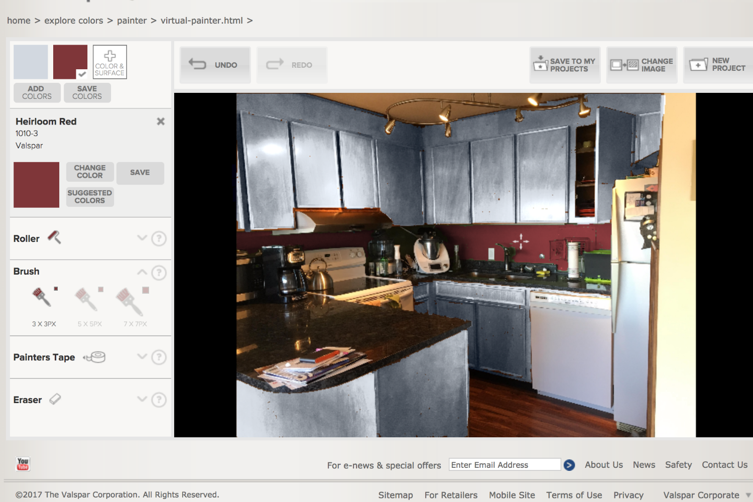
Another site that makes you register, Valspar’s Virtual Painter works a bit differently. First, you choose a spot on the wall with “average brightness.” Next, you pick the colors you want to work with, based on a retailer (Lowe’s, Ace, etc.). You can add the color with a roller, which then lets you choose more or less coverage. If the area’s color is significantly different, it may ask you to select a “midpoint” color. You can fill in spots with a brush, which comes in three sizes, and there’s also an eraser to help with mistakes. These tools are pretty easy to master, but there isn’t a zoom button to help with tight spots. The lack of a boundary tool also meant my lines always looked a little jagged where walls met the ceiling.
When you have your color selected, you can get some coordinating options via the “suggested colors” button. You can immediately select one of the nine colors and begin “painting” with it, to get an idea of how the Really Romantic trim will look with your Leather and Lace wall.
In addition, if you are looking for something different, check out our article about two-tone walls.