Google today released its highly-anticipated news reader app, Google Currents, which aims to take on the likes of Pulse, Flud, Zite, Yahoo’s Livestand and, of course, Flipboard. As with these apps, Currents is a way to read online content with a polished, re-packaged design. Seeing as Currents, which is available for both Android and iOS devices, has to compete against the awesomeness of Flipboard, we decided to try Google’s new app on our iPhone (and a couple of Android devices, just for good measure), as Flipboard just released its first iPhone app earlier this week. Here’s how Currents stacks up.
Getting started
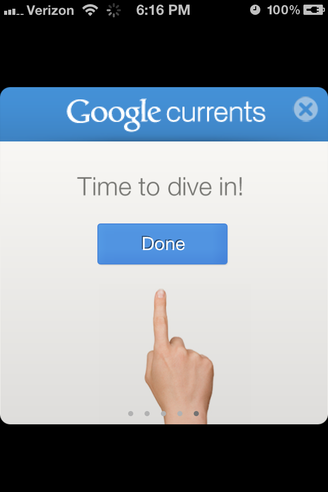 Upon loading the app for the first time, Currents requires you to login with your Google credentials, or make some, if you happened to have just arrived by UFO, and don’t have a Google ID laying around somewhere.
This requirement is a bit obnoxious, as you cannot get into the app without a Google log in. But this is for a reason; namely, so your Currents content can be synced across multiple devices, to import your Google Reader feed (which is conveniently done automatically), and probably as a way for Google to learn even more about your browsing habits (though that last bit is just a guess).
You’re then taken through a quick tutorial, which is helpful the first time. Seeing as you have to go through the tutorial every time you load the app on a new device (we loaded it on three: an iPhone 4S, a Samsung Infuse 4G and the Android-based Motorola Xoom), it does get a bit annoying, but such is life in the world of too many devices.
Subscriptions
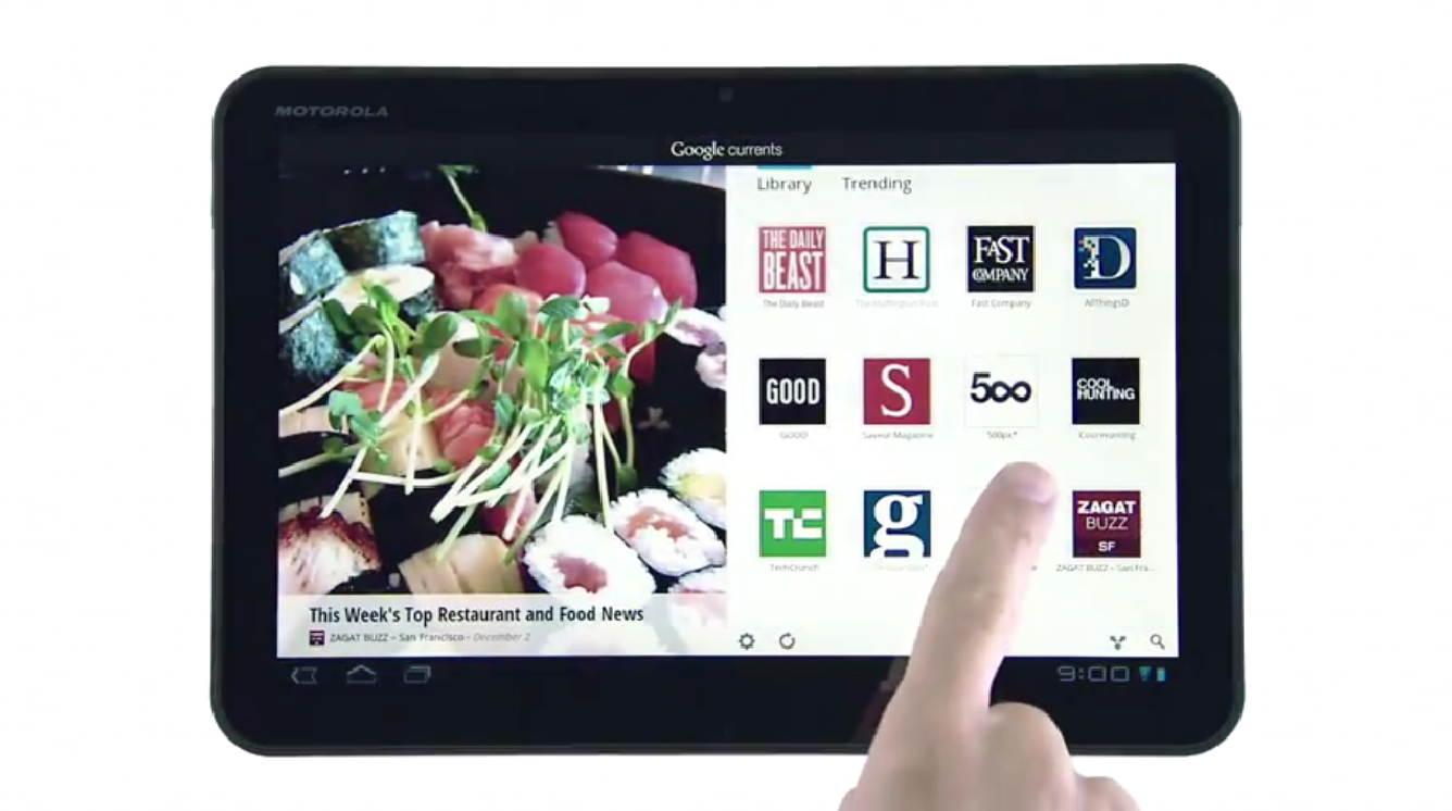
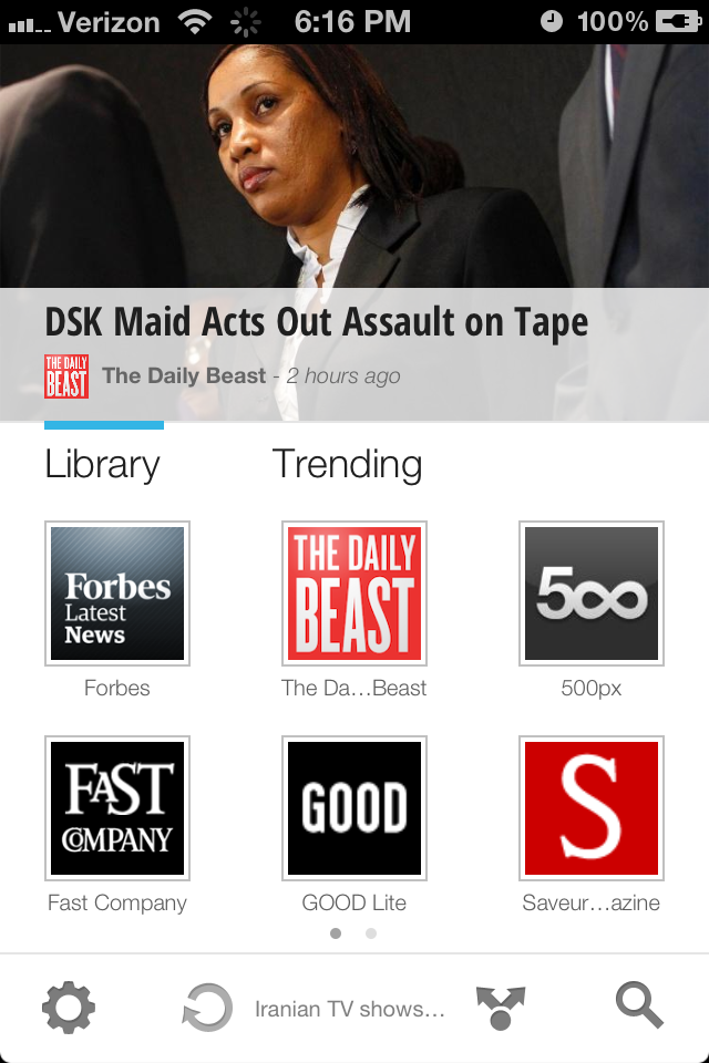 Google automatically gives you a few subscriptions, just to get your feet wet. These include publications like Forbes, Good, and 500px, all of which were pre-selected as launch partners for Currents. On the iPhone and Android phone versions, six publication icons fit on each page, and you can scroll through your subscriptions by swiping from left to right. (Twelve fit on the tablet version.)
Adding new subscriptions — chosen from a selection of about 150 publishers, at present — is done by simply clicking the “add more” icon, which appears at the end of your subscriptions list. If you add new publications on one device, then open Currents on another device, you’ll need to hit the “syncing” icon at the bottom of the page to bring all versions up-to-date.
This process — adding new subscriptions and syncing — takes a bit longer than you would expect. Rather than popping up instantly, you have to wait about the same amount of time as you do for a newly-purchased app to install on your device. This, too, has a reason: the content is being downloaded, so you can view it when your device is offline. In the grand scheme of life, this isn’t anything to get upset about. But we’re testing an app here, and by that standard, it took a frustratingly long time.
New content can also be found through the “Trending” tab, which gives you stories under a number of different categories, and groups various stories under the same topic, much in the way Google News does with related stories. This is definitely a good way to discover new content without having to already know you want to browse a particular publisher. But browsing through this was a bit confusing, as it took about four screens before you actually arrived at the story, video or picture you wanted to check out.
Content
 Currents allows you to view all the standard types of content, like articles, pictures and video. But the experience you get differs from article to article, and from publisher to publisher. Any publisher or blog can have their content reformatted to work with the HTML 5-powered Currents, and much of the layout options are left up to the publisher. (There are, however, a few standard templates, so it’s not all over the place.)
Some articles are only snippets of the full thing, with a link to the Web version at the end. For these, the full versions either load in-app, or you have the option of loading in your device’s browser. Other articles appear in total, and can be browsed through by swiping from page to page. While this isn’t so bad on the tablet version, which fits more words per page, the smartphone versions only allowed for a couple of paragraphs on each page, meaning you had to flip through page after page to read the full thing. Compared to reading the same article online, it’s much more of a hassle.
At the end of one article, Currents allows you to just keep flipping through the content, going from article to video to picture, on and on, until you hit the end of a topic or category. It’s a bit confusing at first: “Is this part of that article, or is this something else?” we asked ourselves, more times that we’d like to admit. Still, it’s a nice way to mindlessly swipe through content, much in the same way you’d aimlessly click on random links on a website.
Compared to Flipboard, we found this aspect of Currents to be far less enjoyable to use. Not only does content on Flipboard look better, but it also lacks much of the lag we experienced while browsing content through Currents.
Social features
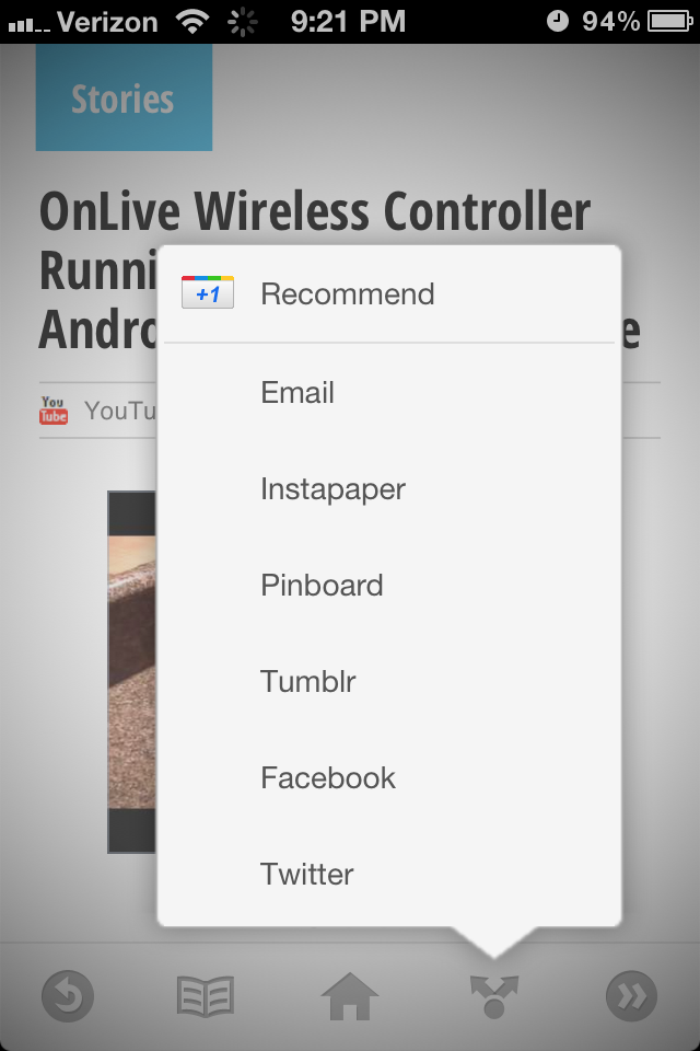 As expected these days, Currents (supposedly) allows you to post content from the app to a wide range of social networks, including Facebook, Twitter and Tumblr. You can also save to Instapaper, Pinboard, or send it via email. Of course, right at the top of the list is a Google Plus +1 Button.
Strangely, sharing content on Currents didn’t work well at all. Yes, we could post a tweet from within Currents, but it didn’t include a link or much of anything useful. Sometimes it included a headline, but not always. Sometimes it included nothing at all, as if you just wanted to post some random status update in the middle of reading about killer dolphins or whatever.
Unless we’ve totally overlooked something, and that is possible, the sharing features are almost unusable. In our experience, the email function was the only sharing feature that worked with any consistency. Google needs to work on sharing more than any other area of Currents, by far.
Conclusion
We’ve only spent a limited time with Currents, but compared to Flipboard, this really isn’t much of a competition. Flipboard just looks, and works, better. In fact, while comparing the two apps, we repeatedly got sidetracked by checking out content on Flipboard. With Currents, we didn’t get sucked in once.
That said, the one area that Currents shines is content variety. Yes, you can access everything that comes through your Twitter, Facebook, Google Reader, and Tumblr feeds on Flipboard, but it’s not as easy to choose content from specific publications, especially in bulk, as it is on Currents. And seeing as Currents only launched a few hours ago, this factor is only going to improve, assuming people continue to use the app.
Also, as with all things Google, Currents will surely get better in a wide variety of ways as Google is able to get a more feedback about what works and what doesn’t. Unlike Apple, Google is all about tweaking its products in plain sight.
Because Currents gives publishers a cheap way to repackage their content into a prettier mobile form — as well as the fact that traffic through Currents is counted by comScore, whose stats can be used to bring in more ad dollars — it’s likely that this app will only grow and blossom into a fully-functioning product in the weeks and months to come. For now though, we’ll stick with Flipboard.