
This is what Google Maps’ big redesign looks like

A screenshot of the redesigned Google Maps app, with three buttons in the navigation bar.
Redesigned Google Maps app Google

In recent years, Google Maps has felt like it’s an afterthought to Google. As Apple Maps continues to improve with better navigation, cleaner transit layers, and better information, Google Maps has lagged. That’s why we’re thrilled about the redesigned Google Maps app that Google showcased at Google I/O 2024.

Recommended Videos

The redesigned Google Maps update includes a cleaner home screen with fewer tabs, new pin colors, and a generally simplified interface. Basically, there’s a new Google Maps bottom navigation bar with three new tabs: Explore, You, and Contribute, paring things down from the five we currently have — Explore, Go, Saved, Contribute, and Updates.

Redesigned Google maps.
Redesigned Google maps Google

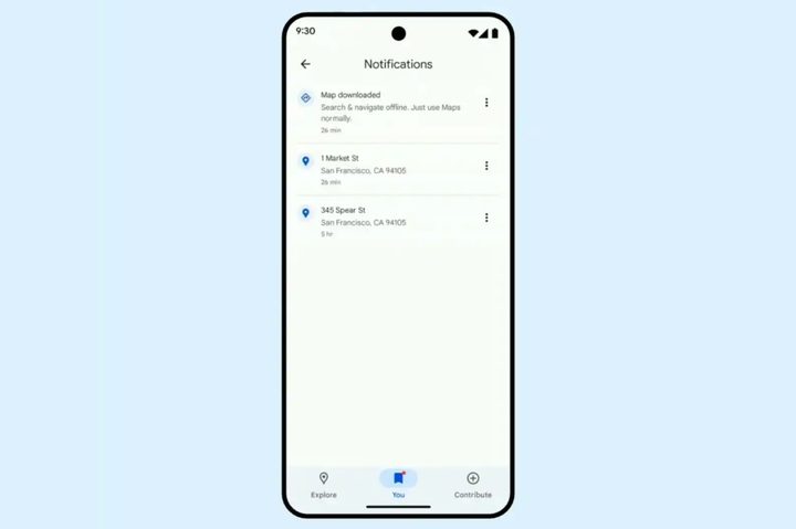
Explore and Contribute haven’t really changed in functionality. Explore still helps you navigate and discover new places and attractions, and Contribute lets you offer your own suggestions, reviews, and photos. The You tab now takes over for Saved places, but also consolidates the Notifications feed, which used to be under Updates and showed reactions and views to your reviews and comments.

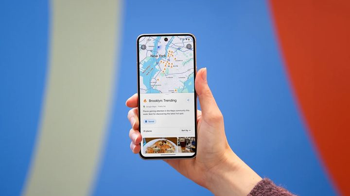
It’s great to see a simplified interface. Like most people, we never used most of the tabs on Google Maps. There are also lots of other quality-of-life features that we’re excited about. There’s a new sheet-based interface, meaning you can see and interact with things on the map without it taking over the whole screen while still getting more information at once.

The map is also visible when using different app functions, so you don’t constantly need to switch between tabs while navigating. It’ll be easier to close sheets, plus there’s a redesigned search field for directions and improved placement of transport options so that options for driving, transit, walking, cycling, and ride-hailing are at the bottom of the screen. Google is also exploring a new Arrival card design.

These changes follow Google’s other recent change in March that made creating and sharing lists better, with a particular focus on travel. You can create a new list with the aptly named “New List” button on the Saved tab, add a place to your list, and always see it pinned on your map. It’ll be organized chronologically. You can move items up and down to create a ranked list to help you visit places, similar to an itinerary. You can also link to content from your social media channels, like with Yelp, to help remind you why something is on your list.

Ajay Kumar
Former Freelance Writer, Mobile
Ajay has worked in tech journalism for more than a decade as a reporter, analyst, and editor.
Google Maps gets a screenshot tool that eases travel planning on your iPhone
AI scanning screenshots and adding details to Google Maps.

A few weeks ago, Google announced a bunch of new features targeted at digital travel planning, such as hotel price tracking and deploying AI as a personal guide. Among them was also a neat trick that could extract address details from screenshots and save them to Google Maps. 

That feature has now started to roll out slowly. Users started receiving it this week, it seems, and earlier today, Google also released a blog update instructing users on how to enable it. For now, it is focused on iOS, but the facility will soon land on Android, as well. 

Read more
Google just leaked images of the upcoming Android redesign
Design elements Google Material 3 Expressive.

Google is due to unveil its new "Material 3 Expressive" design system at I/O 2025 this month, but someone at the company accidentally published a blog post about it this week. It was promptly deleted but the Wayback Machine already archived it and the quick-thinking folks at 9to5Google saved the images as well.

The blog post itself was all about the research that went into the new design system for Android 16. Google spent three years carrying out various studies and experiments with over 18,000 participants, including:

Read more
Google Pixel Watch 4: what we want to see
Someone wearing the Google Pixel Watch 3, showing the app drawer.

Has there ever been such a quickly improved product as the Pixel Watch? Google's first attempt wasn't great, but the Pixel Watch 2 was much better, and the Google Pixel Watch 3 was, frankly, excellent. So it's safe to say there's a lot of expectation riding on the Pixel Watch 4. Will it be a showstopper like the Pixel Watch 3? Or will Google come full circle and release another duffer, like the first Pixel Watch.

Here's where you'll find all the latest leaks and rumors surrounding the Pixel Watch 4. However, since we don't have too many of those yet, we've also included a list of everything we'd like to see from the newest Pixel Watch.

Read more