When Apple announced iOS 14, it made a big deal out of its new widgets, which could be placed on the iPhone’s home screens for a new look. At the same time, apps to make custom widgets arrived, and it was also discovered the artwork used for app icons could be changed in iOS 14. With clever use of wallpaper, icons, and widgets, the home screen could be customized like never before.
Examples of amazing custom iPhone home screens started showing up online, and the temptation to emulate them grew. However, completely redesigning the home screen effectively is no easy task, and unless you’re able to do everything yourself, it may not be worth the effort. Here’s why Apple’s standard home screen customizations, layout, and operation is best left alone.
iOS isn’t Android, or a jailbroken iPhone
Before iOS 14, seeing an iPhone with custom icons and a totally different overall look to the software was clear evidence the owner had “jailbroken” their device, a complicated and often problematic process that allows the installation of third-party apps and all sorts of other questionable (if you ask Apple, at least) activities.
Otherwise, Android was the operating system to have if you wanted to really customize the overall look of your phone. Many manufacturers give you options to do so without resorting to finding custom icon packs online or downloading additional apps. Xiaomi’s MIUI is endlessly customizable, and OnePlus has a page dedicated to changing the icons, theme, and even font.

With iOS 14, you can jump through various hoops to give your phone a totally new look, without resorting to jailbreaking or switching to another type of phone. Does this mean iOS 14’s customization options come close to matching Android?
No, and if you’re hoping a brand-new look for your home screen will be a few button presses away, then prepare for disappointment. It’s long-winded, a bit annoying, and to get it right, you will have to invest time, effort, and money, as well as be creatively talented, too.
Myriad examples
This isn’t a tutorial on how to give iOS 14 a new look, so I’ll skip the how-to and talk about why you’d be keen to try it for yourself in the first place. Search Instagram, Pinterest, and Twitter for the “iOS 14 Aesthetic” and there are thousands of examples of astonishingly creative and beautiful iOS 14 homepages, all made possible with custom icons and widgets.
It’s inspirational, and who doesn’t want their phone to look different from everyone else’s? But when you look closely, the examples are often made by people who really understand design and how colors and shapes work together, whether professionally or personally. These intricate, beautifully coordinated styles don’t happen by chance.
I am not an artist or a designer. I understand what looks good, but can rarely pinpoint exactly why, and that means whatever I personally come up with won’t look half as good as the examples that inspired me. The solution is to copy the design, however unsatisfying that may be, but using these custom looks in the real world exposes why they’re best left in your Instagram Liked list.
Icons and widgets
If you’re not designing the new icons yourself, the best icon packs cost money. Most provide a list of app icons that are included, but naturally, not every app ever made will be represented. This means probably hiding away a few apps that end up spoiling the overall effect, even if they’re ones you use often. The new app icons don’t show red notification dots anymore either. That begs the question of just how important is the new look to you? More important than usability?
Let’s say you’re OK with this. Changing the app icon’s look is a manual process, with each app needing a duplicate to be created using Apple’s Shortcuts feature. Then you’ve got to hide away all the existing, original apps and create the screen’s look. So if you’ve got 80 apps, which is the average, expect to be there for some time.
At first, using Shortcuts like this also slowed things down because Shortcuts briefly opened when you tapped the duplicate app icons. In iOS 14.3, this has been changed and apps open normally, but with a banner appearing at the top of the screen telling you the app was opened using Shortcuts. It’s not intrusive, but it is distracting, as I’m conditioned to always glance up at these banner notifications.
To change the look of the widgets, you must use another app. Widgetsmith is popular, and although you have to pay a monthly subscription for the best designs, there are plenty of basic free options, too. The widgets start out with a black-and-white color scheme, but you can change this by digging into the options, and we’re suddenly back to the importance of understanding how colors and designs best work together.
To come close to those static images of pretty iOS 14 screens, you’ll have to make some compromises, spend time and money, and definitely possess a modicum of design talent to bring the widgets, icons, and wallpaper together in an attractive manner.
Apple really does know best
Home screens with stunning custom looks are perfect to share on Instagram. They are works of art, and the best art does not always lend itself well to everyday use. Apple clearly doesn’t really intend you to change icon art and widgets this way, otherwise it would make the whole operation much simpler.
Is all lost for the creatively challenged? No, iOS 14 does still provide enough customization to make your phone unique, using your own choice of wallpaper, folders, and widgets. Apple’s curated shapes, colors, and sizes ensure it’s all uniform, and that everything works exactly as Apple intended without compromises.
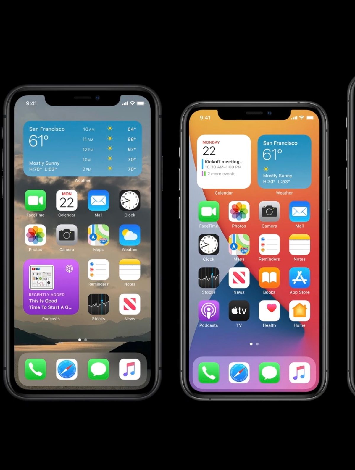
Personally, I use several Smart Stack widget arrays — where different widgets are “stacked” in a single space, and scrolled through to see the information — on my homepages. It breaks up the visual monotony of a standard iOS homepage nicely. Sadly, outside of Apple’s own apps, the choice of widgets is small, and only a handful of the hundreds of apps installed on my iPhone provide one.
Cleaning the look is aided by the excellent App Library, where all those apps you don’t really use, but don’t want to delete, go to be forgotten about. It’s placed after all your home screens, and is the iOS equivalent of Android’s App Drawer, except better because it automatically places apps into appropriate folders for you, making it easier to navigate without much effort.
Once widgets become more plentiful, iOS’s home screens will be transformed, providing a totally different look and more usability, but until then, Smart Stacks, custom wallpaper, folders, and the App Library let those of us who don’t have the talent to make our own icon packs scratch that creative itch.
It’s not a bad thing, either. Apple’s iOS home screens are easy to navigate, beautifully simple, and suitably informative. If you don’t know what you’re doing, disturbing it too much just ends up ruining it.