
“Why you can trust Digital Trends – We have a 20-year history of testing, reviewing, and rating products, services and apps to help you make a sound buying decision. Find out more about how we test and score products.“
Apple’s operating system has enjoyed some excellent updates over the last few years, and it benefited from Microsoft’s experimentation. While Redmond’s engineers tried to meld the desktop with touch, those in Cupertino happily refined the traditional keyboard and mouse experience. That approach turned out to be more appropriate. It meant Windows refined or changed features, while OS X gained new ones.
This year is different. Windows 10 has not only refined ideas that didn’t work but also added entirely new functionality. It is, relative to the yearly updates performed by Apple, a much larger leap forward, which makes it tougher for OS X 10.11 to stand out. El Capitan’s focus on refinement rather than big, headline features, only makes the situation worse.
But that doesn’t necessarily mean OS X has fallen behind. Apple’s lead has grown wide over the last few years. Some might argue too wide, as many users complained that Yosemite was buggier than previous releases. El Capitan chooses to stay the course — but is that the right decision?
Old Macs can apply
The lack of feature additions in OS X 10.11 indicates that performance and stability is the goal. Of course, that’s difficult to evaluate, particularly when Apple’s performance claims are vague. Do PDFs really open “up to” four times more quickly than before? Maybe. Maybe not. I can’t say I noticed a significant improvement, but perhaps it’s more noticeable with files larger than those I typically use.
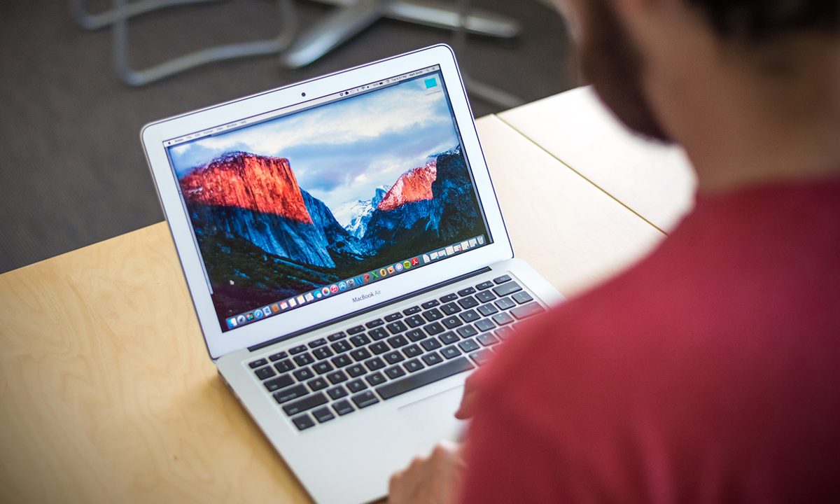
El Capitan installed and ran without a hitch on our three-year-old, barebones MacBook Air 13.
Still, Apple’s focus on performance and stability is a noticeable. Safari was a particular problem both in Yosemite and El Capitan’s beta, as it often crashed when asked to visit complex sites like Trello, an organization tool we use at Digital Trends to manage workflow. Such issues have stopped. In fact, it’s been weeks since I’ve seen the operating system, or any first-party software, crash or freeze (knock on wood).
And 10.11 does feel as snappy as promised. My review was completed on a 2012 MacBook Air with a Core i5 processor and four gigabytes of RAM — far from cutting edge hardware. Despite that, El Capitan ran like a champ. Documents and applications open within a few seconds, and animations look smooth, though OS X still suffers from occasional graphical hitches during its most elaborate transitions. That’s a problem even the quickest Mac can’t dodge.
I suspect the speed is an example of software leveraging the hardware. Though it is now several years old, the Air I used for testing 10.11 has an extremely quick solid state drive, and its Core i5 isn’t that far behind modern processors. The Air feels about as quick as a six month old Windows 10 laptop, the HP Spectre x360, that I use regularly.
No problems with wireless connectivity or stability appeared during my time with the new operating system. Wi-Fi issues were a major problem for Yosemite, and I saw no evidence of them by the time this release came around. Bluetooth also worked as it should. These are important points not only from a general connectivity standpoint but because a number of OS X features rely on them, such as Continuity and AirDrop. As with the wireless features themselves, these extras work exactly as advertised, even when connected to a previously unused Wi-Fi network.
Spotlight on language
The revision of Spotlight is my favorite addition to OS X Yosemite. It makes the operating system more usable by negating the difficulties of the Finder — which I’ve always found inferior to Windows Explorer — and drawing in results from the Web when appropriate. For El Capitan, Apple has found ways to improve it, but the new features don’t add as much to the experience as hoped.
Natural language is the big news. Like most search functions online and off, Spotlight helps users refine results by date, file type, and other filters, but using those filters can be difficult and often requires memorization of annoying booleans such as “not” and “or.” That’s no longer the case. Want to find documents from April? Type “documents from April.” Need April of 2015? Add 2015 to the end of the sentence. It’s that simple. Spotlight is hooked into Apple’s Mail app, making mail search far easier.
Natural language search is intuitive, but there are limits to what Spotlight will understand.
Or maybe not. Natural language search on all platforms and devices still suffers from a problem — limited understanding. Yes, you can search your Mac for “.doc files from March,” but don’t expect quality results if you instead ask for “Word documents from March.” In my experience, Spotlight doesn’t understand enough to really work as natural language search, because the user still has to hunt for keywords, or keyphrases, that bring up the expected results. It’s just a more approachable version of old-school search booleans.
Microsoft’s Cortana suffers the same issue. There are some things Cortana will understand that Spotlight won’t, and vice versa, but overall each has similar problems with implementation. There are two key differences, however, one in favor of Apple and one in favor of Microsoft.
Related Product: Free MacPaw CleanMyMac3 Download
A number of smaller improvements come alongside Spotlight’s natural language upgrade. New types of content can now appear in Spotlight including Web video, stocks, and weather. And the Spotlight window can now be moved and re-sized. Desktop users will love that — having search stuck in the middle of the screen was pointless on a 27-inch iMac.
OS X benefits from this better search integration throughout the operating system. This mostly boils down to Spotlight in Finder, which works the same as Spotlight launched as a search window from the desktop. Cortana in Windows 10 is currently in its own playpen, so natural language search (and other features) doesn’t work when you search through File Explorer.

But to Microsoft’s credit, Cortana offers a range of assistant functions that Spotlight can’t handle. You can ask Cortana to make or show your recent appointments, find local restaurants, or map out directions. Apple’s a bit behind in that area, since Siri is still restricted to iOS devices.
Still, Spotlight is my favorite between the two. I’ll take its better integration throughout the operating system over Cortana’s personal assistant features. This is a close call, though, and the way Microsoft integrates Cortana with other platforms may end up the deciding factor. As it stands, the fact no one uses Windows Phone is a major limitation of Cortana, but that may change if the app version of the assistant works well on Android and, later, iOS.
Wrangling windows
El Capitan continues an expansion of window organization techniques that’s been ongoing for several years. In this update there are several additions with potential, though they look better on paper than in actual use.
Split View is the obvious starting point. Finally, after years of waiting, Apple has adopted the handy window-splitting feature added by Microsoft in Windows 7. Except that’s not what the feature does. Split View applies only to full-screen view of applications. You can have two apps side-by-side in their respective full-screen modes. But windowed? Nope.
Which begs the questions: Who uses OS X apps in full-screen mode? Didn’t Windows 8 prove no one cares about full-screen apps on the desktop? There may be situations where this is a useful feature, especially with Safari, but why not allow the same feature in the desktop environment?
Mission Control fairs better. In the past Apple stacked open windows from the same program into tabs, which reduced clutter, but often made picking a specific window out of a stack of open windows very difficult. Picking the proper Word document out of four or five options, for example, was almost impossible.
Now every window has its own space. I find this an improvement, but it is a compromise, because this new tactic results in an extremely cluttered Mission Control when numerous windows are open. Apple seems to be relying on the fidelity of its Retina displays to counter this, because each app is readable even with 10 or more open. On the less pixel-dense MacBook Air I used for this review, the applications could be difficult to pick out.
If you preferred the old functionality, fear not — it’s still there as an option in Mission Control’s preferences.
It’s also possible to add windows to a virtual desktop by dragging them to the top of the screen, which prompts the desktop manager’s appearance. An application can be taken to full-screen in this way as well, by dragging it to its own space rather than a desktop.


All of this is useful, to be sure, but it’s not revolutionary, not even in the decidedly ho-hum world of window management. And then there’s Windows 10. Microsoft finally ripped off Mission Control with its new Task View, but Apple hasn’t emulated Windows’ Snap feature, which makes it possible to easily add windows that cover only half or a quarter of the display. It’s incredible how significant the changes to Windows 10 feel. Before it, OS X was easily the better solution for users that multi-task; Microsoft has confidently retaken the crown.
Related Product: Free Macpaw Gemini Trial
I also must mention my continued disappointment with the OS X dock. It has never appealed to me much, as I feel it’s over-populated by default apps, too large at its default size, and odd-looking when sized as small as I prefer, and it doesn’t summarize currently open applications as well as it could. Besides, its context menus aren’t as informative as the Jump Lists in Windows 10. Opinions certainly vary on this topic, but in my view the dock could use an overhaul.
New Notes, Transit in Maps, and more
Apple’s keynote covered a number of improvements to its bundled applications. These always end up coming across as vague, because it’s hard to lump them together during a presentation, but you shouldn’t ignore these enhancements.
El Capitan throws those who do enjoy full screen usage a bone by providing better multi-tasking. That’s important, because in prior versions those who used Mail didn’t have an an easy way to switch between open messages in-app. If you wanted to compose a message, then switch back to your inbox, then switch back to the draft you were composing, you had to use Mission Control. That’s no longer true. You can’t open many messages and navigate between them, however — only one is supported at a time.

There are also numerous feature tweaks. You can now swipe on the touchpad to dismiss emails, as you might on an iPhone, and there are new one-click options for adding people who email you to Contacts, or adding invitations to Calendar. Also, as mentioned earlier, Mail offers Spotlight’s new natural language search.
Mail has been in good shape for several years, and that remains true in El Capitan. It’s not exceptional, but it does its job well, and is a bit more feature-rich than the default Mail app in Windows 10.
Notes
Notes has been significantly redesigned with a focus on media. Users can now drag-and-drop links, photos, and other files into the app, which greatly expands its utility. An attachment browser makes it easy to find specific media. But the Notes app is still no rival for OneNote or Evernote. This is because it works the most like a physical notebook out of the three — it’s basically a fancy text document. Still, the improvements are welcome, and may keep users who would otherwise turn toward those alternatives.
Maps
Another big addition is Transit for Maps. While the keynote spoke of this feature only in the context of iOS, it’s available in El Capitan as well. I decided to give it a try and was immediately greeted by the message “Transit data for Portland is not available.” Apple is rolled out Transit only for San Francisco, New York, Baltimore, and Washington, D.C. (as well as some cities in China) initially. Other cities have been added since then, but not my admittedly small hometown.

Windows 10 also has a Maps app, and it’s better in almost every way. It offers public transit directions for most cities across the globe, more detail in its 2D maps at any given level of zoom, and better clarity in 3D view. Mac users will still need to use Google Maps for any serious navigation.
Safari
Safari has received two minor interface additions. One is a new “pinned sites” feature, which can permanently pin websites of your choice to the left side of Safari’s tabbed interface. These sites display only an icon or abbreviation to save space. The other addition is the ability to mute tabs by clicking the speaker icon on an open tab that’s playing audio.
In addition, Safari now can AirPlay to Apple TV without sharing your entire desktop view. Yosemite allowed AirPlay, but the entire desktop was mirrored, which could be rather inconvenient.
Here’s the most certain statement I’ll make in this review — Safari trounces Microsoft’s Edge browser. The latter doesn’t stand a chance. Whether or not Safari is good enough to serve as your primary browser remains up for debate, but I personally use it whenever I’m on a Mac, and in fact prefer it over Chrome.
Photos
While it’s technically not a part of El Capitan, as it recently rolled out to older versions of OS X, it’s worth mentioning that Photos recently received a major update. The much-needed change revised the interface to look more like the iOS app. That means a flat design dominated by whites and grays along with a zoom feature that lets users see months or even years of photos at once.

Photos for Windows 10 has an inverted column scheme, favoring a black background and other dark accents, but it otherwise follows a similar philosophy. Both Apple and Microsoft present your photos as either a continuous stream broken up by date and/or location, or a series of albums. For the most part, this works well, though I find it frustrating that neither app makes it obvious where photos are located on either your local drive or cloud storage account.
Also, the fact that no one uses Windows Phone puts Microsoft’s incarnation at a disadvantage, as an average user is far more likely to be using iCloud than OneDrive for cloud photo storage.
Disk Utility
While the average user might not notice this update, enthusiasts will certainly enjoy the new Disk Utility. It has been overhauled to provide an intuitive visual breakdown of how drive space is being used, and drive functions (like erase or image) are more prominently displayed.
Microsoft also updated how storage use is displayed in Windows 10, through a module in Settings. Its visual breakdown is similar, but offers more detail, because users can easily drill down into each category to see exactly how much space a specific application or file is taking. Users can also uninstall or delete data directly from the Storage menu.
Apple doesn’t offer such detail, and thus its Disk Utility isn’t as useful for managing how much is stored on a particular drive. However, Apple has a major edge when it comes time to partition or format drives. Disk Utility in OS X makes these tools easy to find and use. Partitioning a drive is as easy as manipulating a pie chart. Windows 10 does not offer an such features in its Storage tool, forcing users over to the confusing and archaic Disk Management app to accomplish such tasks.
Security (two-factor authentication, System Integrity Protection)
El Capitan replaces the earlier “two-step” verification system with a new “two-factor system.” For the most part, it appears ease of use was the real motivation for the change. The new system removes the “choose a trusted device” step from logging in, and instead sends a code to all of your trusted devices. Apple says the old system will still be available, for users who don’t update to a new operating system or feel the new system is not as secure.
System Integrity Protection prevents critical system files and folders from being modified even by a user with root access.
Apple is also taking an axe to the recovery key. If you don’t remember what it is, you’re not alone. Many users seem to forget this 14-character code which used to be generated when two-step verification was first set up. That meant a lot of users were locked out of their accounts. Now, users will have to call in to perform account recovery, which includes providing “a verified phone number where you can receive a test message or phone call.”
There’s also a new security featured called System Integrity Protection, which prevents critical system files and folders from being modified even by a user with root access. In theory this feature should defeat attacks that rely on privilege escalation to gain root-level authority and then cause havoc. Whether it will work in practice remains to be seen.
More like El Ensign
Apple’s last two updates to OS X, Mavericks and Yosemite, deserved praise. Both added significant features and modernized the aging interface while unifying portions of OS X with iOS in a way no other company can mimic. The fact that both updates were free was icing on the fat, delicious cake.
El Capitan is a snack by comparison. Its additions are appreciated but minor, and some features (like Split View) aren’t as useful as they seem at first glance. The apparent performance and stability of the operating system on the aging MacBook Air I used for this review is appreciated, but then again, Yosemite wasn’t exceptionally slow or unstable — for me, at least.
There’s no reason not to update to OS X 10.11, as it’s free and doesn’t contain any major problems. Still, the new version of OS X doesn’t make much of an impression. Windows 10 has the momentum this year, and El Capitan does nothing to change that.
Highs
- Spotlight integrates with Finder and Mail
- Runs well on mediocre hardware
- A wide array of useful app updates
- New security against root-level attacks
Lows
- Natural language search could be more intuitive
- Split view is limited compared to Windows Snap
- Most app additions are unremarkable