  1. Home
  2. Social Media
  3. News

Facebook’s rebrand isn’t quite as drastic as Twitter’s

Add as a preferred source on Google

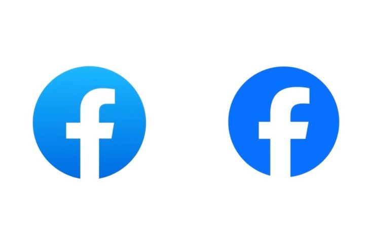
Facebook's new logo.
Facebook’s new logo (right) beside the previous one. Meta

There were probably many meetings, some of them drifting beyond regular work hours. Whiteboards likely saw much scrawling and a good deal of wiping. Discussions were probably heated, fists banging on tables as proposals were defended against scornful criticism. And after all that work, after all that intense input, Facebook’s new logo is … well … almost identical to the old one.

Recommended Videos

Facebook owner Meta recently decided that the social networking platform was due a brand refresh, but not quite on the scale of the one that saw Twitter recently transform into X, a drastic overhaul that banished the iconic blue bird logo in favor of a black-and-white “X.”

Realizing that the white “f” on a blue background continues to have massive global recognition, the Facebook team behind the refresh decided it would be a good idea to go with a white “f” on a blue background. With a couple of very subtle changes.

Here’s the team describing its approach:

“Our intention was to create a refreshed design of the Facebook logo that was bolder, electric, and everlasting. Each of the distinctive, new refinements drive greater harmony across the entire design as a key element of the app’s identity. We’ve done this by incorporating a more confident expression of Facebook’s core blue color that is built to be more visually accessible in our app and provides stronger contrast for the ‘f’ to stand apart.”

Which can basically be summed up as: “Bigger ‘f’, darker blue.”

Facebook’s director of design, Dave N., said the goal of the team’s work was to “expand upon our foundation and create the defining mark of our brand that anchors the identity system across Facebook.”

He added: “We wanted to ensure that the refreshed logo felt familiar, yet dynamic, polished and elegant in execution. These subtle, but significant changes allowed us to achieve optical balance with a sense of forward movement.” So, are you feeling that optical balance and a sense of forward movement?

Facebook’s wordmark has also been redesigned “to create a consistent treatment and improve overall legibility across Facebook,” a redesign that is again hard to spot, but which apparently allowed the team behind it to “build upon the heritage of our identity, while creating a stronger relationship between how the wordmark pairs with the rest of the typeface.”

The changes are certainly subtle, an approach that the team ultimately considered as the best way forward for a brand that’s already doing rather well, with an incredible 3.08 billion people — or 38.4% of the global population — checking their Facebook account at least once a month.


Trevor Mogg
Contributing Editor
Not so many moons ago, Trevor moved from one tea-loving island nation that drives on the left (Britain) to another (Japan)…
Meta used AI to make your Instagram feed harder to quit
Meta says its latest AI recommendation sytems are keeping people on Instagram longer by serving up more relevant Reels and Feed posts.
Instagram open on iPhone

Caught yourself scrolling on Instagram a lot longer lately? You're not imagining it. Meta just told investors what's driving that trend, and AI is at the center of it.

During its second-quarter earnings call, Meta said time spent on Instagram grew by double digits year over year after rolling out new AI-powered recommendation systems. According to the company, the biggest gains came from improvements to how it recommends Reels and other public content, making it easier to surface videos people are more likely to watch.

Read more
Meta’s latest courtroom losses expose a potential hole in social media’s strongest defense
Plaintiffs are treating engagement features as deliberately designed products, an argument that could make Section 230 far less useful
facebook

Two jury losses have given plaintiffs momentum against Meta, but they haven’t rewritten the rules for social media. One case relied on New Mexico consumer-protection laws. The other asked a California jury whether addictive design contributed to a young woman’s mental-health issues.

The verdicts, detailed by The Wall Street Journal, reached Meta through different legal routes. Together, they suggest Section 230 becomes a less dependable shield when a lawsuit centers on choices made by the platform itself.

Read more
Meta AI is moving into your Threads DMs, where awkward AI chats belong
Because not every AI conversation deserves a spot on your followers' timeline.
Meta AI in threads DM

One of the reasons Grok AI became so popular is because it let people chat with it directly on X, resulting in some hilarious conversations. And while the public availability of Grok AI on X has resulted in numerous safety issues, there's no denying that this openness played a major role in its rise. 

It seems Meta wanted the same, which became evident when the company started testing Meta AI directly on Threads a few months ago, letting users chat with it right in their feed. But not everyone was comfortable having those conversations out in the open, so Meta has just moved its Meta AI inside your Threads’ DMs. 

Read more