1. Home
  2. Computing
  3. News

This Windows 11 update makes Start Menu much more desirable and usable again

Add as a preferred source on Google
The Dell XPS 13 on a table with the Start Menu open.
Digital Trends

The Start Menu has been the central element in Microsoft Windows for nearly three decades. Though loved initially for its resourcefulness, the Menu went through some debatable — I call them abhorrent — changes with Windows 8, but eventually returned to occupying less space in the interface with Windows 8.1, and then Windows 10 and 11. Despite the rescuing, it is still reeling under the damaging changes in the form of recommendations and random automatically populating lists that reduce it to a mere glorified search interface. However, Microsoft may now be looking to resolve these issues and bringing back a more simplified interface with an upcoming update.

Microsoft is testing a new interface for Start Menu on Windows 11, reducing the existing clutter of randomly interspersed apps and files. X user @phantomofearth, renowned for testing new features in Windows Insider builds, gave us a good look at the new interface in a detailed video walkthrough.

Hidden in today’s Dev/Beta CUs: a major update to the Windows 11 Start menu! It has a new, larger layout with everything on one scrollable page, with the “All” list below recommendations – which can FINALLY be turned off! Pinned list is now limited to 2 rows, but can be expanded. pic.twitter.com/JkP3V2I5g6

— phantomofearth 🌳 (@phantomofearth) April 3, 2025

First off, the video shows that the updated interface rids away of the current split view that comprises Pinned and Recommended sections and merges them into a single section. It adds a third section labelled All, which lists every installed app, which was previously accessible by clicking the All button next on top of the Pinned section. These can be arranged into an alphabetical list or a grid with folders compiling apps based on their category.

Recommended Videos

The overhauled Start Menu also gets a vertically scrolling layout, so all your apps can be accessed through a single page with fewer button clicks or taps. In addition, the Start Menu also lets you hide recommendations entirely if you’d like it that way. The idea is to seemingly give Windows 11 users more control over the menu’s usability.

While it’s difficult for the Start Menu to return to its glorious Windows XP days, I expect some respite from the barrage of unwanted ads with these improvements.

These changes are coming to the latest Windows 11 Insider preview builds in the Dev and Beta channels, with build numbers 26200.5518 and 26120.3671, respectively. That means you can’t immediately access it unless you are part of those Insider channels.

Microsoft hasn’t officially made any announcements on when the new Start Menu interface will be available for stable channels — and whether it will be or not. However, with Microsoft’s Copilot event, along with the company’s 50th Anniversary celebration, lined up for early morning tomorrow, we can expect it to share some news.

Tushar Mehta
Tushar is a freelance writer at Digital Trends and has been contributing to the Mobile Section for the past three years…
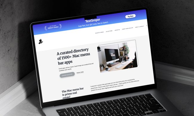
This website is a goldmine if you love Mac menu bar apps
Discover hundreds of menu bar apps, from tiny utilities to powerful productivity tools, all in one place.
MacMenuBar website open on Mac

The menu bar is the most underrated part of macOS. It sits quietly at the top of your screen, and most people never do anything with it other than checking the time and battery percentage. But if you find the right apps, that thin strip becomes the fastest way to get things done on your Mac.

The problem is finding those apps. The Mac App Store is not great at surfacing them, and hunting through random blog lists is a chore. And while I have shared my favorite Mac utilities that include menu bar apps like Supercharge and CleanShot X, there’s an even better place to find the best apps for your Mac’s menu bar.

Read more
How to install macOS 27 Golden Gate public beta on your Mac?
From a smarter Siri to a more reliable Spotlight, here's your full walkthrough for installing macOS 27 Golden Gate's public beta today.
macOS 27 Golden Gate

Along with iOS 27’s public beta, Apple has also released macOS 27 Golden Gate’s public beta build, so that early adopters can get their hands on the new features, including Siri AI, and provide timely feedback to help ensure a stable iOS launch in September. 

If you’re sold on all the new features but don’t want to put your faithful MacBook through developer beta duty, a public beta offers a much more refined experience. To install macOS 27’s public beta, follow the steps given below. 

Read more
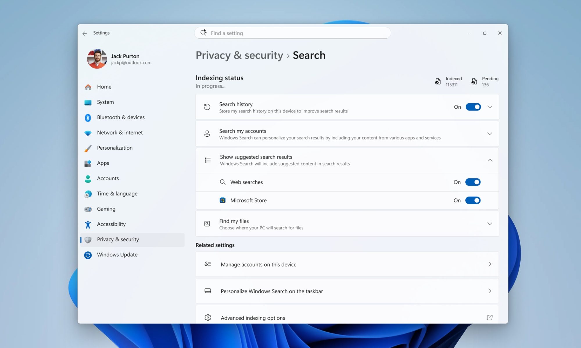
Microsoft is finally fixing the worst thing about Windows Search, but you can’t try it just yet
Windows Insiders in the Experimental channel are getting a Search experience that finally feels less of a billboard and more of what users actually need.
Page, Text, Person

Windows Search has been a mess for years, and I do not use that word lightly. Open it to find a file, and you get trending Bing topics, Microsoft Store promotions, and an AI tools tile that just opens a browser. 

That is changing, but not immediately for all users. Microsoft is rolling out a batch of Windows Search improvements to Insiders in the Experimental channel, and for once, this isn't just a fresh coat of paint.

Read more