
This small Windows update brings a highly requested change

the leaked windows 11 file explorer app with a modern design.
Digital Trends

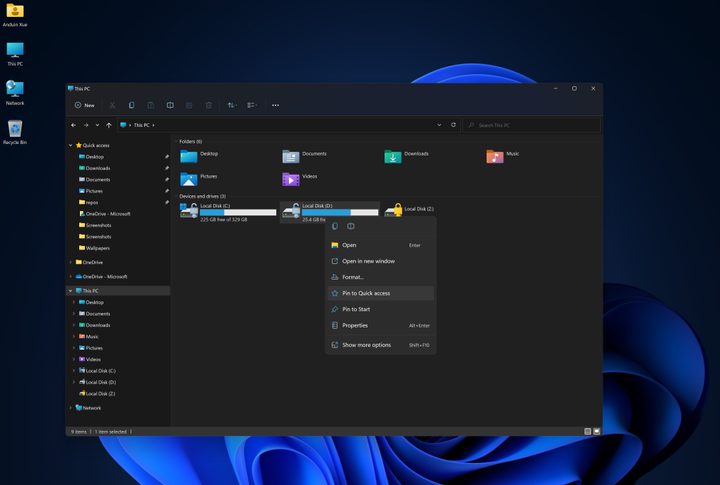
Microsoft is simplifying file management in Windows 11 with a new feature in the latest Canary Build (an early preview version of Windows 11). Users can drag and drop files directly between breadcrumbs (paths) in File Explorer. This fulfills a common request from Windows Insiders, and is something Microsoft recently announced in a June 19 Windows Insider Blog post.

These breadcrumbs are the paths you take to where you want to save your file. For example, This PC > Windows (C:) > Program Files. The breadcrumbs will appear in the Address Bar and display the current path taken inside the app. This feature also seems to have reached non-Insiders since its release at the end of May.

Recommended Videos

Microsoft describes this breadcrumb path as a thin border around the selected area that aims to make moving files around easier. In addition to the drag-and-drop feature, the notifications also get an update. Microsoft has changed how it detects when to suggest turning off app notifications. Microsoft has extended the time frame for detecting when to suggest turning off app notifications, though the exact duration remains unspecified.

The tech giant also acknowledges and lists known issues in the build. The list of problems is not long and includes some issues, such as a bug in dark mode inside the Task Manager and getting hung up on a prior build. This change may not be huge, and time will tell how well it works. But it’s definitely welcome, and Microsoft listening to feedback gives us hope that we might get other much-needed changes to how we use apps on Windows 11.

Judy Sanhz
Computing Writer
Judy Sanhz is a Digital Trends computing writer covering all computing news. Loves all operating systems and devices.
I hope these 3 long-lost Microsoft Windows 8 features stay gone forever
Windows 8 Start screen

If you used a Windows computer in the early 2010s, chances are you experienced Windows 8. Whether it was a good experience is another matter entirely, though. If you ask me, it was a bit of a disaster.

For me, updating to Windows 8 was an unexpected jumpscare. Maybe you had a similar experience; perhaps you just updated your computer one day to discover that the beloved Start Menu vanished without warning. In its place, you saw a full-screen tile interface that probably made you feel like you were using a phone rather than a desktop.

Read more
This Windows 11 update makes Start Menu much more desirable and usable again
The Dell XPS 13 on a table with the Start Menu open.

The Start Menu has been the central element in Microsoft Windows for nearly three decades. Though loved initially for its resourcefulness, the Menu went through some debatable -- I call them abhorrent -- changes with Windows 8, but eventually returned to occupying less space in the interface with Windows 8.1, and then Windows 10 and 11. Despite the rescuing, it is still reeling under the damaging changes in the form of recommendations and random automatically populating lists that reduce it to a mere glorified search interface. However, Microsoft may now be looking to resolve these issues and bringing back a more simplified interface with an upcoming update.

Microsoft is testing a new interface for Start Menu on Windows 11, reducing the existing clutter of randomly interspersed apps and files. X user @phantomofearth, renowned for testing new features in Windows Insider builds, gave us a good look at the new interface in a detailed video walkthrough.

Read more
Windows’ infamous blue screen of death is changing
The blue screen of death in Windows.

The infamous Blue Screen of Death — oft-shortened to BSOD — is changing, and many fans aren't happy with its new look. While seeing the BSOD was never a good thing, the long-time version displayed a fair amount of information regarding the cause of the crash or error. And in a way, sentimentality also plays a role. The BSOD has been a part of Windows since 1990, although it has changed its look a couple of times over the years.

Now it looks like the BSOD is changing to the...well, the BSOD. The black screen of death. In Windows 11 24H2, the iconic frowning emoji is gone, replaced with a much more straightforward screen: a black background with the words, "Your device ran into a problem and needs to restart." It has a progress counter beneath, and a few lines at the bottom detailing the stop codes as well as what failed.

Read more