
 Gmail got a makeover a few weeks ago on the iOS edition of the software, but Android’s version has been using a pretty standard UI for some time now. Looking to give it a little more flair, a designer from Brooklyn has given his take on what a new Gmail UI should look like.
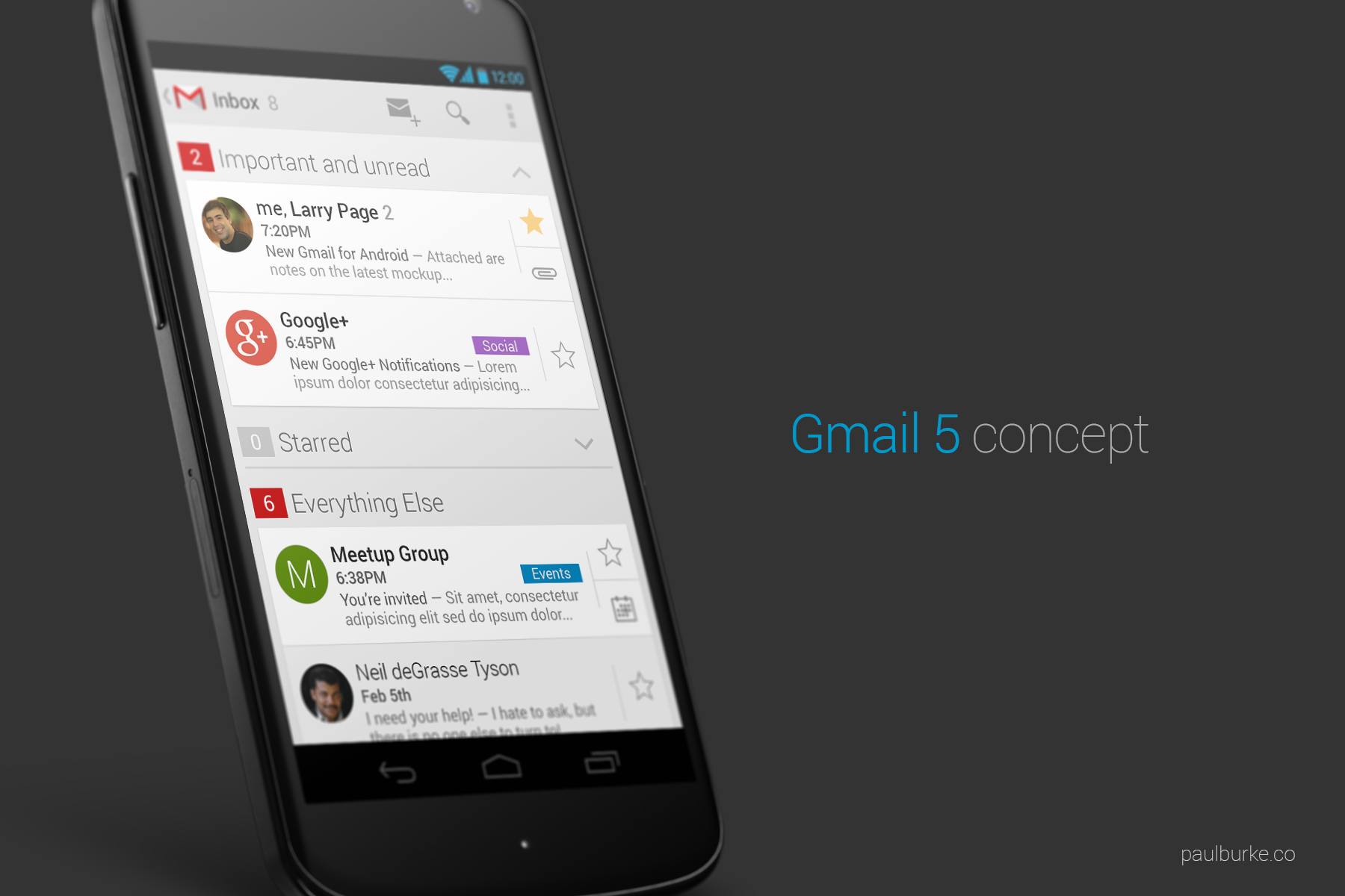
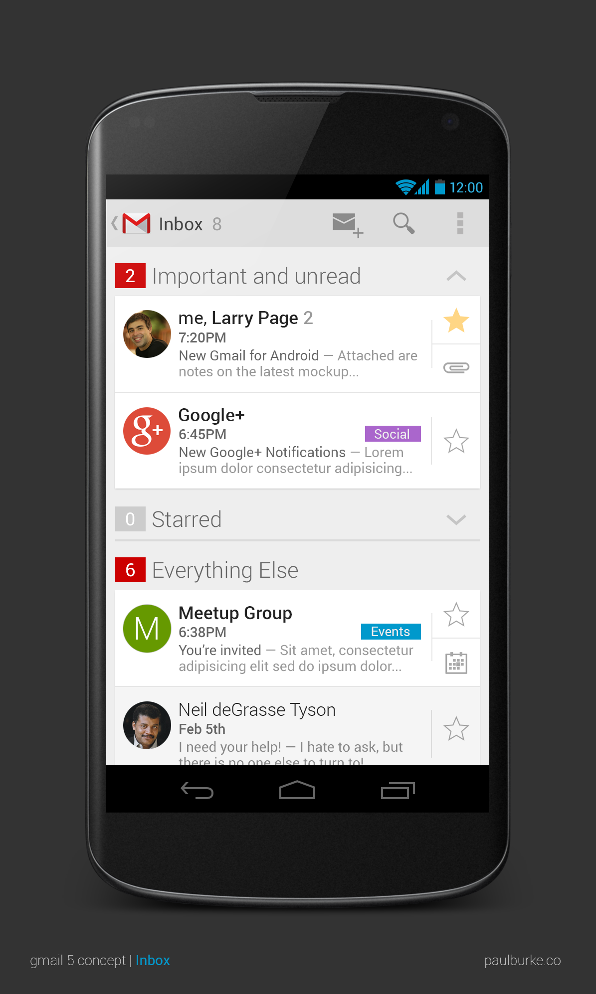
Gmail is an essential app for anyone running Android, especially since you need a Google account to use the majority of features offered by the device. As a result, it’s a very essential part of the whole Android experience, and while there aren’t any gaping flaws in the current Gmail design, it is certainly feeling a little dated with you compare it to some other, more recently updated aspects of the Google experience, such as Google Now and its new card system. Plus, Google just gave iOS owners a fresh new flavor of Gmail, which is a little surprising given Google has yet to offer anything to current users of Google’s own Operating System, Android. Nonetheless, Paul Burke, a designer from Brooklyn, has taken it upon himself to show what he feels Gmail could perhaps look like, with respect to the “Post Google Now world” that Google has created.
The new design merges both the sleek look of Google Now and the iOS version of Gmail, while also adding some interesting new options and interface design decisions. The experience offers less pieces of mail on the screen, but uses the space much more intuitively to let you easily open attachments, view calendar invites and more. The experience also suggests much easier swiping and moving of mail to easily delete or archive mail, and focuses on a cleaner, crisper experience from start to finish. It certainly isn’t coded and mostly just for aesthetics, but the designer is making some good points about what we really want when experiencing our mail. These days, as Google integrates mail more and more with things like Calendar, social media, and content, we want our mail experience to be accessible for this rich content, too.
If you’re looking to give the new design a look and see what it’s worth, feel free to download it here. Who knows, maybe Google will take a hint or two from this design.


