Every year, Google adds a potpourri of features to Android. Visually, however, it changes only once a few years. The last time Google made significant visual changes, it was with Android 12 over three years ago. In the coming months, Google is expected to kick off another cycle of aesthetic overhaul, with significant changes sprinkled across the UI. These appear right before Google is set to launch Android 16, and has ignites new expectations — but I’m afraid this comes too little, too late.
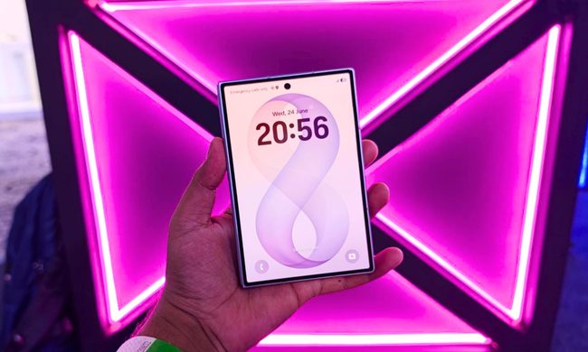
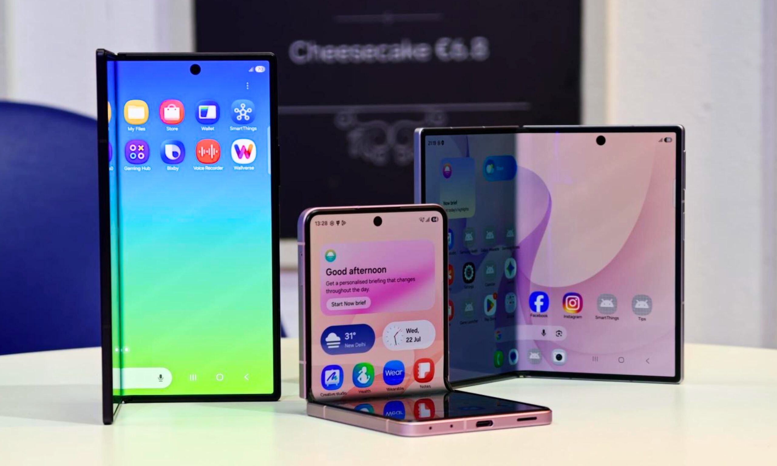
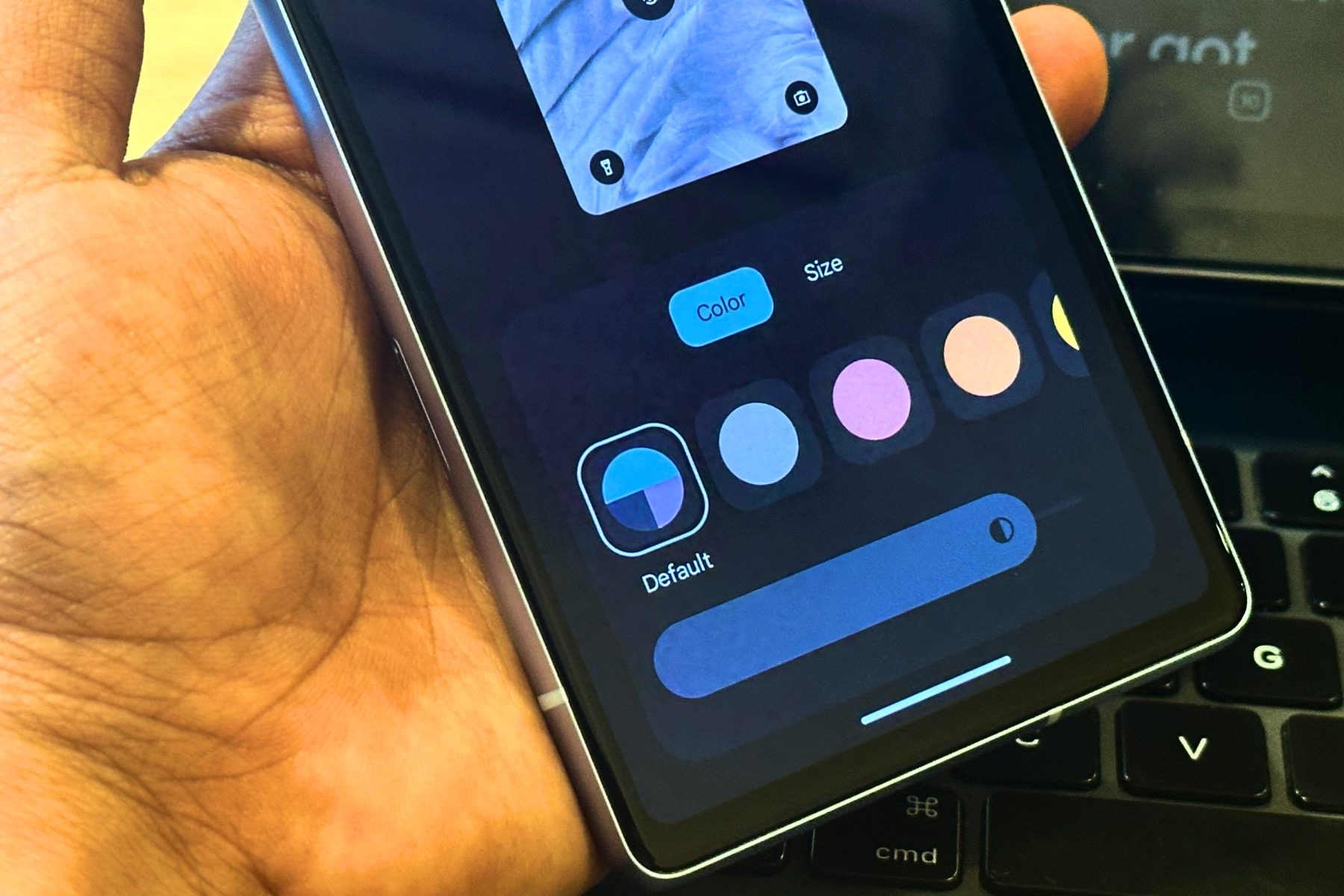
The redesigned Android interface brings a breath of freshness, with visually engaging colors and completely refreshed sliders across the interface. Even smaller elements, including icons in the status bar, are going under the knife, and coming out slightly more detailed than were in the previous iterations. Many aspects of the interface appear to have adopted a translucent cloak, giving it a more modern look. While the visual impact is undeniable, the timing is rather odd.

Google’s upcoming Android version — Android 16 — is just around the corner and is expected to start rolling out formally at Google I/O — its annual conference for developers, which is scheduled to kick-off on May 20th. So the first thought to emerge is that Google may introduce the feature when it announces other major changes coming to Android later this month. However, there are signs contradicting that.
Firstly, these changes weren’t spotted as a widely available feature. Instead, folks at Android Authority discovered it in the latest edition of Android 16 beta and reverse engineered the code to activate the new interface. That means, most of us, including those who have been testing Android 16 beta on our Pixel devices will not have access to the new features yet. But does it mean we will have them when Android 16 finally rolls out for a wide base of users as a stable update? Well, that’s the tricky part!
This preview feels poorly timed
Every big visual or feature overhaul typically comes with a new version of Android. Big upgrades like these qualify for dedicated version number updates — and any lesser treatment wouldn’t suffice! It’s the same with every software company — Apple is expected to refresh its interface across iOS, macOS, and tvOS with a consistent, glass-inspired theming.
Simultaneously, it is also a tradition for software companies to preview any interface changes, such as this one, months in advance as part of the beta previews. Not only that allows the brands to help consumers warm up to any radical changes that might result in users having to change their ways around the interface, but also gives them time to address concerns by integrating any ubiquitous feedback points.
Google also follows the same pattern with a lot of other features where changes are previewed and available as optional capabilities instead of being crammed down the people’s throats. A good example would be Adaptive icons, which have been available in Android since Android 12 but haven’t truly graduated to a level of being a functional — and, more importantly, flawless.
For these reasons, it seems less plausible for Google to introduce these changes as part of Android 16. Instead, what seems more likely is that these will form the basis for a bigger visual change coming our way in Android 17.
Another reason backing this assumption is that Google also had fewer months to work on Android 16, after initiating its developer preview program in October last year. That usually happened in February, and Google I/O would be when Google showcased potential features that would make it to the final release. Instead, affairs at Google are being sped up this year — after an unreasonable delay in launching Android 15 last year, and Android 16 is already in its finishing stages.
So, it wouldn’t be mature of Google to ship out a feature with minimal testing and virtually no feedback from developers or consumers. What seems a rather plausible outcome is that these features are announced later in the year as exclusive to the Pixel 10 series, though Google hasn’t differentiated between devices based on visual traits before, and that doing so might challenge the open nature of Android.
The unpredictability remains
While it seems unlikely for Google to take the plunge so soon, there are certain reasons it might betray our expectations. Firstly, Google is working on a third iteration of its Material Design theming engine. “Expressive,” as we hear, is the guiding trait behind this refresh.
Android Authority says Google will familiarize developers with this concept at the I/O conference, hoping to inspire them to adopt these visual elements to their apps. Unlike Apple, which sets strict standards for how iOS apps look, Google is more lenient. That could mean developers may not adopt it for several more Android iterations.
However, for things Google can control, such as the Settings menu or the Quick Settings or notifications on Android, it might bring this new interface sooner in the form of a new optional theme. Whether it’s as soon as Google I/O in the coming months, Pixel 10’s launch in the second half of 2025, or with the Android 17 beta is what remains completely unclear.
The redesign is long overdue

Irrespective of how Google handles the roll-out, the suggested interface looks slick and desirable. And I couldn’t help but wish Google hadn’t taken so long with it. Compared to other Android manufacturers, the opaque sections in stock Android definitely look more drab and discomforting. So, by adopting this interface, Android would be closing in on iOS alongside others such as Samsung, Xiaomi, or OnePlus that have already opted for translucent backgrounds and simpler icons. So, the wait is undoubtedly killing me.
On the plus side, though, stretching the release out gives Google ample time to test it out, refine, and enable third-party developers to integrate similar features. I just wish Google does not leave another project in limbo as it has done to the Adaptive icons or the Desktop mode in Android.