“There’s a great tablet inside the Surface 2, but it’s covered in too much muck from Windows’ past. If you want productivity, we recommend a full PC or Mac.”
- Great design and feel
- Magnetic Type Cover rocks
- Kickstand works great and has two angles
- Improved Start screen and Windows Store
- Using the destktop is necessary, but not fun at all
- Heavy for its class
- Type Cover is expensive ($130)
- Windows Store app selection is still bad
“Why you can trust Digital Trends – We have a 20-year history of testing, reviewing, and rating products, services and apps to help you make a sound buying decision. Find out more about how we test and score products.“
It’s been a year since the original Surface RT launched, but Microsoft is still in the same position it was in last October. With the new $450 Surface 2, it hopes to prove to the world that Windows RT 8.1 is worth using. It’s going head to head with an army of new, more affordable Android tablets, and a refreshed group of iPads. But does a tablet with one foot in the PC world and one foot in the mobile world have what it takes to win fans?
Love the Start screen, hate the desktop
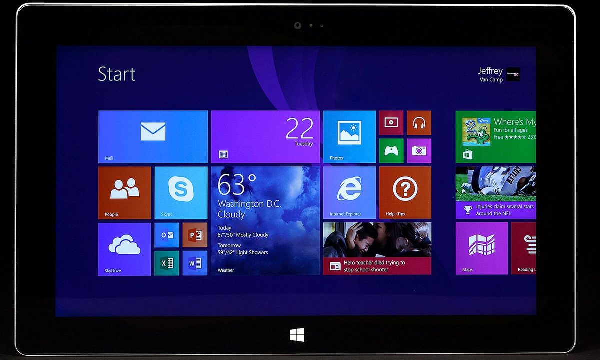
With Windows RT 8.1, Microsoft has made a lot of upgrades to the Start screen and its entire Windows 8 interface. It’s easier to get to your apps list (just swipe up); there are now extra small and extra-large Live Tiles; the Windows Store looks a lot cleaner and has a few good apps; and split-screen multitasking now works. Encouraged by our happiness with the Start screen, we entered the simple PC Settings menu, which shrunk the size of our Live Tiles, allowing us to fit more on the screen and also open up three apps at a time in the multitasking menu. With a crisp 1080p screen, everything still looked great on the Surface 2.
The Start screen is much improved, but a year into Windows 8, the desktop still isn’t user friendly on a touchscreen, or any small screen.
Unfortunately, while shrinking the Start screen makes it more useful, by doing so you shrink the desktop as well, to insanely small proportions. There is no way to fix and resize the desktop to something more manageable.
This disparity is the problem with the Surface 2, in a nutshell. Microsoft created a nice new interface for the Start screen but has still, a year into Windows 8, failed to make its desktop user friendly on a touchscreen, or small screen. The desktop looks almost exactly like it did in Windows 7. Using it with your fingers is difficult by default because it isn’t made for fingers. Crunching that untouchable interface down into a 10.6-inch tablet screen makes it that much worse. Turning the size of the Start screen to “small” made the desktop so small that even with 20/15 vision, I could barely make out what I was writing. I felt like Andre the Giant using a normal computer.
You can get used to the desktop, but it’s never fun to use. It makes us wonder why Microsoft felt the need to include it at all. This isn’t a Windows machine. It looks like Windows, but it doesn’t run classic Windows software. Windows RT is built for ARM (smartphone/tablet) processors and won’t run iTunes, Photoshop, Spotify, Chrome browser, Firefox browser, or any other programs you like to use on Windows. They’re incompatible. Microsoft’s inability to move its own software to the new Start screen interface is the only reason you have to endure torture. Word, Excel, PowerPoint, OneNote, Outlook (new), and folder access are only available on the desktop. And they feel like they’re built for the desktop too, because they’re clunky, though improved from older versions. Browsing the Internet is also a confusing affair.


There are two versions of Internet Explorer on the Surface (and every Windows 8 device). One of them is made for the new interface and it’s touch-friendly, but not great for multitasking or having multiple tabs open. We can’t figure out how to have multiple browser windows open, so we can’t use the clever new split-screen mode either – that is, unless we also use the desktop version of Internet Explorer. This version is functional but not as touch friendly.
Like all Windows 8 products, the Surface 2 forces you to choose: Do you want productivity, or do you want an intuitive interface? Microsoft desperately needs to figure out how to blend these ideas. It’s first step should be to eliminate the desktop on Windows RT. Maybe we don’t have to pretend that both versions of the Surface are full-blown PCs? This isn’t. But it is a pretty good tablet.
Great hardware design, again
Like the original Surface, this is a well-designed and durable tablet. Microsoft has stuck with a nearly identical look to last year’s Surface. The size and shape is the same, but the magnesium shell now shows its actual silver color, which almost makes it look like grey plastic – until you pick it up. This is not a flimsy tablet.
Like the original Surface, this is a well-designed and durable tablet.
A new kickstand looks like the one on last year’s model, but lets you snap it out into a relaxed position, making it easier to use the Surface as a laptop replacement. We say “easier” because it’s still uncomfortable to use without a table. The kickstand digs into your legs, the screen is a small 10.6 inches, and the detachable Type Cover is still a little floppy.
Put it on a table though, and it works great. Speaking of that Type Cover, it’s almost the same as last year’s model, but now has light-up keys. The luminance will cost you, though. The new Type Cover is $130. We recommend it over the Touch Cover, which is only $70 now, but difficult to type on because it doesn’t have actual buttons for keys. Like before, it still has that satisfying snap into place, and won’t dislodge unless you pull at it from an angle.
Underneath the kickstand is a MicroSD card slot for expanded storage. One full-size USB 3.0 port is on the right side, along with a smaller Mini USB port and proprietary charging area (no USB charging here, so don’t forget that charger at home). The power button is located on the upper right (if held in landscape orientation) and the volume is on the left side, right under the audio jack. This is not a useful configuration if you ever hold your tablet in portrait (vertical) orientation to read. Of course, you probably wouldn’t do this anyway, because the Surface 2 is still heavy, weighing in at around 1.5 lbs. The new iPad Air, by comparison, weighs a single pound. That may not sound like a big difference, but if you like to hold your tablet a lot, it makes a big difference.
A typical tablet camera, but good webcam
The 5-megapixel rear camera on the Surface 2 is not impressive, but there isn’t a tablet out there with a great camera, honestly. They just don’t exist yet, likely because few people want to hold up their giant tablet to take pictures. Shots on the Surface 2 are serviceable, but if the conditions aren’t favorable (low light, indoors), you’re not going to get great pictures. Use your phone instead. Microsoft’s camera does have one special power though: It’s angled. So if you have the kickstand up, your rear camera will face directly ahead. We’re scratching for a good reason why you’d need this feature, but we’re sure you’ll think of something.


The 3.5-megapixel webcam is more powerful than we’re used to seeing. Microsoft claims it’s built to better utilize Skype. In our tests, video calls came through more clearly than in many of our attempts to use FaceTime. Skype comes installed out of the box, which is also nice.
It has some power
Though it won’t measure up to an Intel-based PC, by tablet and phone standards, the Surface 2 is competitive. It packs in a 1.7GHz quad-core Nvidia Tegra 4 processor, 2GB of RAM, 32GB (or 64GB) of internal memory (with MicroSD slot), a 10.6-inch 1920 x 1080 pixel LCD screen, stereo speakers that sound nicer than most tablets thanks to integrated Dolby tech, Bluetooth 4.0, and Wi-Fi 802.11 a/b/g/n, which will do you well enough. There is no LTE-capable Surface model. For a Windows RT 8.1 tablet with LTE, you will want to check out the Nokia Lumia 2520.
We aren’t able to perform benchmarks to compare this directly to iPad Air or Android tablets, but if we did, we believe it would perform well. The Tegra 4 isn’t as popular as Nvidia’s Tegra 3 was last year, but it stacks up well to Qualcomm’s Snapdragon processors, which are found in most phones and tablets this year. Apple’s iPad Air likely has an advantage over the Surface (and every other tablet) due to its new 64-bit processor, but the difference is mostly superficial because there isn’t yet a lot of software that can take advantage of Apple’s new tablet.

The Surface 2 is noticeably faster than its predecessor, beating it at loading videos, apps, and multitasking. The differences are subtle, but will become more pronounced over time, as Windows Store apps get more complex.
Finally, Microsoft is promising about 10 hours of battery life. We’ve found that this is a little optimistic. We’ve seen somewhere between 8 and 10 hours in our first days with the Surface.
Conclusion
The Surface 2 is a paradox. We love its hardware and the Start screen continues to improve, as does the Windows Store. If we never entered the classic desktop mode (old-style Windows), we’d enjoy this tablet a lot more. But, as Microsoft makes clear in its attacks on the iPad, the Surface is built for productivity. We need the Type Cover and Microsoft Office to get any work done, but using them requires you to enter the desktop. And the desktop isn’t fun.
Right now, the Surface 2 is a $450 (+$130 for keyboard) tablet that’s pushed as a work device, but works much better as a standard tablet. Unless you’re really excited about the Type Cover, kickstand, Live Tile interface, or using full-blown Microsoft Office, you might be better off scaling up to a real PC or getting an iPad Air ($500) or a Nexus 10 ($400). You can buy good keyboard attachments for them both.
Highs
- Great design and feel
- Magnetic Type Cover rocks
- Kickstand works great and has two angles
- Improved Start screen and Windows Store
Lows
- Using the destktop is necessary, but not fun at all
- Heavy for its class
- Type Cover is expensive ($130)
- Windows Store app selection is still bad