Microsoft wants its Office suite to look the same regardless of how you access it, and it’s working to make that experience more consistent across the web and on its mobile and desktop apps. While Office products — like Word, Office, and Excel — share a similar interface today, depending on how and where you access these apps, there are enough differences to how icons and menus are displayed.
The new visual overhaul marks a major change to Office since the ribbon was introduced with the 2007 edition. The new design includes three main elements, with a simpler ribbon as the biggest change to be introduced. However, despite Microsoft’s desire for consistency, it may take some time for the new interface to hit all Office products and platforms.
The new design is based on Microsoft’s Fluent Design principles. The new look is expected to hit the web and subscription-based Office 365 first. Given the launch timeline for Office 2019, Microsoft’s version of its productivity suite with a perpetual license, the new design may not be ready in time. This matches with Microsoft’s subscription strategy of delivering new features as updates to users who buy into its software-as-a-service model, whereas perpetual users won’t get new features until they purchase the next major release. “The development work simply won’t be done by the time Office 2019 is released,” Ars Technica said.
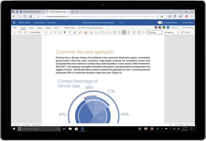
Starting Wednesday, June 13, on Word on the Web, Microsoft is replacing its three-row ribbon design with a simpler ribbon. There will be a single-row tabbed toolbar that can be expanded if needed. Microsoft will take its time rolling out the ribbon to Word, Excel, and PowerPoint, but users will be given a choice to revert back to the old ribbon if they prefer the old style better. “Users have a lot of ‘muscle memory’ built around these versions, so we plan on being especially careful with changes that could disrupt their work,” Microsoft explained in a blog post. “We aren’t ready to bring the simplified ribbon to these versions yet because we feel like we need more feedback from a broader set of users first.”
The second change is that Microsoft is switching to scalable vector graphics for icons. The icons will also get new colors, and the new change will hit Word on the Web first. Desktop Word, Excel, and PowerPoint apps will see the changes later this month, followed by Outlook for Windows next month, and Outlook for Mac in August.
Finally, the third change is a more intelligent search. The new smarter search is already available for Office for the Web and in Outlook mobile, which displays relevant documents, collaborators, and events based on what you’re doing even before you begin typing a search term. The new smart search box is coming to Outlook on the Web in August.
“We plan on carefully monitoring usage and feedback as the changes roll out, and we’ll update our designs as we learn more,” Microsoft said.