The idea that one of the most influential women in the history of tech is best known for designing icons sounds, on the surface, a bit surprising. Sure, everyone enjoys a good bit of computer iconography, but… most influential? Like, for real?
If you think this way, it’s understandable. Icons are such a ubiquitous part of today’s most popular devices — whether that’s personal computers or mobile devices — that it can be tough to imagine them working any other way. But it wasn’t always like this.

Icons give us a way of instantly understanding the tools we’re using. In the early days this frequently meant by way of a real-world analog. A trash can was where you got rid of things. A folder was where you stored files. A lasso could be used to grab (read: select) things. Today, our tools aren’t always describable in this way. However, icons still describe the experience of using them, often in an unthreatening manner.
A lot of this is thanks to the work of Susan Kare.
Making computers friendly for the masses
An art major from Mount Holyoke College with a masters and doctorate from New York University, Kare has enjoyed an unlikely career in technology stretching back almost 40 years. But she remains perhaps best known for her work at Apple as the designer of the icons and bitmap typefaces on the original Mac. While the Mac was not the first computer to have a graphical user interface with icons, it was the first popular computer to do so.
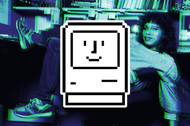
The Mac was approachable at a time when most computers were still scrabbling around in the primordial soup of command-line interfaces. Much of that approachability and personality came from Kare. Thanks to her whimsical sensibilities, the first image a user would see when they turned on their Mac was a tiny portrait of a Mac with a smiling face to show that everything was working correctly. If there was a (rare) fault and the computer crashed, the user would see an image of a cartoon bomb, complete with fizzing fuse.
“I don’t believe that you need to be a member of the target audience in order to do a good job as a designer,” Kare told Digital Trends. “But in the case of the Macintosh — ‘the computer for the rest of us’ — I definitely was. It was easy to empathize with the mission [of] making computers accessible and appealing to a non-technical audience because I had zero technical background.”
A digital artist
Kare’s business card at Apple read “Macintosh Artist,” at a point in time when the idea that computers were a tool for creativity seemed, well, wrong. Although many people would not know her name compared to the likes of Steve Jobs (a huge fan of Kare’s work), Kare’s vision became the filter by which ordinary people took their first steps into using a computer.
“Because the computer was supposed to be ‘friendly’ I wanted to inject some friendliness, some fun, and some common-sense, easy-to-remember images,” she continued. “I thought a good test for a symbol was that you could remember it if someone told you once what it meant.”
“I thought a good test for a symbol was that you could remember it if someone told you once what it meant.”
Kare drew the inspiration for her icon mosaics from a number of places. She loaded her cubicle up with books such as Henry Dreyfus’ Symbol Sourcebook, which described offbeat pictorial languages such as hobo signals: the simple chalk-on-stone markings used to describe the kinds of people transients met as they moved from place to place. Elsewhere, she gleaned thoughts on “universal symbols” from sources as diverse as Haitian textures and old-fashioned needlework to the abstract faces of retro sci-fi robots. The results, to use an Apple phrase from years later, just worked.
“I had a liberal arts and studio art background,” said Kare. “I think that helped with thinking about metaphor and meaning, and figuring out how to arrange 16 x 16 or 32 x 32 black and white pixels to represent a concept. It was a bit like writing a Haiku, [with] many options within the constraints. The technical limitations of the time, a monochrome 640 x 480 pixel display, necessitated a visual simplicity that was in many ways beneficial. [There was simply] no room for extraneous detail.”
A world with (fewer) limitations
In the modern computing world, a lot of those limitations have been stripped away. Computers circa 2020 don’t have the same graphical limitations as computers in the early 1980s, when Kare started her career in this field.
“Over time, icon designers have been freed from low resolution and limited palettes, and sometimes this can manifest itself in the creation of complex imagery because it’s possible,” she said. “Or animation that doesn’t really enhance understanding. There’s a wonderful book, Understanding Comics by Scott McCloud, which includes many thoughtful comments relevant to icon design. McCloud, for example, points out that the simplest smiley face, with its lack of detail, is universal, because we can all see ourselves. In the same way, a chrome pen, rendered to show reflection, can be a nice illustration, but as an icon for writing it might exclude some users who don’t typically encounter pens like that. I like the idea of symbols that are easy to recognize at a glance because they contain just enough detail. I appreciate the never-ending search for good universal symbols; it’s a joy to see a great new metaphor.”
“An icon’s meaning is at least as important as its appearance, and sometimes that takes more time and thought than is allotted.”
While Kare, understandably, doesn’t approve of every new icon that comes out, her philosophy of computer iconography remains the gold standard years after she started work.
“Icons come and go and with luck the less effective ones fade away,” she said. “An icon’s meaning is at least as important as its appearance, and sometimes that takes more time and thought than is allotted.”
Making a lasting contribution
Today, Kare is 65-years-old. She works at Pinterest doing a variety of digital and analog design projects. She also helps run kareprints.com, which offers limited edition prints of her icons. Years after they were created as functional pictograms, Kare’s mosaics have become beloved artworks in and of themselves.

Apple frequently reinterprets them and prints them on shirts, and still repurposes the “hello” graphic Kare designed in 1982. Kare additionally crosses over into the real world with projects like a new Jacquard blanket with an icon pattern that’s coming out this spring. “And I’m always working to improve my surfing,” she said.
Susan Kare was not, by a long shot, the only brilliant creator to work on the original Macintosh. But she did play an indelible role in its development, and to computing ever since. In a field like high tech where gadgets are replaced, for reasons of technological advancement or just novelty-seeking, after only a few years, it’s the rare person who makes a contribution that lasts.
Kare, it seems, is that rare person.