Dynamic Island — Apple’s marketing name for its pill-shaped cutout– is one of the major distinctions between the iPhone 14 Pro and non-Pro models. Apple’s take on embracing the cutout with software magic is interesting, and all those pretty animations are noteworthy. I bought the iPhone 14 Pro for the Dynamic Island and the new cameras. Unfortunately, the former isn’t what I expected it to be.
More distracting than the notch
The notch wasn’t a distraction after a few hours of use on previous iPhones. You get used to the notch on the iPhone 14 and its predecessors within a few hours of usage. But the Dynamic Island is a big pill of distraction. It isn’t like the notch, meaning that you don’t get used to it.
I’ve been using the iPhone 14 Pro for three days and I’m still distracted by Dynamic Island. When you get past the marketing name, all you see is an ugly cutout sitting lower than the notch, and if you’re using your iPhone in light mode, it’s going to be hard for you to get used to it.
As you can see from the above image, this is the Dynamic Island when it isn’t dynamic. It’s just sitting there over the top of the screen, distracting you from what you are doing. You’ll notice it every time you open any messaging app like Telegram or WhatsApp or social apps like Twitter and Instagram. Thankfully, Instagram Stories black out the top, so the cutout isn’t visible there. But using Twitter with a big cutout on the top isn’t what I expected when I bought the iPhone 14 Pro.


There is no getting used to Dynamic Island when it isn’t dynamic. You’ll notice it every time in each app, especially when using the iPhone in light mode. You can lower the frustration by using the iPhone in dark mode. However, I shouldn’t be forced to use dark mode because of the design choices made by a company.
As mentioned above, Dynamic Island sits below the notch. As a result, it eats up space while watching 18:9 videos on YouTube. Even if you aren’t filling the whole screen, it still takes up space in the video. And if you decide to fill the screen, you are left with one ugly cutout in the middle of your viewing experience.
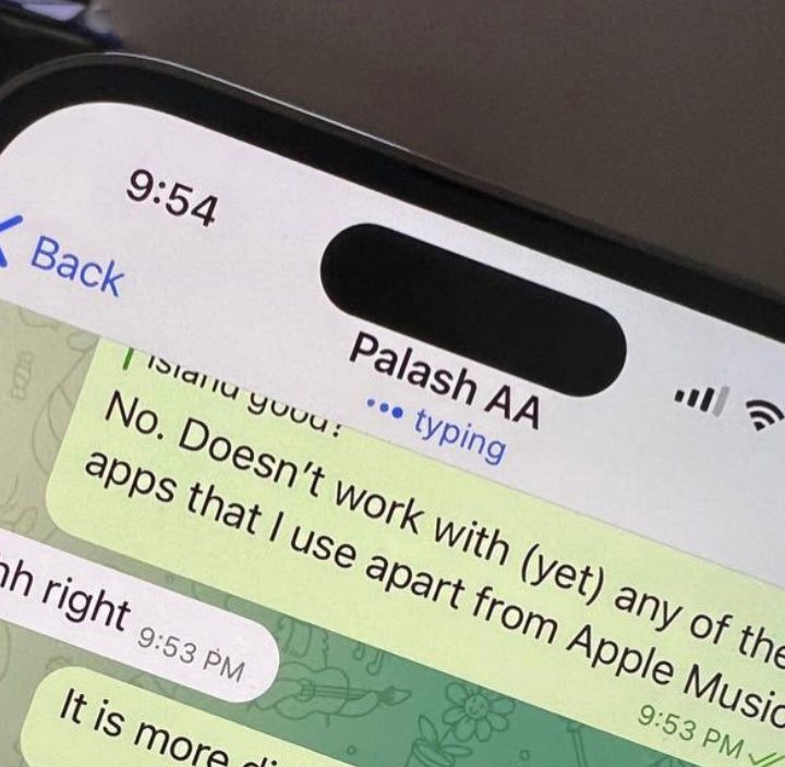
It only works with a handful of my apps

Dynamic Island isn’t very dynamic for me. It works with just three apps that I use, namely, Apple Music, Spotify, and WhatsApp. In my decade of smartphone usage, I might have triggered the timer twice, so that use case is out of the way. The software works with first-party apps and a handful of third-party apps as of now. It should get support for more third-party apps like Uber later this year.
But as it stands in September 2022, Dynamic Island isn’t very useful for me. And even when it is in use, it’s like a persistent notification telling me that I’m playing music in the background. Tap on the Dynamic Island, and it’ll open the app; press and hold it, and you’ll trigger quick actions. I found that instead of reaching to the top of the screen to go to my music app, I’d rather swipe from the bottom and go to it from the recent apps menu. It saves finger gymnastics.
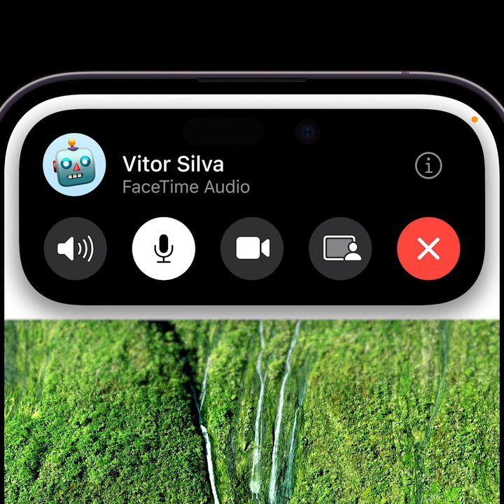
The same goes for WhatsApp calls. I get pretty animations on the top of the screen telling me that I’m on a call and the mic is active, but that’s about it. You can’t tap on the Dynamic Island to trigger an action. It isn’t a shortcut for functions. As it stands right now, Dynamic Island is there to notify you mostly about things you already know. I can hear the music, so I know I’m playing music. Having the Dynamic Island tell me that isn’t exactly helpful.
Hoping my time on the Dynamic Island gets better
With more third-party app developers making use of Dynamic Island later this year, I hope things get better — and that it’s a lot more useful for me with apps that I use. But we judge a product by how good it is when it’s released — not what it could be in the future. And for the Dynamic Island, unfortunately, it’s not very dynamic as it stands today.
I wish Apple had stuck with a notch and integrated the Dynamic Island features there. It wouldn’t have come in the way of me watching videos, nor would it have been so distracting. But the Dynamic Island is the way Apple is going forward, and — at least right now — I’m not a fan.