
Material Design 2.0: rounded corners, darkened palette, and more

Material Design
Google

A second generation of Google’s “Material Design” user interface overhaul appears to be in the works. Screenshots from the latest Chrome Canary build for Windows show that the UI will be darkened and Google will continue to move toward a more rounded interface. The purpose of the update, if enacted as it appears, would be to improve readability on devices, as well as tweak the way Android responds to touch inputs.

The original Material Design user interface was implemented in 2014 with the launch of Android Lollipop. It introduced a clean color palette and subtle physics to give the Android OS and associated apps more of a real-world feel. Google has made it easier over the years for other developers to adopt the design choices, too.

The new Chrome overhaul will make similarly subtle, but impactful changes on the browser’s user interface. As 9to5Mac highlights, the first changes have now appeared in the Canary build of Chrome, showing rounded tabs and a darker UI. The new tab “+” icon has been moved to the far left and the account avatar has been moved to the toolbar.

Note the rounded tabs and the newly located new tab “+” button in the top left. Image used with permission by copyright holder

Other changes hinted at in updated Material Design specifications on Chromium hint at a floating effect for the omnibar dropdown and new prompts for certain text inputs.

Image used with permission by copyright holder

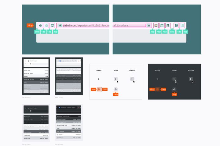
On a more functional level, Google also appears to be tweaking the way touch support works with the Chrome web browser on Chrome OS. There are references to touch optimization elements within the Material Design 2 notes, though they don’t go into any detail.

While these changes are in the works though, they’re not directly linked to any kind of official Material Design announcement. However, shortly after this story first broke in February, the original commits were made private, which would suggest they weren’t intended for public release. That doesn’t necessarily mean they are legitimate, but it adds a little more weight to the idea that Google has something up its UI design sleeve.

When you consider too that 9to5Mac received tips just over a year ago about a potential successor to Material Design, it seems quite likely that at some point in the future Google will be making some subtle but substantial changes to how Chrome looks on various devices.

According to the tip we received last year, the goals of this supposed Material successor are to increase readability and efficiency, and minimize clutter. It’s the “cleanest
implementation of a natural UI yet.”

— Stephen Hall (@hallstephenj) February 5, 2018

Editors' Recommendations

Jon Martindale
Jon Martindale is the Evergreen Coordinator for Computing, overseeing a team of writers addressing all the latest how to…
SpaceX’s Starlink internet service reaches milestone
A Starlink dish.

SpaceX’s Starlink service now has more than 3 million customers globally, the company announced this week.

“Starlink is connecting more than 3M people with high-speed internet across nearly 100 countries, territories, and many other markets,” SpaceX said in a social media post on Tuesday that also included a short video showing Starlink satellite dishes set up and providing an internet connection in various places around the world.

Read more
Whatever you do, don’t buy the Asus ROG Ally right now
A man plays High on Life on an Asus ROG Ally.

The Asus ROG Ally is undoubtedly one of the best handheld gaming PCs you can buy, but right now is easily the worst time to buy one. Asus has already teased that a new handheld is on the way, and it sounds like a massive upgrade. On top of that, the cost of the ROG Ally is holding steady at list price, and it likely won't stay that way for long.

If you're in the market for Asus' handheld, you should wait just a bit longer. In a few weeks from now, you'll not only have more options but you'll also probably save some money.
X is on the way

Read more
The first Copilot+ PC has been tested — and it destroys the MacBook
The Surface Laptop shown in front of a Copilot+ sign.

We've heard a lot about Microsoft's new Copilot+ PCs over the past few days, but we can finally put some hard data to the company's bold claims. Signal65, a benchmarking and analysis company, put the new Surface Laptop through its paces, and it absolutely wrecks the MacBook Air M3.

The laptop, equipped with a Snapdragon X Elite processor, put up impressive results across the board, but battery life stands out most. According to the report, the Surface Laptop lasted over 21 hours in a local video playback test. For reference, that's close to twice as long as the Surface Pro 9, and more than 15% longer than the MacBook Air M3.

Read more