Read our full Motorola Moto 360 review.
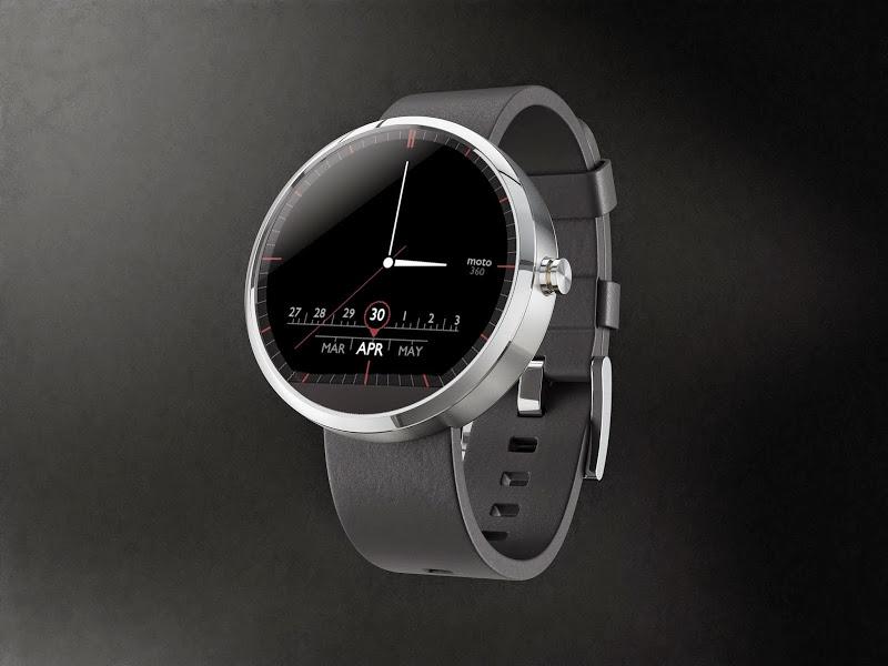
Motorola is all geared up to release its first smartwatch this summer. The Moto 360 is already celebrated as the first beautiful smartwatch because of its round face and stylish design. Recently, Motorola kicked off a competition for designers to create the best watch face designs possible. The winner will receive a free Moto 360 as soon as the smartwatch is released.
A panel of judges, including the Moto 360’s design chief Jim Wicks and several other smartwatch UX and UI designers from Motorola, whittled down the 1,300 entries to their 10 favorite designs, using several criteria. The designs had to be aesthetically pleasing, possible to create, and functional. Now that the company has announced the top 10 finalists, it wants Moto 360 fans to vote for the watch face design they like best.
The chosen designs are a nice mix of old-fashioned and modern styles. While some feature notifications for Gmail, Hangouts, and select alerts, others are more simple, featuring just the time and occasionally, the date. You can vote for your favorite design on Motorola’s Google+ page. The designer with the most +1s will win the competition and a Moto 360. The lucky designer will also see his design featured on the Moto 360. Motorola says that the winner will be announced on June 24, so you’d better vote soon if you want your favorite design to appear on the Moto 360.


- 1. Design by Layton Diament
- 2. Design by Aramis Negron
- 3. Design by Jose Azua
The watch faces in the gallery above are three of the most modern designs in the top 10. The first design comes from Layton Diament and it called “My Vanishing Hour,” because the number in the center of the watch face disappears as each minute of the hour ticks by. The second, from Aramis Negron, is simple and easy to read, with the minutes ticking by in a circle, rotating around the central circle where the hour is displayed. The last design comes from Jose Azua and is called “Angles.” It shows the hour in the center of an acute angle pointing upward, while the minutes tick by along the top of the watch face.


- 1. Design by Paul Stringer
- 2. Design by David Pascual
- 3. Design by Dave McCarthy
Some of the more traditional designs came from Paul Stringer, David Pascual, and Dave McCarthy. Stringer’s design looks like a car’s speedometer with the hours on the outer rim and the minutes and seconds in the inner ring of numbers. Pascual’s design treads the line between modern and traditional, with the numbers 12, 3, and 9 in their regular positions. In the center, the designer added room for notification widgets, so you can see when you get an email, call, or message. The last design, from McCarthy, is strictly traditional and minimalistic.


- 1. Design by Will Rodriguez
- 2. Design by Jason Wang
- 3. Design by Tyler Allicock
These last three designs are different from the others. Will Rodriguez’s design is predominantly white, features lines to represent the time, and allows for notifications in the middle, while also showing the weather. The next watch face by Jason Wang looks like an old-fashioned radar screen. The hour numbers 12, 3, 6, and 9 range down the middle in a vertical line at the top of the face, while 15 minute intervals range down the middle at the bottom. It also features orange accents.
The third one is from Tyler Allicock and it shows the date in the center of the watch, the second on the top half, and the hour and minutes at the bottom in typical digital style. The top is white and the bottom of the face is a dark, charcoal gray.
This last design comes from designer Pawel Hanusowski shows a watch face that looks sort of like a radio dial. It has room for the date at the bottom of the watch face. The hours and minutes are represented by lines around the display. It also has red accents and white needles in the center that tell the time. The face, like most of the designs in the top 10 is all black.