“Many infotainment systems feel like blatant Apple rip-offs, but Volvo's Sensus Connect has taken a more nuanced approach with great results.”
- Incredibly quick responses
- Can be operated with gloves
- Smart, intuitive interface
- Looks great
- Unknown stability and reliability
Updated on 7-8-2015: This rating was lowered to reflect increased competition in the space from Apple and Google. For more on how we rate products, see our scoring breakdown.
Volvo has debuted a number of impressive — even revolutionary — technologies on the new XC90, including everything from a new scalable platform to a unique range of four-cylinder plug-in hybrid drivetrains.
Still, in my time driving the new car in Spain, I came to the conclusion that perhaps the most impressive innovation is the one that will be talked about the least: Volvo’s Sensus Connect infotainment system.
Sensus offers something that none of its competitors can: performance on par with the latest tablets and smartphones. This is not just a welcome development but a massive achievement, given the limitations of infotainment systems.
The right benchmarks
The first step in developing any new product is setting the right benchmarks for success. Volvo’s engineers seem to have done this right, both through aggressive hardware targets and intelligent design standards.
Volvo’s engineers began initial research on Sensus as far back as 2008. In that research they learned a lesson that other automakers would be wise to take note of: if you are going to copy from industry leaders like Apple or Google, don’t do so wholesale.
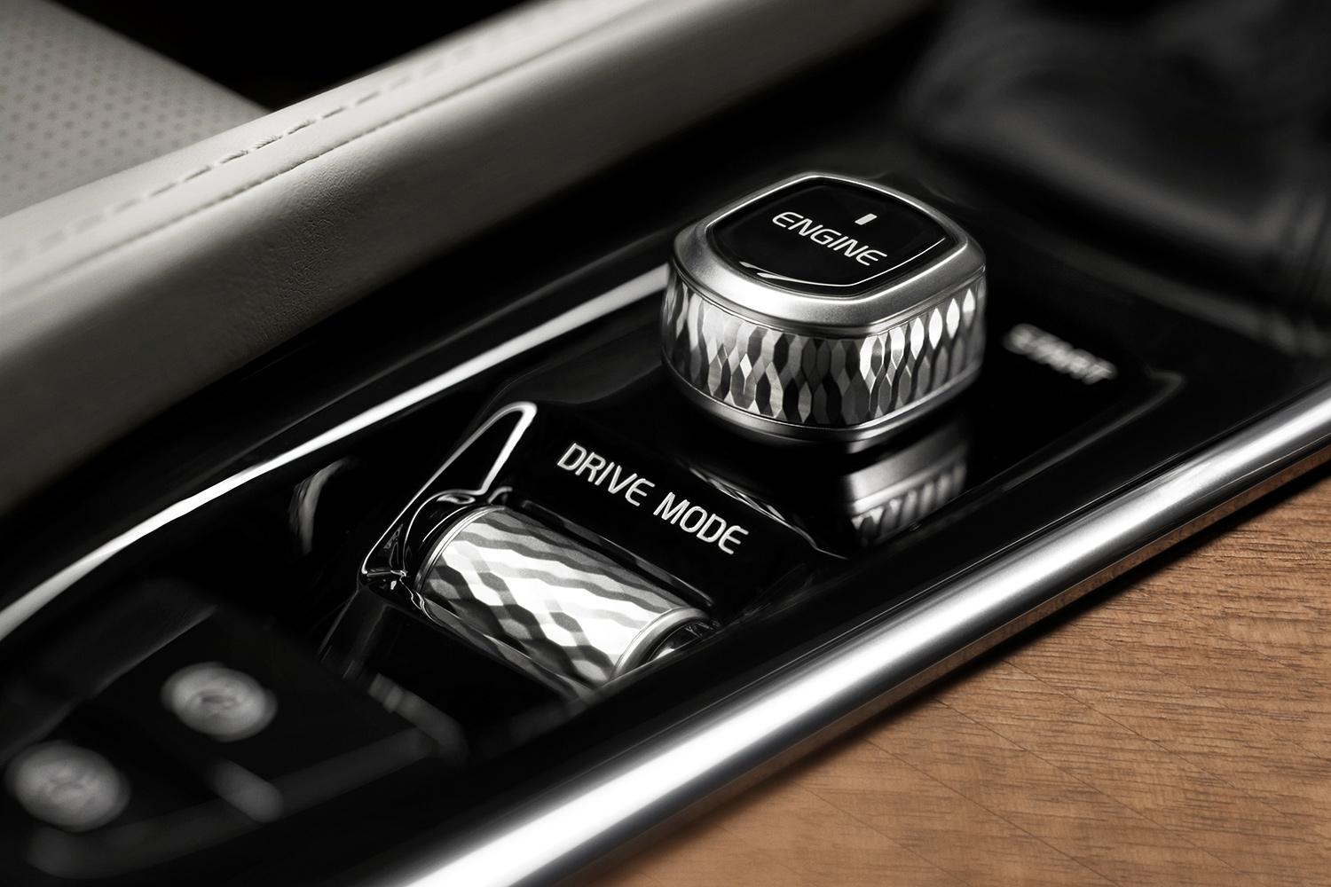
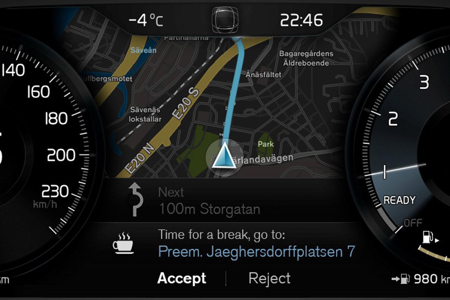
This lesson is revealed in Sensus’ main interface. The system’s vertically oriented screen is divided into four tabs: navigation, audio, current active system app, and phone controls. Climate controls are accessible at the bottom of the screen at all times.
Basic controls — for instance, the ability to pause or skip tracks — are available on the small tabs. More extensive options can be accessed by clicking on the tab, which expands it compressing — but not removing — the other three. Swiping left to right can access additional system options, such as car settings.
The beauty of this set up is that all critical functions are never more than a single command away. The extra real estate created by the ability to swipe left and right from the main screen also means that menus need not be layered as they are in other feature rich systems. If users do get lost, there is an iPad-style home button at the bottom of the screen.
The project’s chief engineer explained to me that the system has more processing power than any iPad.
This stands in stark contrast to other systems where the screen is dominated by whatever app is active, as on an iPad or iPhone. On a phone or tablet, this concept works well. In a car, however, it means the driver cannot look down and see both the navigation map and what song is playing, or a host of other pieces of information.
Additionally, switching between different functions invariably requires multiple commands, usually by way of the home screen. Such systems work, but the reliance on one app screens just doesn’t make sense in cars.
Of course, none of this means anything if the hardware isn’t up to the task. As we have outlined in a recent Road Rave, cars are an incredibly challenging environment for electronics. Components must not only stand up to extreme temperature variations and constant vibrations but also the long and difficult automotive development cycle.
The result of these difficulties is that infotainment systems often suffer from slow processors and balky touchscreens.
Sensus appears to be a different story. The project’s chief engineer explained to me that the system has more processing power than any iPad. This was no idle boast; the system responded with an immediacy noticeably lacking in other luxury brand’s offerings.


The touchscreen, too, is worthy of praise. Produced by Alpine, the screen uses infrared lasers rather than capacitive touch sensors. The result is that it can be used by a person wearing gloves or even with a pencil or other object. In fact, the screen does not even need to be touched, as the lasers are capable of detecting objects a few millimeters away.
In practice, this translates in fluid and precise control. Zooming and swiping on the navigation map is quick and easy, with none of the lag or wonky responsiveness all too common on most infotainment systems.
Choosing what matters
I think the impressive capabilities of Sensus are in part a result of a unique attitude regarding the purpose of infotainment systems.
Most companies seem to treat infotainment systems more as a place to cram in as many eye-catching features as possible, rather than useful driver aids. This disease seems to have particularly affected luxury automakers, which have recently unleashed a host of innovations like virtual cockpits and handwriting recognition.
Sensus seems to be a massive improvement, not just on Volvo’s outgoing system but also the competition.
These are cool features, but not actually necessary or even that useful. For instance, Audi’s engineers told me that their new virtual cockpit is no safer than its traditional infotainment system, though they hoped it would.
By contrast, Volvo has focused on the things that really matter. Namely, the way users actually interact with the system, like the screen, the processing power and the interface itself. If this winning formula sounds familiar, it should, because it is exactly what has made Apple’s mobile devices so successful. After all, Apple wasn’t the first to invent a lot of its famous products; it’s just the best at producing appealing user interfaces and packaging. Volvo seems to have achieved the same effect with Sensus — not first, just best.
A word of warning
As much as I would like to give Sensus a completely clean bill of health, I have a few caveats. First is reliability. While the Sensus systems I used in several test vehicles worked without a hitch, at least two others had problems.
The new XC90s we were driving were preproduction, so it is possible that these problems were only the sorts of teething problems all products go through, or indeed operator error. However, stability problems are an all too common issue in infotainment systems. The answer to this question will only come with time and more opportunities to test Sensus in real-world conditions.
My other caveat is less problem than hesitation. It is possible to tell a lot about a system from a few days of use. For things like infotainment, though, an extended review is critical in determining the system’s day to day usability. For that reason I can’t yet make a fair comparison between Sensus and its competitors whose foibles I know only too well. That being said, Sensus seems to be a massive improvement, not just on Volvo’s outgoing system but also the competition.
Highs
- Incredibly quick responses
- Can be operated with gloves
- Smart intuitive user interface
- Looks great
Lows
- Unknown stability and reliability
Editors' Recommendations
- Watch your back, Tesla. Volvo’s EX30 just raised the bar on EV value
- 2022 Volvo C40 Recharge first drive review: EV fashion statement
- The best infotainment systems
- 2021 Volvo XC40 Recharge first drive review: Refined EV subtlety
- Audi’s updated Q5 receives extra power, better infotainment, and OLED lights