Reddit refurbishes its bland style, adds an endless scroll, new view options

Even CEO Steve Huffman calls Reddit a “dystopian craigslist” — but that could soon change as the social site launches a major redesign with multiple view options, scrolls that never end, and an upgraded posts editor. While the “front page of the internet” has been planning the update for over a year now, on Monday, April 2, a small percentage of users got the first glimpse at the website’s major overhaul.

Recommended Videos

A randomly selected group of Redditors now have access to an early version of the redesign. The company said it is are still adding in some earlier features, designing new ones, and incorporating feedback from early users — so what that small percentage of users see now will likely change before a more widespread rollout.

Reddit’s design overhaul was, in part, to create a code base that will allow the team to add new features faster than previously possible. Reddit explained that its code base has remained largely unchanged since launching more than 12 years ago and that the outdated code made it more difficult to add new features to the platform. The second major idea is to make Reddit more welcoming to new users, simplifying the process of finding new communities to join.

The new design gives users three different view options to choose from (and users part of the early launch can also opt out to get the old design back by going to old.reddit.com). The card view, as the name suggests, puts each post inside a Reddit community in an individual card, with some of the content expanded without the need to click on it. The company says this version is the most like Facebook and Twitter, which was a conscious decision to make the platform easier to use for Reddit newbies. Compact view is designed for scrolling through posts quickly and Classic view, as the name suggests, is closest to the old Reddit.

Besides just giving Reddit a new look, users will also see a handful of new features. For one, text, links, and images can now all be part of the same post, created inside a new post editor. The update also includes infinite scrolling — and when you do stop that scroll to click, a pop-up will show the content while keeping your spot in that scroll that never ends. The update also builds in some customization for communities that moderators previously created with their own workarounds.

Social media users have a tendency to resist changes at first (case in point: Snapchat’s redesign) and as Wired points out, Reddit has remained the same for so long that any user resistance might be more extreme than the norm. The company notes, however, that it does “not have plans to do away with the current site,” suggesting the option to revert to the old school Reddit will be available for some time. But of course, for users that don’t like the new design, there is a Reddit for that — the platform is taking feedback on the update at the r/redesign Reddit.

Hillary K. Grigonis
Hillary never planned on becoming a photographer—and then she was handed a camera at her first writing job and she's been…
We just got our first hint of the RTX 6090, but it’s not what you think
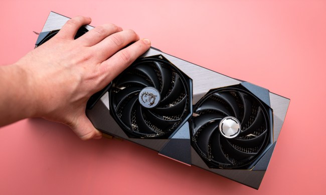
A hand grabbing MSI's RTX 4090 Suprim X.

As we're all counting down the days to a possible announcement of Nvidia's RTX 50-series, GPU brands are already looking ahead to what comes next. A new trademark filing with the Eurasian Economic Commission (EEC) reveals just how far ahead some manufacturers are thinking, because it mentions not just the Nvidia RTX 5090, but also an RTX 5090 Ti; there's even an RTX 6090 Ti. Still, it'll be a long while before we can count the RTX 60-series among the best graphics cards, so what is this all about?

The trademark registration filing, first spotted by harukaze5719 on X (formerly Twitter) and shared by VideoCardz, comes from a company called Sinotex International Industrial Ltd. This company is responsible for the GPU brand Ninja, which doesn't have much of a market presence in the U.S.

Read more
How the Blue Screen of Death became your PC’s grim reaper
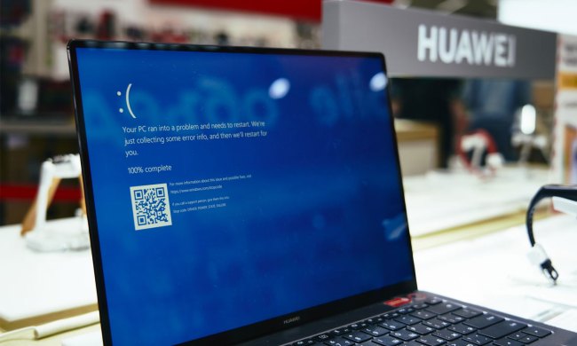
The Blue Screen of Death seen on a laptop.

There's nothing more startling than your PC suddenly locking up and crashing to a Blue Screen of Death. Otherwise known as a Blue Screen, BSOD, or within the walls of Microsoft, a bug check screen, the Blue Screen of Death is as iconic as it is infamous. Blue Screen of Death is not a proper noun, but I'm going to treat it like one. It's what you were met with during crashes on Intel's 14th-gen CPUs, and it littered airport terminals during the recent CrowdStrike outage.

Everyone knows that a Blue Screen is bad news -- tack on "of Death" to that, and the point is only clearer. It's a sign that something catastrophic has happened, so much so that the operating system can't recover, and it needs to reboot your PC in order to save it. The Blue Screen of Death we know today, fit with its frowning emoticon, is a relatively new development in the history of Windows.

Read more
The performance downgrade made to the M4 Pro that no one is talking about
Someone using a MacBook Pro M4.

I've spent this whole week testing the new M4 chip, specifically the M4 Pro in both the Mac mini and 16-inch MacBook Pro. They are fantastic, impressive chips, but in my testing, I noticed something pretty surprising about the way they run that I haven't seen others talk much about. I'm talking about the pretty significant change Apple made in this generation to power modes.

First off, Apple has extended the different power modes to the "Pro" level chips for the first time, having kept it as an exclusive for Max in the past. The three power modes, found in System Settings, are the following: Low Power, Automatic, and High Power. The interesting thing, however, is that in my testing, the Low Power drops performance far more this time around.

Read more