Apple likes to portray its Macs as the best, most innovative computers in the world, so it can be easy to forget that the company has released some real stinkers over the years. Not every Apple computer has been a hit — some have been downright awful.
In this article, we dive into Apple history to unearth the computing duds that are better left forgotten. If you’ve ever wondered about the worst computers Apple has ever made (or want to see the flip side of Apple’s greatest ever Macs), you’re in the right place.
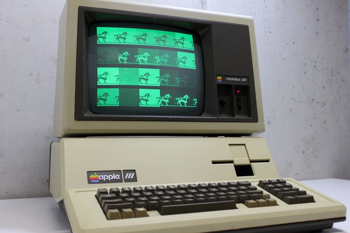
Apple III (1980)

Introduced in 1980, the Apple III attempted to build on the strong reputation of the popular Apple II. Unfortunately, it was so bad that somewhere around 20% of the total number sold had to be recalled due to critical stability problems.
Apple founder Steve Jobs insisted that the Apple III should have no fans or air vents in order to operate quietly, which meant it had to rely on an aluminum base acting as a heatsink. The result? A seriously overheating computer. Elsewhere, there were major problems with the logic board, which was almost too small to fit all the computer’s components. Company co-founder Steve Wozniak said the problems stemmed from letting the marketing team design the computer rather than the engineering team.
Apple was a mere four years old when it launched the Apple III, which raises the question of whether the computer’s failure came down to inexperience or hubris. Whatever the case, the Apple III was swiftly tossed down the memory hole, never to be seen again.
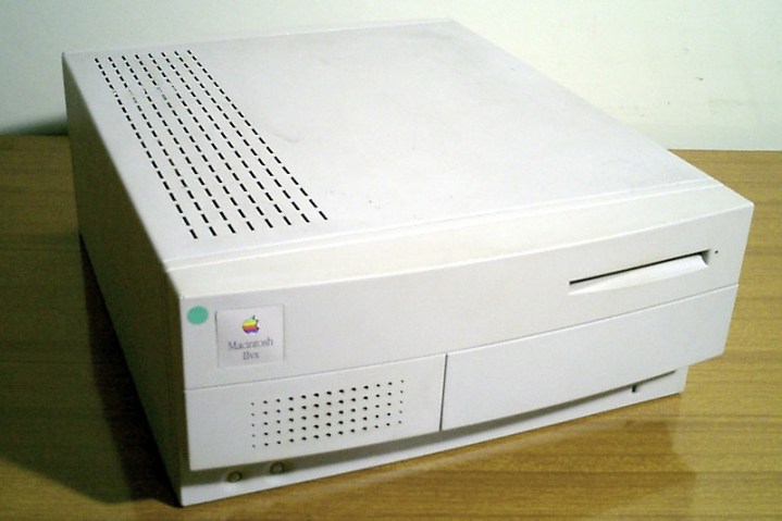
Macintosh IIvx (1992)

The Macintosh IIvx was meant to represent a big step forward for Apple. Alongside its Macintosh IIvi sibling, it was the first Mac to come with a CD-ROM drive. Yet its production was rushed, and the resulting shortcuts hobbled it from the outset.
For one thing, it had a 32mHz processor that was crippled by a 16mHz bus, which meant it was slower than the older Macintosh IIci. Its serial port, meanwhile, was limited to 57.6Kbps, causing problems with hardware connections.
Four months after the Macintosh IIvx launched, Apple brought out the more powerful Centris 650 for $250 less than the IIvx, immediately making it obsolete. Apple very nearly went bankrupt in the 1990s, and with products like the IIvx, it’s not hard to see why.
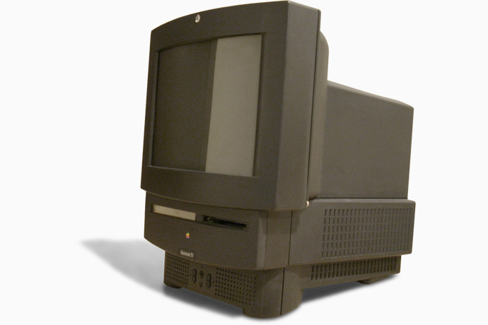
Macintosh TV (1993)

Almost 30 years after its launch, the Macintosh TV remains a strange curiosity in the history of Apple devices. As its name suggests, it combined a computer and a TV into a single product, yet it was a case where the whole was definitely not greater than the sum of its parts.
While it was capable of displaying both computer and TV outputs, it could not do both simultaneously (showing TV content in a window on the computer’s desktop, for example). You had to choose one or the other and switch every time you changed your mind.
Worse, the computer itself was mediocre at best — just like the Macintosh IIvx, the 32mHz processor was held back by a 16mHz motherboard bus. You would have been better off buying separate products, which is what most people did. Only 10,000 units were sold, and it was killed off after just 99 days.
Twentieth Anniversary Macintosh (1997)
The Twentieth Anniversary Macintosh (TAM) is a cautionary tale about how an overzealous marketing department can derail an otherwise acceptable product. As the 20th anniversary of Apple’s founding approached, the company executives decided to launch a celebratory computer — and thus the TAM was born.
It was meant as a showcase of cutting-edge computing technology, and it even came with a concierge delivery service, but Apple’s marketing team allegedly pivoted it from a mainstream device to an expensive collectible priced too high for the masses.
Its launch price of $7,499 (nearly $14,000 today) was slashed to $3,500 mere months later. Just a year after its introduction, a recently returned Steve Jobs canceled it entirely and cut the price of the remaining units to $1,995. Jobs reportedly hated it, but probably not as much as anyone who forked out the initial $7,499 asking price.
Despite its shortcomings, the TAM was something of a trailblazer. It was the first Mac designed by Jony Ive, and foreshadowed many of today’s Apple staples, from the iMac to the standalone trackpad. Yet, its outrageous pricing meant it was always doomed to fail.
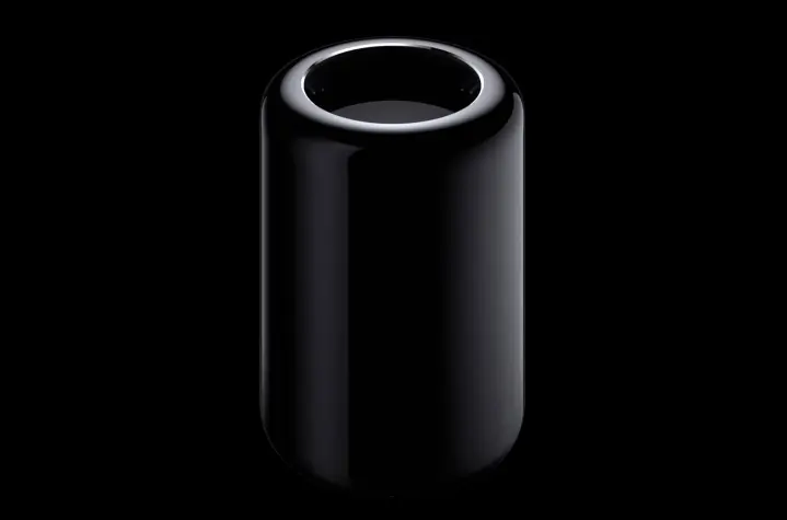
Mac Pro (2013)

While the 1990s are generally regarded as Apple’s “wilderness years,” the mid-2000s might not be far behind due to the sheer number of shoddy Macs released during this time. This second dreary era was kicked off by the 2013 Mac Pro, aptly nicknamed the “trash can Mac Pro.”
Apple is renowned for its design chops, but the 2013 Mac Pro seems to have been one time the creative teams got a little overenthusiastic. The device was formed into a cylindrical shape, with components arranged around a central column that dissipated heat.
The problem was that it didn’t dissipate enough heat, meaning Apple couldn’t upgrade the machine with newer, more powerful components. As the industry moved forward, the Mac Pro became stuck in time. It wasn’t helped by the fact that only the memory and storage were user-upgradable, frustrating the modularity so often needed by professional users.
The result was a computer that made Apple’s designers happy, but irritated its consumers. It’s telling that the latest Mac Pro returned to the both the standard tower design and much greater modularity of the original Mac Pro that first appeared in 2006. Sometimes, you can’t beat the classics.
12-inch MacBook (2015)

Occasionally, companies bring out a product that feels more like a tech demo than something that is expected to sell millions of units (just look at the first-generation Samsung Galaxy Fold). The 12-inch MacBook feels like it falls neatly into this category.
The device felt like it was the result of a challenge issued to Apple’s engineers: how thin and light could they possibly make a laptop? Looked at one way, the designers succeeded, because the 12-inch MacBook was truly a thing of beauty. By far Apple’s most lightweight laptop, it felt almost impossibly slimline.
The problems lay, well, almost everywhere else. Being so tiny meant anything more powerful than a mobile CPU would create too much heat, so the laptop was woefully underpowered. Apple could only fit one port onto the chassis, and decided to make it the (at the time) barely used USB-C. And the price? Let’s just say it wasn’t competitive at all for the performance.
Nowadays, we take USB-C ports on laptops for granted, but the 12-inch MacBook paved the way (in fact, it might even stage a comeback sometime soon). It’s just a shame it was so overpriced and underpowered.
MacBook Pro (2016)

It’s telling that when Apple launched the redesigned MacBook Pro in 2021, it served as a refutation of almost everything that defined the previous version. That goes to show just how much the MacBook Pro got wrong in the preceding years, and it all started with the 2016 model.
The most obvious sticking point was, quite literally, the butterfly keyboard. While thinner than previous MacBook keyboards, its keys were prone to sticking when dirt got under them. They were also unsatisfying to use, with shallow key travel that produced errors and misspellings.
Elsewhere, the laptop only had USB-C ports, meaning users had to buy a plethora of dongles and adapters to connect their peripherals. Its Intel CPUs were underpowered and overly hot, while the Touch Bar was a neat idea that never found its purpose.
Thankfully, Apple has since seen sense and reverted to more standard fare in the latest MacBook Pro, bringing back more port variety and ditching the Touch Bar. Better yet, powerful Apple silicon chips have restored the MacBook Pro’s performance right back to where it should be.


